
The Mercator Projection Legacy
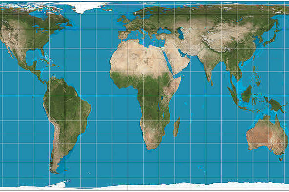
The world maps we see in classrooms today are often based on the Mercator projection, a design created by Gerardus Mercator in 1569. This specific map was originally built to help 16th-century sailors navigate the vast oceans by preserving straight lines for compass bearings. While it was a brilliant tool for explorers during the Age of Discovery, it creates a massive visual problem because it stretches objects as they move further from the equator. This means that landmasses near the North and South Poles look much larger than they actually are in real life, while tropical regions appear shrunken and less significant.
Because this map has been the gold standard for over 450 years, most people have internalized a skewed version of global geography. This distortion isn’t just a math error; it impacts how we perceive the importance of different nations and continents. When certain areas look oversized, they can subconsciously seem more powerful or relevant in our minds. In recent decades, educators and cartographers have pushed for more balanced views, such as the Gall-Peters projection introduced in 1973, to provide a fairer representation of the Earth. Understanding these historical choices helps us realize that the “standard” map is just one way of looking at our complex, round planet.
Africa Versus Greenland

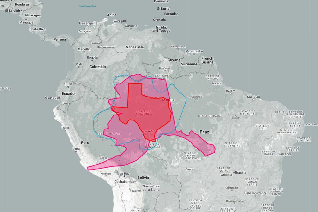
One of the most shocking examples of map distortion involves the comparison between Africa and Greenland. On a standard Mercator map, these two landmasses appear to be roughly the same size, but this is a complete optical illusion caused by polar stretching. In reality, Africa covers about 30.37 million square kilometers, making it approximately 14 times larger than Greenland, which only covers about 2.16 million square kilometers. To put that into perspective, you could fit the entire United States, China, India, and most of Europe inside the borders of Africa with room to spare, yet the map makes them look like equals.
This massive geographical misunderstanding has been debated by scholars since the mid-20th century because it minimizes the true scale of the African continent. Africa is the second-largest continent on Earth, trailing only Asia, yet its central location on the equator causes it to look compressed on flat paper. By correcting our mental image of these regions, we can better appreciate the massive diversity, resources, and physical reach of the African landmass. Moving away from these outdated 16th-century visual biases is a vital step toward a more accurate and respectful understanding of global proportions and the actual distribution of land on our rotating sphere.
Brazil And Alaska
When scrolling through digital maps or looking at a wall chart, Alaska and Brazil often look like they occupy a similar amount of space. However, this is a major geographical deception. Brazil is actually nearly five times larger than Alaska in terms of total land area. Brazil spans over 8.5 million square kilometers, ranking as the fifth-largest country in the world, while Alaska covers about 1.7 million square kilometers. Because Alaska sits so far north, the map stretches it horizontally and vertically, making the “Last Frontier” appear much more massive than the tropical giant of South America.
This visual trickery can lead people to underestimate the sheer size of Brazil, which takes up nearly half of the South American continent. While Alaska is certainly the largest state in the U.S., its size is dwarfed when placed next to Brazil on an equal-area map. These distortions were first brought to mainstream attention during the cartography debates of the 1970s, as experts argued that equatorial countries were being “cheated” out of their true physical status. Recognizing the actual scale of Brazil helps us understand its environmental impact and regional influence more clearly. It serves as a reminder that what we see on a flat screen is rarely a perfect reflection of the physical Earth.
Antarctica’s True Scale
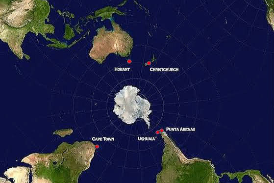
Antarctica is frequently shown as a gigantic, unending strip of white ice stretching across the entire bottom of the map. This gives the impression that it might be the largest continent of all, but this is simply a result of how flat maps handle the South Pole. In reality, Antarctica covers about 14.2 million square kilometers, making it the fifth-largest continent. It is significantly smaller than Asia and Africa, and it is even smaller than the total landmass of Russia. The Mercator projection takes a single point, the South Pole, and stretches it into a long line, creating a massive exaggeration of the icy region.
While Antarctica is visually dominant on school maps, its true size is more comparable to 1.5 times the size of the United States. Since the signing of the Antarctic Treaty in 1959, the continent has been a focal point for international scientific cooperation and climate research. Understanding its true proportions is important because it helps scientists and the public accurately visualize the scale of its ice sheets. When we see Antarctica in its proper context, we realize it is a distinct, isolated continent rather than a massive base for the rest of the world. Using globe-based views or Robinson projections provides a much more honest look at this vital, frozen part of our world.
Russia Appears To Dominate

Russia is famously the largest country on Earth, but typical maps make it look even more imposing than it truly is. Because Russia stretches across the high northern latitudes of Eurasia, the Mercator projection inflates its size until it looks larger than the entire continent of Africa. In reality, Russia covers about 17.1 million square kilometers, while Africa is nearly double that size at over 30 million square kilometers. While Russia is undoubtedly vast, spanning eleven different time zones, the visual representation on most maps suggests a level of dominance that doesn’t quite match the actual physical measurements of the land.
This exaggeration of northern territories has historical and political roots that go back centuries. When the northern hemisphere appears larger, it can create a subconscious bias where northern nations seem more central to global affairs than those near the equator. Since the fall of the Soviet Union in 1991, geographical literacy has become even more important for understanding the true layout of the post-Cold War world. By using modern tools like the “The True Size Of” interactive maps, people can now slide Russia toward the equator and watch it shrink to its honest proportions. This helps us develop a more balanced perspective on global geography and corrects the visual myths we’ve been taught for generations.
‘North’ Is Not Up

For most people, the idea that “North is up” feels like an absolute law of nature, but it is actually just an old human habit. There is no physical reason why the North Pole should be at the top of a map; in the vacuum of space, Earth has no inherent “up” or “down.” This orientation became the standard in Europe during the 16th century, largely due to the use of the North Star and magnetic compasses for ocean travel. Before this became the norm, different cultures had their own ideas. For instance, many medieval Islamic maps were drawn with South at the top, while early Christian maps often put East at the top.
Choosing to put North at the top was a cultural decision that eventually became a global rule through the spread of European cartography. In modern times, “South-up” maps have been created as educational tools to challenge our perspectives and break traditional biases. These maps, popularized in the late 20th century, show Australia and South America at the top, which can be quite disorienting at first. This exercise proves that maps are not just scientific records, but also reflections of human history and power. By realizing that “up” is a choice, we can start to see the world from different angles and appreciate that no single perspective is more “correct” than another.
Canada’s Perceived Bulk

Canada is a massive nation, but on a standard flat map, it looks like a Colossus that could swallow the entire United States and Mexico combined. This visual bulk is another side effect of the Mercator projection’s tendency to stretch land as it reaches toward the Arctic Circle. In reality, Canada’s land area is about 9.98 million square kilometers. When you combine the United States (9.8 million sq km) and Mexico (1.9 million sq km), they actually surpass Canada’s total size. On a globe, Canada appears much more slender and less bloated than it does on the maps pinned to many office walls.
This distortion has influenced how people perceive the geography of North America for a long time. While Canada is indeed the second-largest country in the world, its northern islands are particularly exaggerated, making them look like massive continents of their own. Since the early 1900s, geographers have pointed out that these visual errors can affect our understanding of population density and land use. Most of Canada’s population actually lives within 100 miles of the U.S. border, a fact that is often obscured by the massive, empty-looking northern expanse shown on distorted maps. Seeing Canada’s true scale helps us better understand the real relationship between the three largest nations in North America.
Madagascar’s Scale
Madagascar is often tucked away in the corner of maps, looking like a tiny footnote off the coast of East Africa. In truth, it is the fourth-largest island on the planet and is significantly bigger than many well-known countries. With a land area of approximately 587,000 square kilometers, Madagascar is larger than Spain, Thailand, or Germany. Because it is located closer to the equator, it doesn’t get the “stretching” benefit that northern islands like Great Britain or Greenland receive, which makes it look smaller to the casual observer. This island is a world of its own, boasting biodiversity that is found nowhere else.
The realization of Madagascar’s true size is essential for understanding its importance as a center of evolution and culture. Since it split from the Indian subcontinent about 88 million years ago, it has developed unique plants and animals, such as the famous lemur. When we view it on an equal-area map, its impressive scale becomes clear, highlighting its status as a major geographic player in the Indian Ocean. For years, environmentalists have used the island’s true scale to emphasize the importance of conservation efforts there. Correcting our view of Madagascar helps us appreciate the true diversity of our planet’s landforms and the hidden scale of the southern hemisphere.
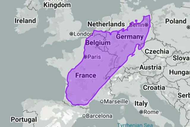
Europe Versus South America

On many common world maps, Europe and South America look like they might be roughly equal in size. This is one of the most persistent illusions in cartography. South America is actually nearly twice as large as Europe, covering about 17.8 million square kilometers compared to Europe’s 10.2 million square kilometers. The Mercator projection inflates Europe because it is located in the northern latitudes, while it compresses South America as it sits across the equator. This makes small European nations look much more expansive than they are, while the massive reaches of the Amazon and the Andes appear smaller.
This visual imbalance has been criticized for reinforcing a Eurocentric view of the world, where northern regions are given more visual “weight” than those in the south. The debate over this distortion reached a peak in the 1970s with the introduction of the Peters Projection, which was designed to show the true relative sizes of all continents. When you see South America in its correct proportions, its massive role in global climate and geography becomes much more obvious. Acknowledging that South America is a giant compared to Europe is a simple but powerful way to correct our geographic literacy and respect the actual physical layout of the Earth.
Scandinavia’s Size Illusion

The countries of Scandinavia, Sweden, Norway, and Finland, appear as massive territories on the top of most world maps. Because they are so close to the North Pole, they are subject to extreme stretching. For example, Sweden looks like a giant on a map, but it is actually roughly the same size as Thailand or the state of California. Norway looks sprawling, yet its land area is smaller than that of Japan. This “size illusion” is a classic example of how latitude dictates how much a country is distorted on a flat surface, leading to a mental overestimation of northern European land.
This cartographic quirk has existed since the first Mercator maps were printed in the 16th century. While these northern nations have significant cultural and economic influence, their physical footprint is much more modest than a classroom map suggests. Modern digital mapping tools now allow us to drag these countries down to the equator to see how they “shrink” when the distortion is removed. This comparison is a great way to teach students and map lovers about the math behind mapmaking. By recognizing these illusions, we can look at the world with a more critical eye and appreciate the clever, if imperfect, ways humans have tried to draw our round home.
The Borderless Sargasso Sea

Unlike almost every other sea on the planet, the Sargasso Sea is not defined by land or rocky coastlines. Most bodies of water, like the Mediterranean or the Caribbean, are tucked between continents or islands, but the Sargasso exists entirely within the open North Atlantic Ocean. It is bounded instead by four massive, rotating ocean currents: the Gulf Stream, the North Atlantic Current, the Canary Current, and the North Atlantic Equatorial Current. These currents create a swirling vortex known as a gyre, which traps a unique type of golden-brown seaweed called Sargassum, giving the sea its name and a distinct, forest-like appearance on the water’s surface.
Since the late 15th century, sailors have been fascinated and sometimes frightened by this “sea without shores.” Christopher Columbus famously documented his encounter with the thick mats of seaweed in 1492, fearing his ships might run aground even though the water beneath was miles deep. Today, scientists recognize the Sargasso as a vital “oceanic desert” that is actually teeming with life; it serves as a critical nursery for endangered sea turtles and a mysterious spawning ground for American and European eels. Because its “borders” are made of moving water rather than solid ground, the Sargasso Sea reminds us that nature doesn’t always fit into the tidy lines we draw on our maps.
Maps Must Distort

It is a mathematical fact that every flat map of the world must contain some level of distortion. This challenge is known as the “Orange Peel Problem”, just as you cannot flatten a round orange peel onto a table without it tearing or stretching, you cannot project a 3D sphere like Earth onto a 2D surface perfectly. Cartographers must choose which reality to preserve: shape, area, distance, or direction. For example, the Mercator projection, created in 1569, was designed specifically for navigation because it keeps directions accurate. However, the price of that accuracy is that it wildly exaggerates the size of landmasses the further they are from the equator.
Throughout history, different mapmakers have offered various solutions to this puzzle. In 1923, the Mollweide projection gained popularity for showing equal areas, though it distorted the shapes of the continents at the edges. Later, in 1963, the Robinson projection was developed as a compromise, distorting everything slightly so that nothing looked too extreme to the human eye. Understanding these trade-offs helps us realize that no single map is “perfect.” Every map is a tool built for a specific purpose, and recognizing these built-in flaws allows us to see the world with a more informed and critical perspective.
The world is a complex, beautiful sphere, and learning to look past the distortions on the page helps us appreciate its true, balanced scale.


