
The Psychology Behind Every Aisle You Walk
Have you ever walked into a grocery store for a gallon of milk and walked out with three bags of snacks and a potted plant? You aren’t alone. It turns out that since the first modern supermarket, Piggly Wiggly, opened its doors in September 1916, retailers have been perfecting the art of the “nudge.” Every single inch of a grocery store is mapped out based on decades of behavioral science. From the floor tiles to the ceiling lights, the environment is engineered to influence how you move, how long you stay, and, most importantly, how much you pull out of your wallet at the end.
Retailers invest millions into layout strategies because even a tiny shift in your path can lead to a bigger sale. It is a fascinating mix of psychology and business where the goal is to make the shopping experience feel natural, even though it is highly controlled. By 2026, these tactics have become even more high-tech, using data to ensure you feel “helpful” nudges toward specific products. When you understand that the store is essentially a giant, silent salesperson, you can start to spot the tricks and keep your budget on track.
Fresh Produce First
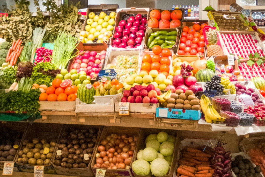
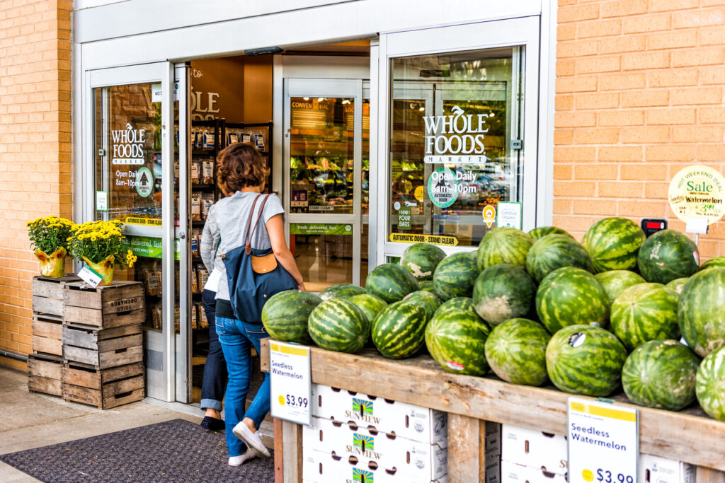
The second you walk through those sliding doors, you are usually hit with a burst of color from the produce section. This isn’t just because fruits and vegetables look pretty; it’s a strategic move to set a “healthy” tone for your entire trip. Since the rise of health-conscious shopping in the early 2000s, stores have prioritized these bright, fresh displays right at the entrance. The vibrant greens and reds are designed to boost your mood and make the store feel like a farm-fresh marketplace rather than a cold warehouse, which puts you in a spending headspace.
There is also a sneaky bit of “moral licensing” happening here. When you start your trip by loading up on spinach and apples, your brain gives you a metaphorical “gold star.” Because you feel like you’ve already made such responsible, healthy choices, you are much more likely to reward yourself later with a bag of cookies or a frozen pizza. By the time you reach the middle of the store, your “healthy” momentum has faded, and your guard is down. It’s a clever way to ensure you feel good about filling your cart with treats later on.
Essentials In The Back
If you’ve ever wondered why you have to hike a half-mile just to find a carton of eggs, there is a very profitable reason for it. Since the mid-20th century, grocery stores have traditionally placed “destination items”, like milk, bread, and meat, at the very back of the building. This layout forces you to navigate through a literal maze of non-essential items just to get to the basics. It’s a simple game of exposure: the more products you have to walk past, the higher the chance that something “unplanned” will catch your eye and end up in your basket.
Every aisle you traverse on your way to the dairy case is an opportunity for the store to tempt you with high-margin items. Even if you are a disciplined shopper with a list, the sheer volume of products you encounter makes impulse buying almost inevitable. What was supposed to be a sixty-second errand for a gallon of 2% milk often turns into a fifteen-minute tour of the entire store. This design is one of the oldest tricks in the book, and it remains effective because it relies on the basic human tendency to browse while we walk.
Eye-Level Placement

In the world of retail, there is a famous saying: “Eye level is buy level.” This refers to the middle shelves that sit right at the average adult’s line of sight. Brands actually pay “slotting fees” to secure these prime locations because they know shoppers are most likely to grab what is easiest to see. According to industry data from 2024, items placed at eye level sell significantly better than those on the top or bottom shelves. Usually, these are the name-brand products that have higher prices and bigger profit margins for the supermarket.
Because we are often in a rush, our brains look for the path of least resistance. We tend to scan the shelves quickly and reach for the first thing that looks familiar, which is almost always the most expensive option at eye level. Meanwhile, the generic or “value” brands are hidden away on the very bottom shelf, requiring you to bend down or search harder to find them. By making the more expensive choice the most convenient one, stores can subtly increase your total bill without ever having to say a word to you.
Kid-Level Targeting
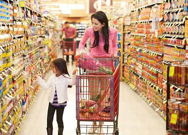
If you look down at the lower shelves in the cereal or snack aisles, you’ll notice a very specific trend: the most colorful, cartoon-heavy boxes are placed right at a height of about three feet. This is “kid-level targeting,” a tactic that has been used for decades to capture the attention of the smallest shoppers. Stores know that if a child sees a box with their favorite character, they are going to ask for it. It turns a routine shopping trip into a negotiation between a parent and a persuasive toddler.
This strategy works because it creates “pester power.” Even if a parent starts with a strict “no treats” rule, the constant exposure to bright packaging at a child’s eye level can wear down even the most disciplined guardian. Research shows that children influence a huge percentage of household grocery spending, especially when it comes to snacks and breakfast items. By positioning these products specifically for little eyes, stores turn children into active participants in the buying process, ensuring that extra items make their way into the cart before you even reach the checkout.
The Decompression Zone
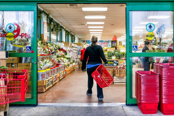
The “Decompression Zone” is that small area just inside the entrance where you park your cart or grab a handbasket. Retail experts have noted for years that shoppers rarely stop to look at items in this space because they are still adjusting to the store’s environment. Your brain is busy processing the change in temperature, the lighting, and the overall layout. Because shoppers are usually “decompressing” from the outside world, any products placed right by the front door are often ignored as people move deeper into the aisles.
Stores are very aware of this psychological adjustment period, so they rarely put high-profit items in this “dead zone.” Instead, they use it as a transition space to get you focused and ready to shop. Once you move about fifteen to twenty feet into the store, your pace slows down and your eyes start to scan the shelves with more intent. This is where the real marketing begins. By giving you a few seconds to adjust, the store ensures that by the time you hit the first real display, you are fully “switched on” and ready to spend.
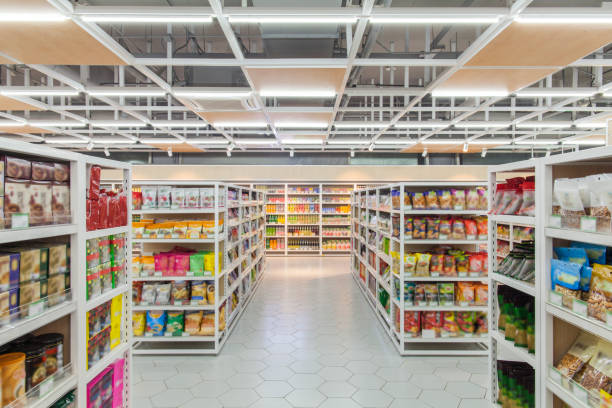
Strategic Store Flow
Most grocery stores are designed with a counter-clockwise flow, meaning you enter on the right and move toward the left. While it might seem random, some studies suggest that this layout aligns with how most people naturally navigate spaces, potentially making them feel more comfortable. The goal is to create a seamless path that leads you through every major department. By guiding your movement, the store ensures that you encounter a balanced mix of “needs” and “wants” in a sequence that keeps you moving forward.
This flow is often reinforced by the placement of long, continuous aisles that make it difficult to “escape” or take a shortcut. As you follow the path the store has set for you, you are constantly exposed to new displays and seasonal items. The longer the path, the more opportunities there are for a “suggestive sale.” Even the way the aisles are angled can play a part in keeping you in the store just a few minutes longer. It’s a quiet, structural way to ensure you don’t miss a single chance to add something to your cart.
Endcap Temptations
The “endcap” is the display at the very end of a grocery aisle, and it is some of the most valuable real estate in the entire building. Because these displays face the main perimeter of the store, they get massive amounts of foot traffic. Brands often pay a premium to have their products featured on an endcap because it gives the illusion of a special deal or a “must-have” item. Even if the price isn’t actually discounted, the prominent placement makes the product feel important and time-sensitive to the average shopper.
Endcaps are the kings of impulse buying. They often feature seasonal goods, like grilling supplies in July or baking mixes in December, that you weren’t originally looking for but suddenly feel like you need. Because they are separate from the regular shelves, they catch your eye as you turn the corner, breaking your concentration and inviting a quick “grab and go” decision. It’s an incredibly effective way for stores to move specific inventory quickly, as many shoppers assume that if something is on a special display, it must be a great value.
Cross-Merchandising Tricks
Have you ever noticed that right next to the dry pasta, there is a shelf of premium marinara sauce, or that the strawberries are displayed right next to the shortcake and whipped cream? This is called “cross-merchandising,” and it’s a brilliant way to increase the number of items in your cart. Instead of making you walk to three different departments to build a meal, the store does the “thinking” for you by grouping related items together. It’s convenient for the shopper, but it’s also a powerful spending trap.
By creating these little “meal solution” stations, stores encourage you to buy things you might have skipped. You might have come in just for pasta, but once you see that gourmet pesto and a bag of parmesan cheese right next to it, the “complete meal” suddenly seems like a great idea. This tactic taps into our desire for convenience and saves us the mental energy of planning. However, it often leads to buying higher-priced “companion” items that you wouldn’t have gone looking for if they were tucked away in their usual aisles.
Music Slows You Down

The background music in a grocery store is never just white noise; it’s a carefully curated playlist designed to control your walking speed. Since the 1980s, researchers have known that slow-tempo music, typically under 72 beats per minute, causes shoppers to move more slowly through the aisles. When you move slower, you spend more time looking at products, which statistically leads to a higher bill at the register. It’s a subtle form of “audio architecture” that keeps you in the store longer without you even realizing it.
In fact, some studies have shown that playing slow music can increase sales by as much as 38% compared to faster music. If the music were too fast, you might feel rushed and stick strictly to your list. By keeping the vibe calm and relaxed, the store encourages a “browsing” mindset. You might find yourself humming along to a soft pop hit while staring at different types of olive oil, and before you know it, an extra five minutes have passed. It is one of the most invisible yet effective tools in a retailer’s kit.
Scent And Atmosphere
Your sense of smell is one of the most powerful drivers of memory and emotion, and grocery stores use this to their full advantage. This is why the bakery is almost always located near the front of the store or in a high-traffic corner. The smell of fresh-baked bread or cookies creates an immediate sense of comfort and hunger. When you are hungry, you are much more likely to make impulsive food choices and buy more than you originally planned. It’s a direct line to your stomach, and your wallet.
Beyond the bakery, stores use “scent marketing” to create a specific atmosphere in different departments. You might smell citrus in the cleaning aisle or floral scents near the produce. These aromas are designed to reinforce the “freshness” of the environment and keep you feeling pleasant. A happy shopper is a spending shopper, and a pleasant-smelling store encourages you to linger. By engaging your senses, the store moves beyond being a simple warehouse and becomes an experience that triggers your appetite and your desire to explore every aisle.
Larger Shopping Carts
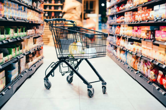
One of the simplest yet most effective tricks is the size of the shopping cart itself. Over the years, grocery stores have gradually increased cart sizes, and most shoppers hardly notice the change. A larger cart creates the illusion that you have not picked up much, even when you already have several items inside. This visual gap subtly encourages you to keep adding more. Since the cart was invented in 1937, its size has nearly tripled in many major American retail chains to boost sales.
Psychologically, people tend to “fill the space” available to them. When a cart looks half empty, it feels like there is room for more, which leads to extra purchases that were never planned. Even shoppers who come in with a list can find themselves tossing in additional items just to make the cart feel complete. This small design tweak quietly raises the average spending per trip without changing prices or promotions. It’s a classic case of how physical environment shapes our internal logic about how much we “need” to buy.
Checkout Impulse Zones
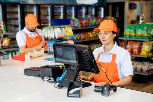
The checkout area is one of the most carefully engineered parts of any grocery store. As you wait in line, you are surrounded by small, inexpensive items like candy, magazines, and snacks. These products are not randomly placed. They are chosen because they are easy, last-minute purchases that require little thought. Since the 1950s, this “point of purchase” strategy has been a goldmine for retailers, capitalizing on the few minutes you spend standing still while waiting for your turn.
By the time you reach the register, you are often mentally tired from making decisions throughout the store. This is known as decision fatigue, and it makes you more likely to grab something quick and satisfying as a small reward. Even a few extra items per customer can add up significantly for the store over the course of a fiscal year. The strategy works because it targets a moment when your guard is down and your willingness to spend is higher. It turns “dead time” in line into a final sales pitch.
No Clocks Or Windows
Many grocery stores are designed without clocks or windows, which might seem like a simple architectural choice. In reality, it is a deliberate tactic often compared to the design of a casino. Without clear indicators of time passing, such as the setting sun or a ticking clock, shoppers tend to lose track of how long they have been inside. This creates a “timeless” environment where your only focus is the task at hand: looking at and buying products.
When people spend more time in a store, they naturally encounter more products. This increased exposure leads to a higher chance of impulse purchases. The longer you stay, the more opportunities there are to notice something new or interesting. What feels like a quick visit can easily stretch into a longer trip, resulting in a fuller cart and a higher bill. By removing the outside world from your view, the store ensures that your entire reality, at least for thirty minutes, is centered around their inventory and displays.
Frequent Store Resets
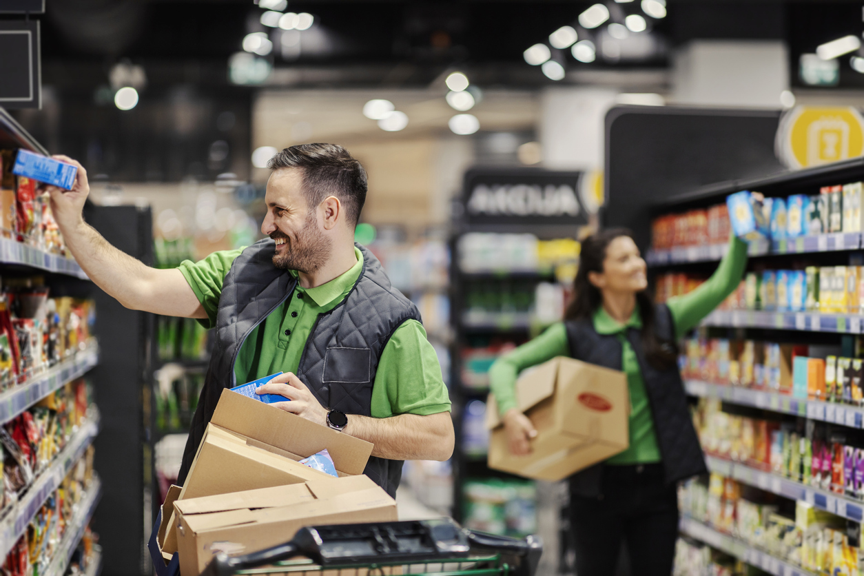
If you have ever struggled to find an item that used to be in a familiar spot, you have experienced this tactic firsthand. Grocery stores regularly rearrange products and even entire sections, a process often called a “store reset.” This is not done for the convenience of the customer. It is meant to disrupt your routine and break your “autopilot” shopping habits. When things are where they always are, you grab them and move on; when they move, you have to look.
When you are forced to search for your favorite cereal, you are exposed to dozens of other items you would normally ignore. This increases the chances of discovering something new and adding it to your cart. According to retail insights from 2025, even small changes in layout can significantly influence buying behavior by increasing product visibility and forcing engagement with different aisles. It turns a predictable chore into a treasure hunt where the “treasure” is something the store wants you to buy.
Bulk Buying Displays
Large displays of bulk items often give the impression of value and savings. Seeing products stacked high in the middle of an aisle suggests abundance and popularity, which can make them feel like a smart purchase. Since the rise of warehouse clubs in the 1980s, traditional grocery stores have adopted these massive “power wing” displays to signal a “deal.” However, buying in bulk does not always mean you are spending less overall when you look at your total checkout price.
These displays encourage shoppers to buy more than they actually need at that moment. While the unit price might be a few cents lower, the total cost is higher because you are purchasing a larger quantity than necessary. Stores benefit from this by increasing the “basket size” of each transaction. What feels like a great deal often results in spending more money upfront, even if some of the product goes unused or sits in a pantry for months. It’s a clever way to move high volumes of inventory.
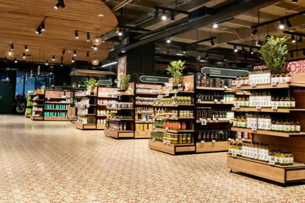
Strategic Lighting Choices
Lighting plays a bigger role in shopping behavior than most people realize. Bright, focused lighting, often using specific LED spectrums, is used to highlight fresh produce, baked goods, and featured products. This makes them appear more vibrant, appealing, and higher in quality. Since 2022, many stores have upgraded to “smart lighting” that can actually make meat look redder or fruit look riper, subtly influencing your perception of freshness and value as you walk through the aisles.
Different sections may also use warmer or softer lighting to create a comfortable, cozy atmosphere. When shoppers feel relaxed, they tend to linger longer and browse more. This extended time in the store increases the likelihood of additional purchases. Environmental factors like lighting are carefully controlled because they influence both your mood and your sensory perception. By highlighting certain items while keeping the general atmosphere inviting, the store directs your attention exactly where they want it to go, leading to more sales.
Price Ending Tricks
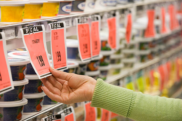
Prices that end in .99 or .95 are incredibly common in grocery stores, and they are not accidental. This pricing strategy, known as “charm pricing,” is based on how people perceive numbers. Because we read from left to right, a product priced at $4.99 feels significantly closer to $4.00 than to $5.00, even though the difference is only a single penny. This tactic has been a staple of American retail for over a century because it consistently works on the human brain.
Shoppers tend to focus on the first number they see, which makes the item appear like a better deal than it actually is. This small psychological shift can influence purchasing decisions across hundreds of products in a single store visit. Over time, it leads to increased sales because customers feel like they are getting better value, even when the savings are negligible. It’s a simple way to nudge a “maybe” purchase into a “yes” by making the price feel just a little bit more digestible.
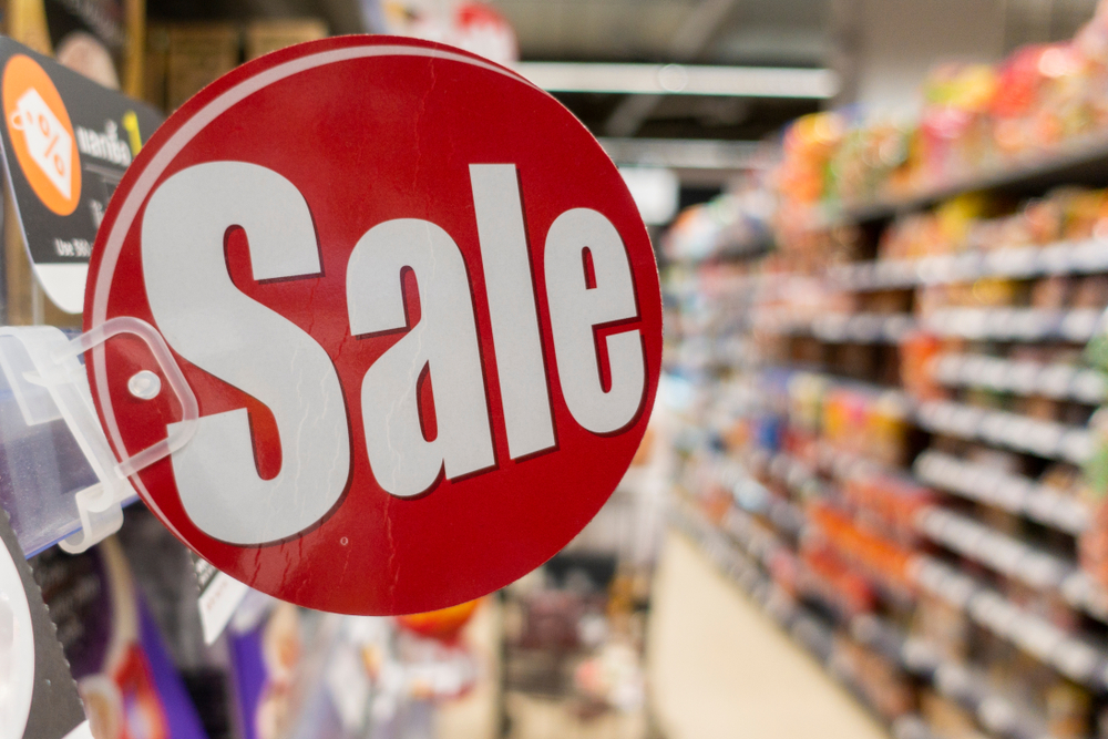
Limited-Time Messaging

Signs that say “limited time offer” or “while supplies last” are designed to create a sense of urgency. These messages tap into a psychological phenomenon called “scarcity,” which pushes shoppers to act quickly rather than think carefully about their purchase. When you see a “Manager’s Special” for March 2026 only, your brain treats it as a fleeting opportunity that you shouldn’t miss. This reduces the time you spend weighing the pros and cons of the item.
When people believe an item may not be available later, they are more likely to buy it immediately, even if they did not originally plan to. This urgency reduces hesitation and encourages impulse buying. Retailers use this tactic to move products faster and increase sales, especially for seasonal or promotional items that need to be cleared out. By making you feel like you’re winning a race against time, the store ensures you don’t walk away from a potential sale, keeping their inventory moving and their profits steady.
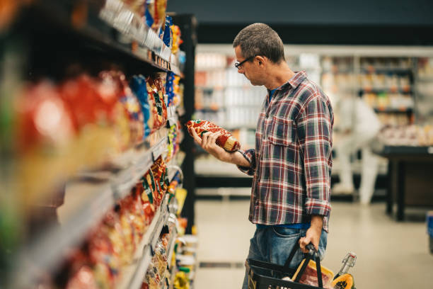
Confusing Price Labels
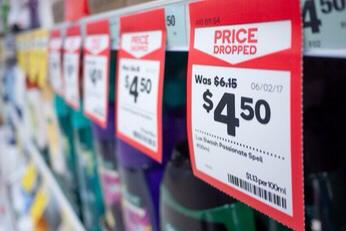
Grocery store pricing can sometimes feel harder to compare than it should be. Labels may use different units, such as price per pound versus price per ounce, or display “buy two, get one” discounts in ways that aren’t immediately clear. Since 2023, there has been a trend toward “digital tags” that can change prices in real-time, sometimes making it harder to track the “normal” price of an item. This complexity is often a subtle way to discourage deep comparison shopping.
This complexity can make it difficult for shoppers to quickly determine which product offers the best value. As a result, many people default to the most visible option or the one that “looks” like a deal, rather than doing the math. This benefits the store, as higher-margin items are often placed in more prominent positions, guiding your choices without obvious pressure. When the math gets too fuzzy, the brain often takes the easiest path, which usually involves picking the item the store has highlighted for you.
Decision Fatigue Effect

By the time you reach the later aisles of a grocery store, you have already made dozens of small decisions. Each choice, from picking a brand of bread to comparing the price of two cans of soup, uses a bit of mental energy. Over time, this leads to “decision fatigue,” where your ability to make careful, rational choices starts to weaken. This is a well-documented psychological state that stores are more than happy to capitalize on during your trip.
When this happens, shoppers are more likely to rely on mental shortcuts, such as grabbing familiar brands or choosing whatever is easiest to reach. This often results in spending more than intended because you no longer have the energy to hunt for the best deal. Stores benefit from this natural human tendency by placing profitable items in convenient spots, especially toward the end of the shopping journey. By the time you’re tired, the store is ready to offer you the easiest, and often most expensive, options.


