
1. The Recycling Triangle
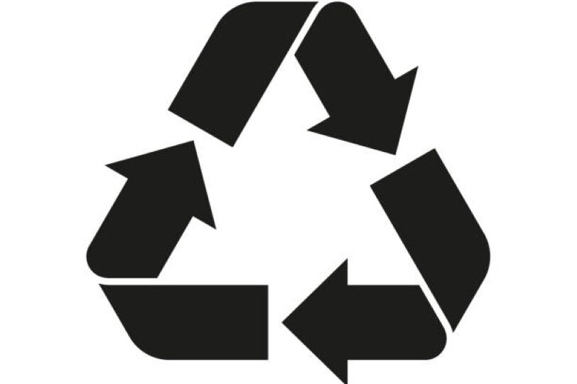
You’ve probably seen the triangle made of chasing arrows so often that it fades into the background. It sits there quietly, giving the impression that the packaging is recyclable, and in many cases, that’s true. But not always in the way we assume. The number inside that triangle matters more than the symbol itself, because it tells you the type of plastic used and whether your local recycling system actually accepts it. It’s a small detail, but it shifts how you think about waste.
As the Environmental Protection Agency explains, “not all plastics are accepted in community recycling programs,” which means that symbol is more like a suggestion than a guarantee. Once you know this, you start turning packages over, looking for the number, wondering where it will end up after you’re done. There’s something grounding about that awareness. It doesn’t make shopping harder, just more thoughtful. And over time, those small choices add up. If this made you pause and look at your next package a little differently, you’re already on the right track, so keep going and stay curious about what else is hiding in plain sight.
2. The “Best Before” Date
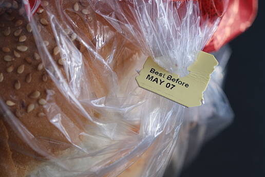
We’ve all had that moment, standing in the kitchen, debating whether to toss something just because the date has passed. The “best before” label has a way of sounding final, like a quiet warning. But in reality, it’s less about safety and more about quality. It’s the manufacturer’s estimate of when the product will taste or feel its best, not when it suddenly becomes unusable.
According to the USDA, “food products are safe to consume past the date on the label, as long as they are handled properly.” That small clarification changes everything. It turns what feels like a strict rule into a gentle guideline, one that invites you to trust your senses a little more.You begin to notice the smell, the texture, the look, instead of just the number. And somehow, that feels more human. Less waste, more awareness. It’s a simple shift, but one that can quietly reshape your habits over time. If you’ve ever thrown something away too quickly, this might be your sign to slow down next time and take a second look.
3. The Little Green Dot
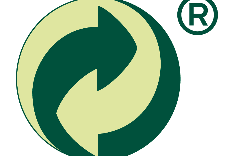
That small green dot can be misleading at first glance. It looks reassuring, almost like a stamp of environmental approval. But its meaning is a bit different. The symbol actually indicates that the manufacturer has contributed financially to a packaging recovery system, not necessarily that the packaging itself is recyclable or environmentally friendly. It’s one of those details that feels surprising once you learn it. As explained by packaging recovery organizations, “the Green Dot signifies participation in a recovery scheme, not recyclability.” That distinction matters, especially if you’re trying to make more environmentally conscious choices.
Still, there’s no need to feel misled. Think of it as a reminder that not everything is as straightforward as it looks. The more you learn, the easier it becomes to read between the lines. And that’s really what this is about, becoming just a bit more aware each time you shop. If this opened your eyes even slightly, keep that momentum going and start noticing the symbols you used to overlook.
4. The “Keep Refrigerated” Icon
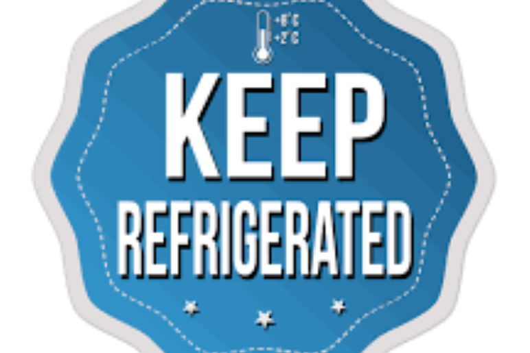
Sometimes it’s not even words, just a small image of a fridge or a temperature symbol tucked away near the back. It’s easy to ignore, especially when you’re in a hurry. But that little icon carries an important message about food safety, not just freshness. It’s there to remind you that certain products need consistent temperatures to prevent spoilage or bacterial growth. The FDA puts it simply: “perishable foods should be refrigerated promptly to reduce the risk of foodborne illness.” That quiet instruction is doing more work than it gets credit for. It’s not about making life complicated, it’s about keeping things safe in a way that feels almost effortless once you notice it.
Over time, you start to respect those small reminders. You bring groceries home and put certain items away first, almost instinctively. It becomes part of your rhythm. And that’s the beauty of it, small symbols shaping habits without demanding attention. If this made you rethink how you unpack your groceries, you’re already building a smarter routine, so keep leaning into it.
5. The Allergen Symbols
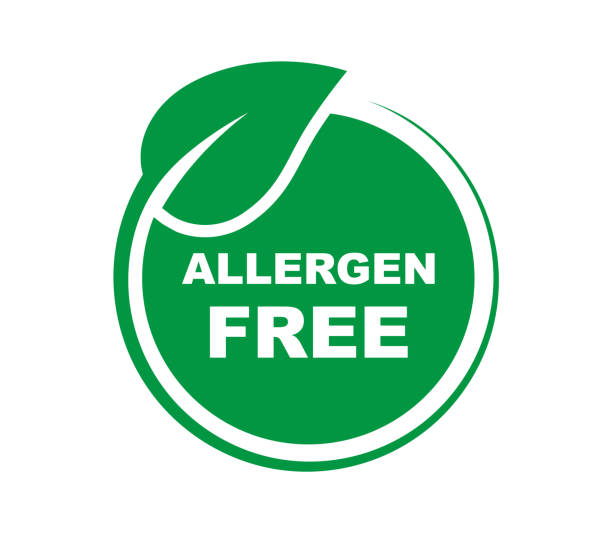
These are the symbols that matter most when it counts. Whether it’s a tiny peanut icon or a simple note about dairy or gluten, allergen labels are designed to communicate quickly and clearly. For people with food sensitivities, they’re not just helpful, they’re essential. Even for those without allergies, they offer a glimpse into how carefully food is regulated and labeled. The FDA emphasizes that “food labels must clearly identify major allergens,” making it easier for consumers to make safe choices. There’s something reassuring about that clarity, knowing that the information is there when you need it, even if you don’t always notice it.
And in a quiet way, this brings everything together. All these symbols, big or small, are there to guide, protect, and inform. Once you start paying attention, you realize they’re less like warnings and more like helpful notes left behind for you. If this journey made you see your pantry a little differently, hold onto that feeling and keep exploring the details that make everyday life just a bit more mindful.
6. The “Do Not Refreeze” Symbol
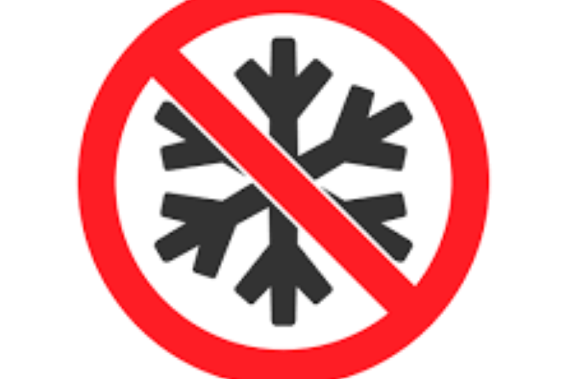
You might have seen this one as a simple warning, often paired with frozen foods, and brushed past it without much thought. It usually shows up as a small icon or short instruction, quietly advising against refreezing once the product has thawed. At first, it can feel overly cautious, like one of those rules people don’t always follow. But there’s a reason it’s there, and it goes beyond just preserving taste. When food thaws, especially meat or ready meals, its internal structure changes and bacteria can begin to grow if it’s left out too long. The USDA explains that “refreezing thawed food can be safe if handled properly, but quality may suffer,” which means the symbol is less about strict danger and more about protecting both safety and texture. Once you understand that, it starts to feel less like a restriction and more like a gentle heads-up.
Over time, you begin to notice how you handle frozen items, maybe planning portions better or being more mindful about what you thaw. It’s a small shift, but one that makes your kitchen habits feel more intentional. If this made you think twice about what’s sitting in your freezer right now, that’s a good place to start, so keep paying attention to the quiet guidance these labels offer.
7. The Microwave-Safe Symbol
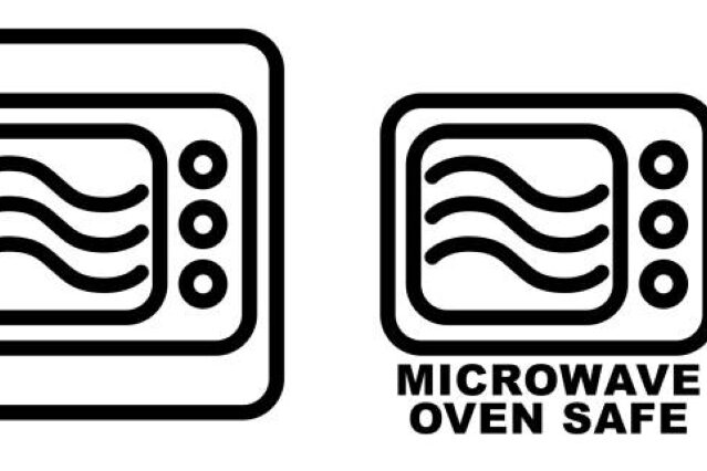
There’s something comforting about tossing a container into the microwave without a second thought, especially on a busy day. But that little microwave-safe symbol plays a bigger role than just convenience. It’s there to tell you that the material can handle heat without melting, warping, or releasing anything unwanted into your food. Without that reassurance, heating certain plastics can actually cause them to break down. As the FDA notes, “not all containers are suitable for microwave use,” which is why that symbol quietly stands guard on packaging designed for reheating. It’s one of those details that blends into the background until you realize how much it matters.
Once you start noticing it, you may find yourself checking containers before reheating leftovers or transferring food into something safer. It’s not about adding extra steps, just about being a little more aware of what you’re using. And in that awareness, everyday routines become just a bit smoother. If this reminded you of that one container you always use without checking, maybe take a closer look next time and let that small symbol guide you.
8. The “Packed On” Date
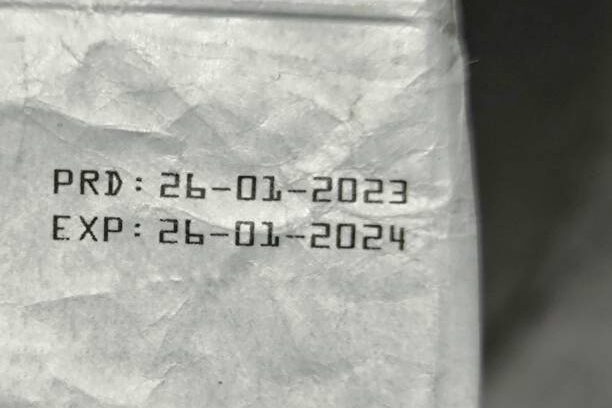
Unlike expiration dates, the “packed on” label feels a bit more subtle. It doesn’t tell you when something will go bad, just when it was prepared or sealed. It’s easy to overlook, especially when you’re focused on the more obvious dates. But this one carries its own kind of usefulness, especially for foods where freshness really matters. Think about bread, produce, or deli items. Knowing when something was packed, produced, or manufactured gives you a sense of how long it’s been sitting before it reached your hands. The USDA highlights that date labeling can help consumers “make informed decisions about food quality,” and this is one of those labels that does exactly that without making a big fuss.
As you get used to spotting it, you may find yourself comparing items on the shelf, reaching for the one that feels just a bit fresher. It’s a quiet habit, almost instinctive after a while. And it makes shopping feel a little more personal, like you’re choosing with care rather than routine. If this made you think about the last time you checked a packed date, let that curiosity carry into your next grocery run.
9. The Organic Seal
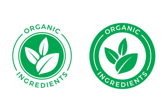
That familiar organic seal often feels like a quick shortcut, a way to decide without thinking too hard. It suggests something cleaner, more natural, maybe even healthier. But behind that simple design is a set of standards and certifications that producers must follow before they can use it. In the United States, the USDA oversees organic labeling, ensuring that products meet specific guidelines. As they explain, “organic products must be grown and processed according to federal guidelines,” covering everything from soil quality to pest control. It’s a lot of effort condensed into a small, recognizable symbol.
Knowing that doesn’t mean you have to choose organic every time, but it does give the label more meaning. It becomes less of a trend and more of a transparent process. Over time, you may find yourself weighing what matters most to you, whether it’s price, sourcing, or something in between. If this gave you a clearer picture of what that seal stands for, carry that understanding with you and let it shape your choices in a way that feels right for you.
10. The Fair Trade Mark

This one feels a little different, almost like a quiet handshake between you and the people behind your food. The Fair Trade mark isn’t about the product itself as much as it is about the conditions under which it was produced. It signals that farmers and workers were paid fairly and worked under safer, more ethical conditions. Organizations like Fairtrade International explain that Fair Trade aims to “secure better prices, decent working conditions, and fair terms of trade for farmers and workers.” It’s a simple idea, but one that adds a human layer to something as routine as buying coffee or chocolate.
And maybe that’s where everything comes together. These symbols aren’t just technical details or industry requirements, they’re small pieces of information that help you see the bigger picture. From safety to sustainability to fairness, they quietly guide your choices in ways that feel natural once you notice them. If this made you look at your pantry with fresh eyes, hold onto that awareness and keep letting those small symbols tell their story as you go.
11. The “Non-GMO” Butterfly
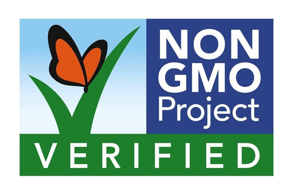
The Non-GMO label, often paired with a small butterfly design, tends to stand out once you recognize it. It signals that the product was made without genetically modified organisms, something that matters a great deal to certain consumers. For others, it’s simply another option on the shelf. Groups like the Non-GMO Project explain that their verification process is about transparency and giving people the choice to know how their food is produced. It’s not necessarily about saying one option is better than the other, but about making the information visible.
As you start noticing it more, you may find yourself reflecting on what matters most to you when you shop. It’s less about following a rule and more about understanding what’s behind the label. And that understanding makes even routine decisions feel a bit more grounded. If this symbol has ever caught your eye, now you know the story it’s trying to tell.
12. The Batch Code
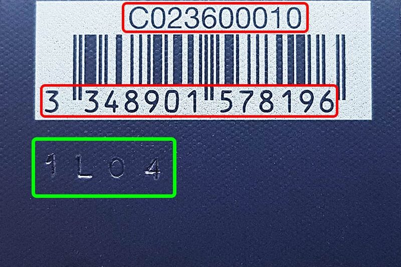
This one doesn’t look like much at all, just a string of numbers and letters printed somewhere on the package. It’s easy to ignore because it doesn’t seem meant for you. But that batch or lot code plays a key role behind the scenes, helping manufacturers trace when and where a product was made. In cases of recalls or quality checks, those codes become incredibly important. The Food and Drug Administration notes that lot tracking allows companies to “quickly identify and remove affected products from the market.” So while it may feel invisible to shoppers, it’s part of a system designed to keep things safe.
And in a quiet way, it brings everything full circle. Not every symbol is meant to guide your choice directly, some are there to support a larger system working in the background. But knowing they exist adds another layer of understanding to what you buy. If this made you take a second look at those random codes, you’re seeing the bigger picture now, and that awareness is something worth holding onto as you keep exploring.

