
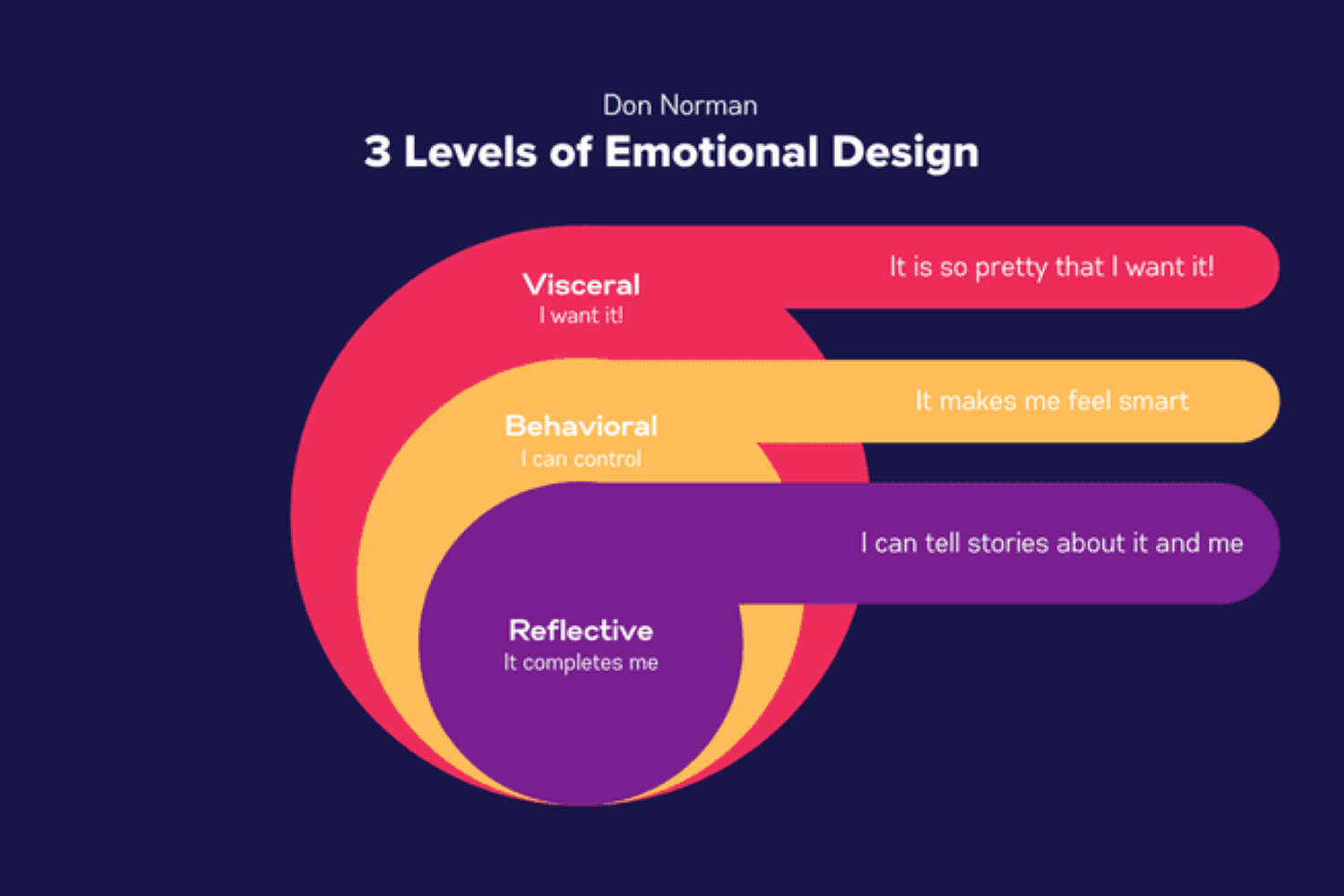
1. The Instagram Effect
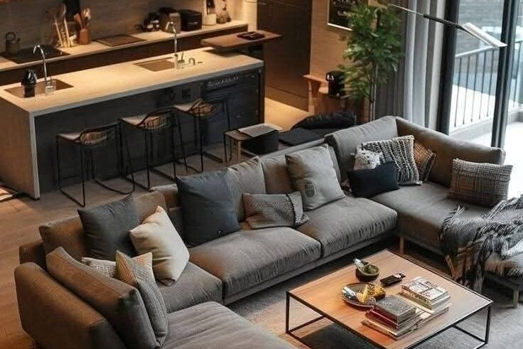
If you’ve spent even a few minutes scrolling through Instagram interiors, you’ve seen the pattern. White walls, beige couches, linen curtains moving gently in filtered light. Designers often say neutrals photograph better. Architectural Digest once quoted a stylist explaining that “a neutral palette lets texture take the spotlight.” That idea stuck. Soft tones created a cohesive grid, and cohesive grids earned attention.
Over time, the algorithm quietly rewarded sameness. The brighter, busier rooms didn’t perform as well as the calm, airy ones. Brands followed the engagement. Furniture companies released collections in sand and cream because they sold. Small businesses adopted muted branding to feel modern. What began as an aesthetic preference slowly became a digital standard. We double tapped it, saved it, and then recreated it at home without asking why.
2. Minimalism Made Us Do It
Minimalism did not just ask us to tidy up. It asked us to rethink what we truly needed. Books, blogs, and documentaries encouraged people to clear surfaces, empty closets, and keep only what served a purpose. The New York Times once described minimalism as offering “visual quiet in a noisy world,” and that phrase lingered. Quiet spaces naturally leaned toward quiet colors. Beige, white, and soft gray created breathing room. They made rooms feel open and manageable, like nothing was demanding attention all at once.
As shelves grew emptier and furniture lines became cleaner, bold color started to feel out of place. A bright red wall could disrupt the calm that minimalism promised. Neutrals, on the other hand, blended seamlessly into the background. They matched everything and required fewer decisions. Choosing cream over cobalt felt mature, intentional, and timeless. Over time, the discipline of owning less slowly merged with the habit of seeing less color. What began as a search for simplicity gently reshaped our surroundings into softer, quieter versions of themselves.
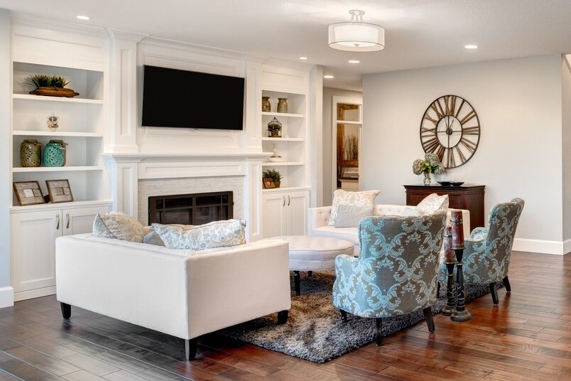
3. The Rise of the Luxury Look
Luxury used to sparkle. Now it whispers. High end interiors lean toward stone, taupe, and warm cream. Elle Decor has observed that soft neutrals convey “understated elegance.” Developers embraced that language. Model homes filled with pale marble and muted upholstery because those shades felt universally refined.
Staging experts favor neutrality for practical reasons. It allows buyers to imagine themselves in the space. Bold color feels personal. Beige feels adaptable. Hotels adopted similar palettes to create calming retreats. Upscale restaurants and boutiques followed suit. Luxury became less about standing out and more about blending seamlessly. The look is undeniably beautiful, but repetition across cities has made sophistication feel surprisingly uniform.
4. Fast Fashion and Safe Choices

Step into most clothing stores today and the palette tells its own story. Racks are lined with black, white, tan, gray, and soft olive, shades that feel easy before you even try them on. Retail analysts quoted in Forbes have explained that brands increasingly focus on “versatile core items” that promise longevity and repeat wear. Neutrals are dependable. They mix effortlessly, photograph well, and rarely go out of style. For companies producing at scale, safe colors mean fewer unsold pieces and broader appeal across different markets.
Shoppers have quietly absorbed that logic. A beige blazer works for meetings, dinners, and weekend outings without drawing too much attention. A bright patterned jacket, while fun, feels tied to a mood or moment. Over time, practicality begins to shape personal taste. Closets become coordinated, streamlined, and calm. Even seasonal collections that once celebrated bold hues now introduce softer variations instead. Style remains polished and intentional, but the playful risk of color shows up less often. Little by little, safe choices have softened the everyday wardrobe into something reliable, wearable, and unmistakably neutral.
5. Corporate Branding Went Neutral
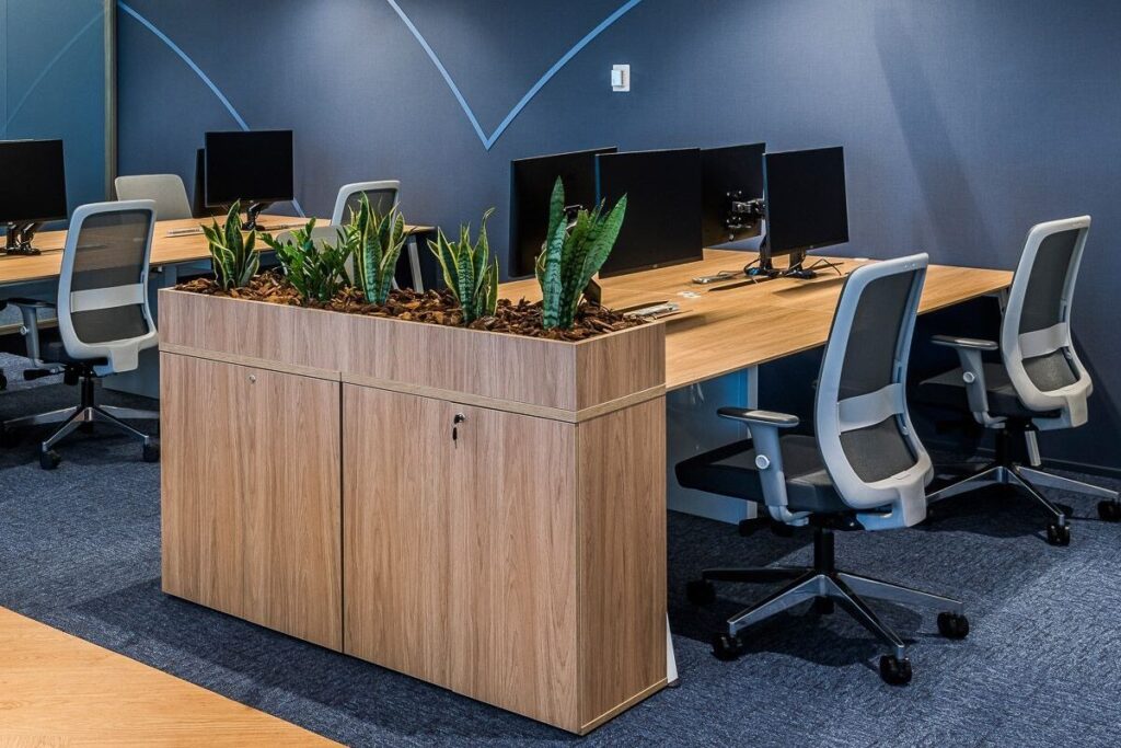
Take a look at many modern company websites and you will notice a familiar pattern. Clean layouts, generous white space, muted tones, and simple typography. Over the past decade, branding experts have emphasized clarity and adaptability. Harvard Business Review has discussed how strong brands today focus on consistency across platforms, from mobile screens to billboards. Neutral color palettes support that goal. They reproduce reliably, feel professional, and rarely distract from the message. Soft grays, off whites, and subtle accents became the quiet foundation of digital identity.
Startups adopted the same visual language to signal credibility. Pale offices, light wood furniture, and understated logos suggested focus and efficiency. Customers began associating calm design with trustworthiness. The shift made practical sense, especially in crowded markets where simplicity cuts through noise. Yet as more companies embraced the same restrained palette, brand personalities began to blur together. Color once played a bold role in helping businesses stand apart. Now subtlety does the work. The corporate world did not banish color entirely, but it gently lowered the volume, leaving a landscape that feels polished, consistent, and unmistakably neutral.
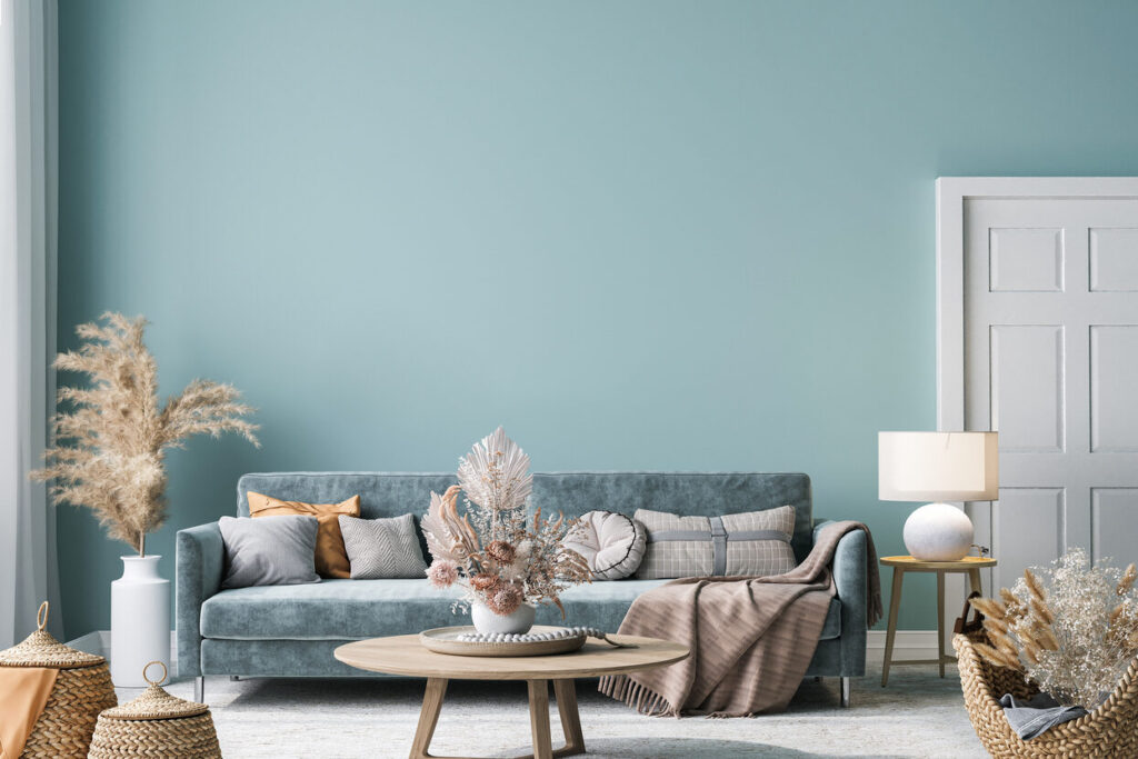
6. Pandemic Comfort and Emotional Retreat
When the world slowed down and uncertainty filled the air, home became more than just a place to sleep. It turned into an office, a classroom, a refuge. In that atmosphere, bold design choices felt less urgent than emotional steadiness. Paint brands noticed the shift. Sherwin-Williams described trending shades during that period as “grounded and reassuring,” reflecting a collective desire for calm. Warm neutrals such as taupe, cream, and soft brown offered a sense of stability when routines felt fragile, and headlines felt heavy.
Many people repainted or refreshed their spaces with comfort in mind. Bright, energetic colors seemed overwhelming during long days indoors, while muted tones created a softer environment to think and rest. The gentle palette reduced visual noise and helped rooms feel safe. Even as restrictions eased and life regained momentum, the colors remained. What began as a temporary emotional response quietly settled into a long-term preference. The retreat into calm interiors made sense at the time, but it also nudged vibrant color a little further out of everyday view.
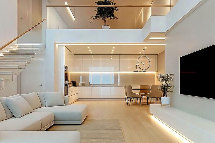
7. Open Plan Living Softened Everything
Open plan living promised freedom. Walls came down, kitchens flowed into dining rooms, and living areas stretched into one continuous space. The layout felt modern and social, perfect for families and gatherings. Designers often recommend cohesive color schemes in these spaces to avoid visual clutter. Better Homes and Gardens has noted that neutral backdrops help large areas feel “seamless and expansive.” When everything is visible at once, too many bold contrasts can feel overwhelming. Soft tones offer a sense of order.
Homeowners embraced that guidance. Beige walls blended into light cabinetry, which echoed pale flooring and understated furniture. Accent colors were used sparingly to maintain harmony from one end of the room to the other. The result felt airy and calm, a space that breathed easily. Yet when each zone shares the same palette, distinction fades. The kitchen no longer stands apart from the lounge, and personality softens along with the walls. Open plan living created connection and flow, but it also encouraged a quieter, more uniform approach to color.
8. Rental Living and Temporary Choices
For many people, renting is no longer a short stop between life stages but a long-term reality. Rental agreements often come with clear expectations about paint colors and permanent changes. Property listings proudly advertise “fresh neutral interiors” because they appeal to the widest range of tenants. Landlords prefer soft whites and beige tones that are easy to maintain and simple to repaint between occupants. Practicality shapes the starting point before personal taste even enters the conversation.
Tenants learn to work within those limits. Instead of repainting walls in bold hues, they layer subtle décor that complements the existing palette. Cream curtains, light rugs, and neutral furniture feel like the safest choices when permanence is uncertain. Over time, living in these adaptable spaces begins to influence preference itself. Beige stops feeling temporary and starts feeling normal. When your surroundings are defined by flexibility, your aesthetic often follows. What begins as a rule written into a lease slowly becomes part of everyday style, reinforcing a world that leans gently toward neutral.
9. The Influence of Scandinavian Design
Scandinavian design arrived quietly but confidently, bringing with it pale woods, soft textiles, and walls washed in white or gentle gray. Publications like Dwell have long admired the style for its balance of beauty and function, noting how it prioritizes light, comfort, and simplicity. In countries where winters are long and daylight is precious, interiors are designed to reflect as much natural light as possible. That practical need shaped an aesthetic built around muted tones and airy spaces. The rest of the world watched and took notes.
As the look spread through magazines and social feeds, cream sofas and light oak tables became symbols of tasteful living. The Danish concept of hygge, centered on coziness and well-being, reinforced the appeal of soft, calming palettes. Bright colors were not forbidden, but they were used sparingly. The emphasis remained on restraint. Over time, many homes adopted the same soothing formula. What began as cultural inspiration gradually blended into global preference, gently nudging bold color further into the background.
10. Technology and Screen Light
We spend a remarkable part of our day facing screens. Phones wake us up, laptops carry our workload, televisions wind us down at night. Designers understand this reality. Many digital platforms rely on soft whites, muted grays, and gentle contrast because they are easier on the eyes. As design experts have noted in Wired, clean and minimal interfaces help users focus without visual fatigue. That philosophy does not stay trapped inside our devices. It quietly spills into our surroundings.
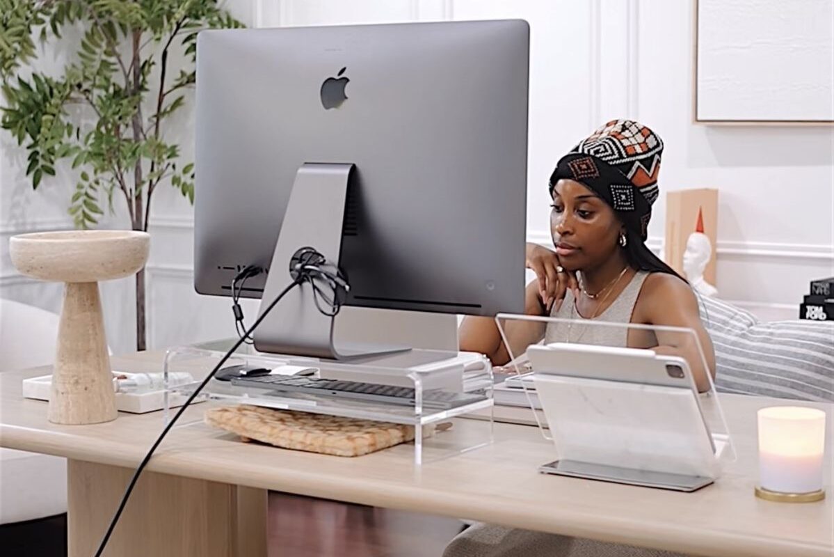
As video calls became routine, our homes turned into backdrops. Bright walls can appear harsh on camera, while beige and soft neutrals reflect light evenly and look professional. Work and home began sharing the same visual language. Calm tones harmonize with screen glow instead of competing with it. Over time, we adjusted our spaces to feel balanced on camera and comfortable in long hours of digital exposure. Without realizing it, the light from our screens influenced the paint on our walls, guiding us gently toward softer, quieter colors.
11. The Psychology of Playing It Safe
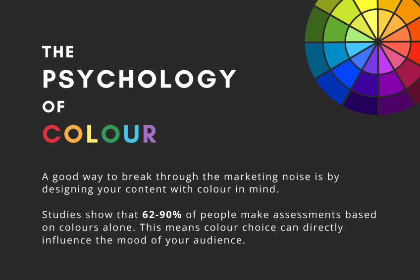
Color has always carried emotion. Red can energize a room, yellow can lift a mood, and blue can steady the mind. Choosing bold shades often feels like making a statement about who you are and how you want to be seen. Psychologists frequently connect color to identity and self-expression, noting that environments influence how we feel and behave. In times of uncertainty or constant visibility, predictability becomes comforting. Softer tones provide stability. They create an atmosphere that feels controlled and manageable rather than attention-seeking.
Beige rarely sparks strong reactions. It blends in quietly and avoids debate. In a world shaped by social media and constant sharing, that neutrality can feel protective. A calm, muted space invites fewer opinions and less scrutiny. Over time, the desire to avoid standing out subtly shapes our surroundings. We begin to equate restraint with sophistication and subtlety with good taste. Playing it safe feels practical, even wise. Gradually, that instinct reduces visual risk and softens the edges of everyday life, leaving behind interiors that feel steady, composed, and carefully understated.
12. A Quiet Invitation to Bring It Back
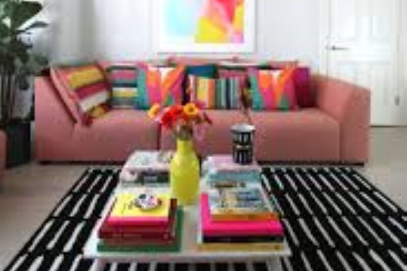
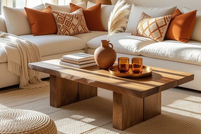
Even in a world softened by beige and muted tones, moments of color still catch the eye. A bright front door, a patterned rug, or a deep green chair can feel unexpectedly refreshing. Beige is not the enemy; it soothes, organizes, and supports. But when it becomes the only note in our surroundings, spaces can feel incomplete. Color reminds us of personality, warmth, and individuality, offering a small spark of surprise in an otherwise calm environment.
The return of color does not need to be dramatic. It can start with a painted shelf, a vibrant cushion, or a piece of art that reflects your style. The beige era taught us to appreciate simplicity and restraint, but it also shows how subtlety can prepare the stage for bold accents. By inviting a little color back into our homes, wardrobes, and workspaces, we create balance between calm and expression. Even a single thoughtful shade can transform a space, lifting the mood and making it feel lived in. Take a moment to notice what your surroundings might be missing, and consider adding one intentional color that feels like you. It can quietly make a big difference.

