
1. Esso’s Tiger
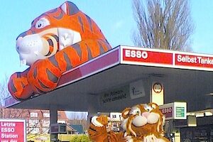
In the golden era of road trips and fast cars, Esso (now ExxonMobil) launched its “Put a Tiger in Your Tank” campaign in the 1960s. It wasn’t just a catchphrase; it was a nationwide movement. The tiger symbolized strength, speed, and unleaded excitement, perfect for a booming automotive culture. According to Button Museum, the mascot appeared in commercials, bumper stickers, and even stuffed toys, driving incredible brand recognition. Families loved it, and drivers felt energized. It turned refueling into something almost fun.
2. Sinclair’s Dino
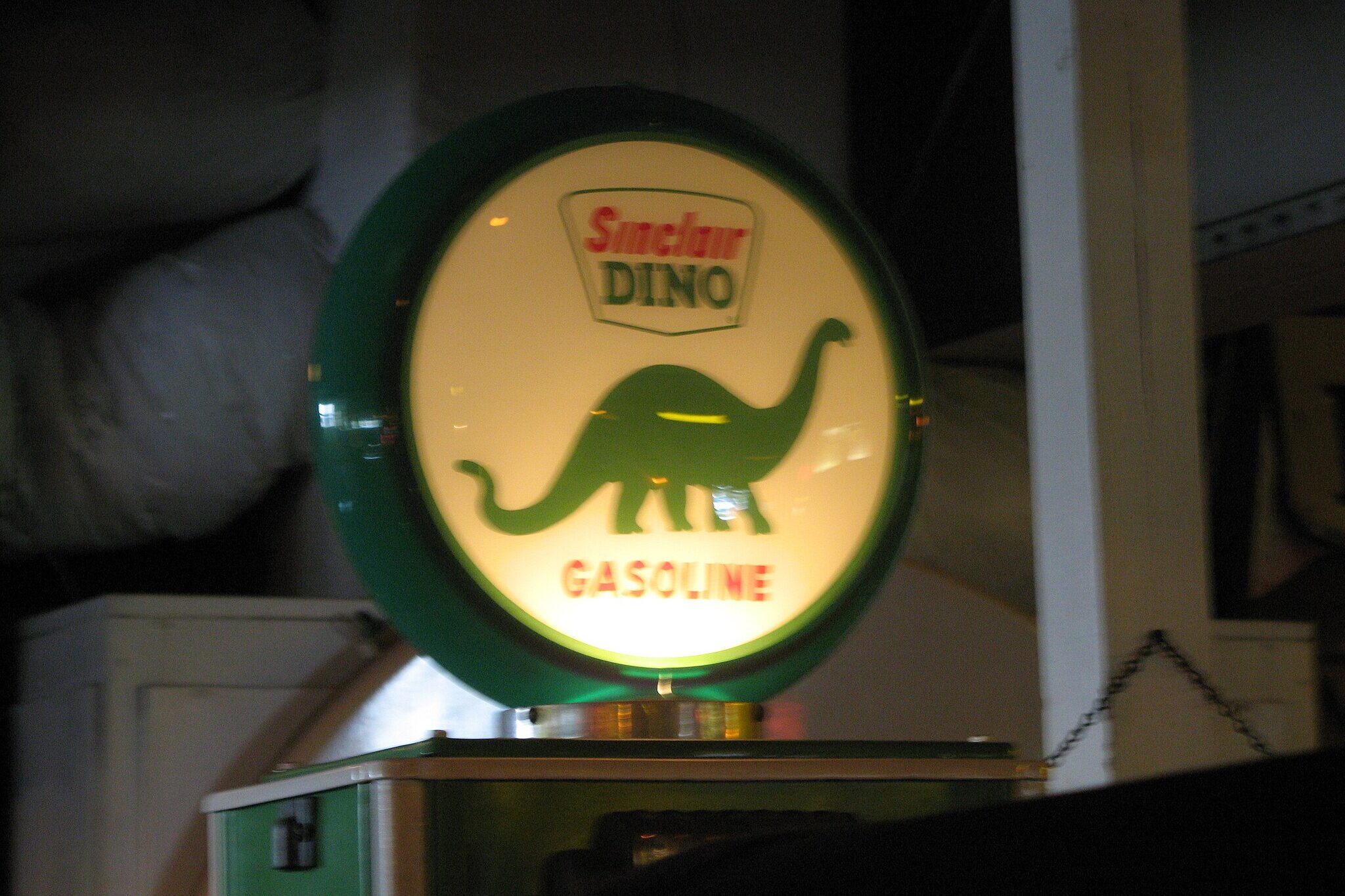
Sinclair Oil’s green dinosaur, Dino, first showed up in 1930, and he wasn’t going extinct anytime soon. He was a gentle nod to the ancient plant and animal matter that formed fossil fuels, making science accessible to the everyday customer. Unlike other industrial logos, Dino felt friendly and almost cuddly. Research says, Sinclair doubled down on this lovable mascot with giant parade floats, gas station statues, and collectible merchandise.
3. Shell’s Scallop Shell and Sea Creatures
Shell Oil’s scallop logo might be the main attraction, but it’s advertising often featured underwater wildlife like turtles, fish, and seahorses, especially in the mid-20th century. These subtle animal motifs gave Shell a refined and natural vibe, a contrast to the grime typically associated with fossil fuels. The ocean imagery hinted at purity, a deep connection to the Earth’s natural resources, and even elegance. For environmentally conscious consumers before that was a trend, Shell struck a chord.
4. Texaco’s Flying Red Horse
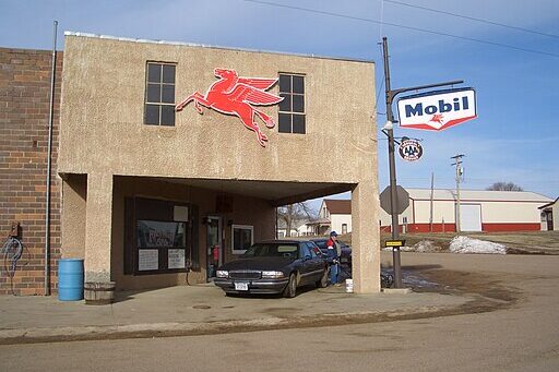
While Pegasus isn’t real, this winged red horse became one of the most legendary oil mascots in history. Originally the icon of Mobil before merging with Texaco, Pegasus represented energy, freedom, and futuristic drive. It wasn’t just a pretty logo either. The bright red horse appeared atop service stations, glowing like a beacon for weary travelers. It was fast, bold, and dignified. In the golden age of American highways, Pegasus didn’t just advertise gas, it inspired trust.
5. Gulf Oil’s Orange Disc and the Subtle Wildlife Touch
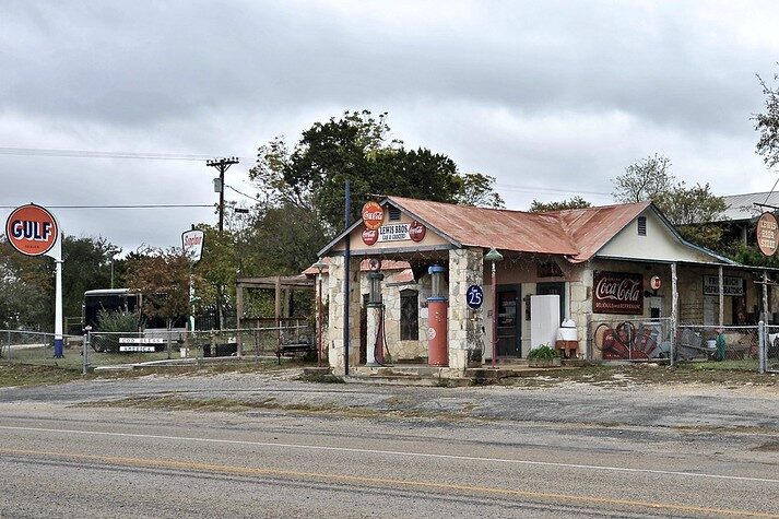
Gulf Oil might be remembered for its orange disc logo, but nature played a quiet role in its identity too. Throughout the 1970s, Gulf’s regional commercials often highlighted wildlife like eagles, horses, and deer. These elements weren’t just pretty scenery. They conveyed strength, freedom, and an all-American spirit that resonated with viewers. The messaging subtly suggested that Gulf’s gasoline respected nature, even as it powered modern machines.
Do you remember any of these gas station icons from your childhood road trips? Which mascot stuck with you the most? Share your memories or tell us which brand made you smile back in the day. Your story might just fuel someone else’s nostalgia!
The story Fueling Brands: 5 Iconic Animal Mascots That Drove the Oil Industry Forward was first published on DailyFetch.

