
Simple Boxes That Became a Marketing Masterpiece

If you have ever walked down a grocery aisle, you have probably seen rows of cereal boxes without giving them a second thought. They are just part of the morning scenery, right? Well, it turns out those cardboard rectangles are actually masterpieces of marketing and psychology. Since the late 19th century, companies like the Kellogg Company have been perfecting this look. Back in 1906, when Will Keith Kellogg started the Battle Creek Toasted Corn Flake Company, he helped set the stage for the paperboard cartons we still use today. It is a mix of keeping food fresh and catching your eye.
What started as a simple way to hold cornflakes has evolved into a high-tech science. Every single inch of that box is calculated to influence how you feel and what you buy. It is about telling a story and building a brand that families trust. Designers spend countless hours figuring out how to blend branding with consumer behavior science. It is pretty amazing to think that a simple box is actually a powerful tool that has been shaping our breakfast routines for over a hundred years.
Built For Shelves
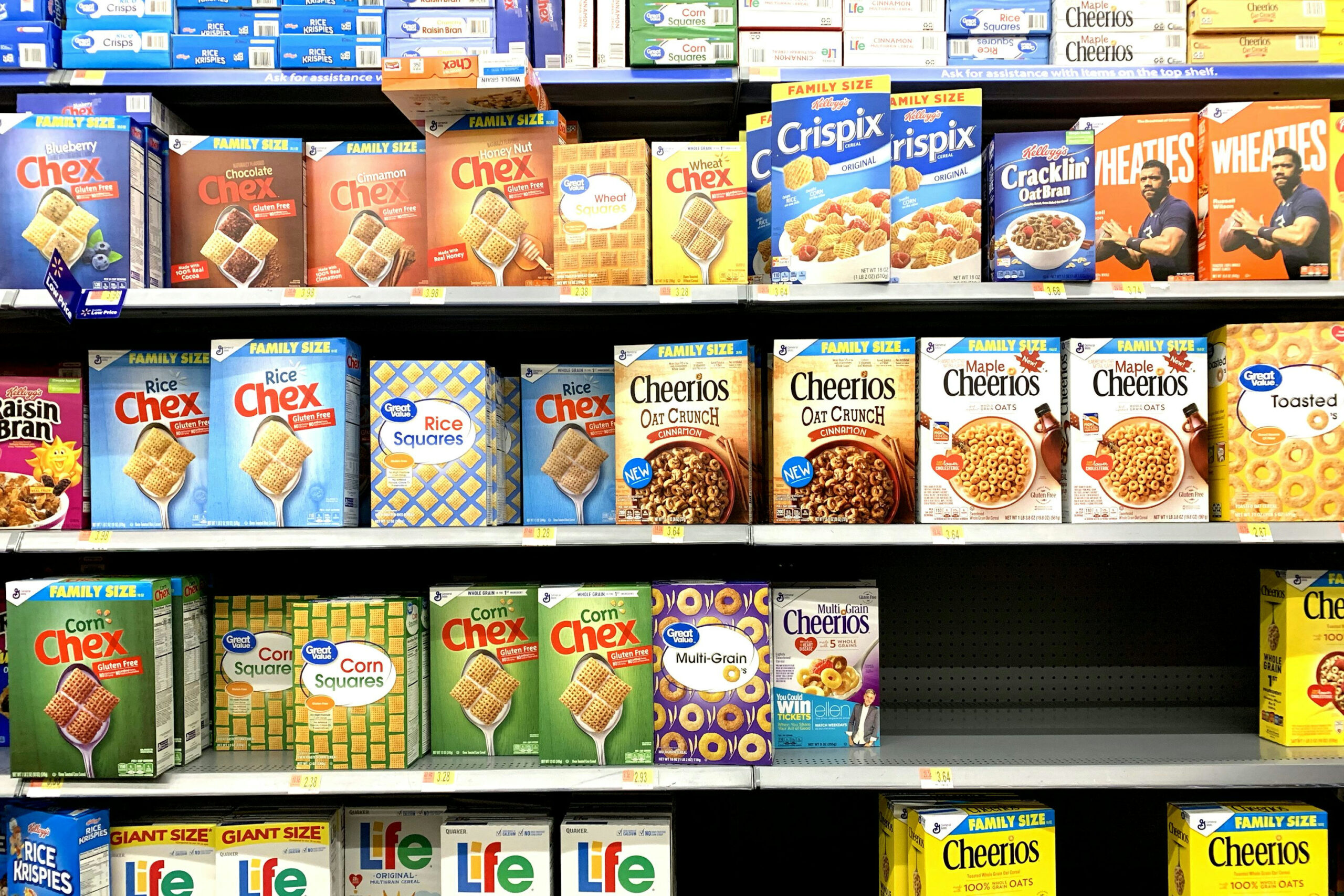
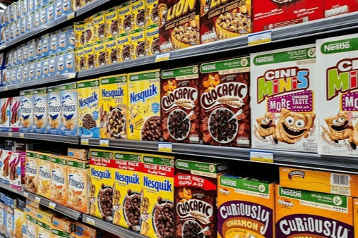
Have you ever wondered why cereal boxes are always so tall and thin? Grocery stores have standard shelf heights, so manufacturers design their packaging to fit perfectly while taking up as little horizontal space as possible. This “upright” design allows stores to cram more brands onto a single shelf. When more boxes are facing forward, it is easier for you to spot your favorite brand while pushing your cart through a crowded, busy aisle.
This slim shape also makes life much easier behind the scenes. During shipping, these rectangular boxes can be packed tightly into shipping containers without any wasted “dead air.” This efficiency has been the industry standard for decades because it saves everyone money, from the factory workers to the retail managers. By the time a box reaches your kitchen table, it has traveled a long way in a very organized fashion. It is a classic example of “form meets function,” where the packaging works hard to be practical, cost-effective, and highly visible all at the same time.
Eye-Level Advantage For Adults
When you are browsing the cereal aisle, you might think you are making all the decisions, but the shelf height is actually doing a lot of the work for you. Brands fight for “eye-level” placement because they know that if you see it first, you are more likely to buy it. This is why adult-focused cereals are usually higher up, while the colorful, sugary options are placed lower. This strategy ensures that the target audience, whether it is a parent looking for fiber or a kid looking for fun, makes immediate visual contact.
A tall box has a natural advantage here because it takes up more vertical “real estate” on the shelf. It stands out against shorter jars or bags nearby, acting like a beacon in a sea of products. This subtle tactic has been used by retailers for years to guide your eyes exactly where they want them to go. Even in a store packed with hundreds of items, that specific height makes a product pop. It is a quiet but incredibly effective way to win the battle for your attention without you even realizing that a marketing team planned it that way.
Mascots Make Contact Easier For Children
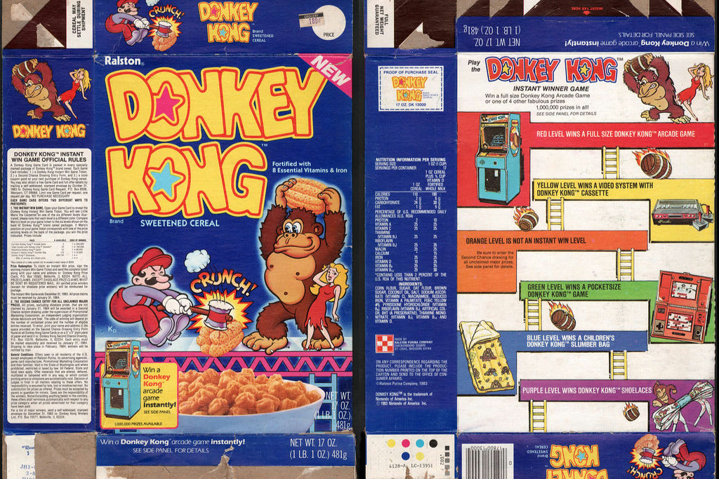
Next time you are at the store, take a closer look at the characters on those colorful cereal boxes. You might notice something a bit “sneaky” but brilliant: many mascots are drawn looking slightly downward. Research has shown that these characters are often positioned to make direct eye contact with children who are walking by. This creates an immediate, subconscious bond between the child and the brand. It turns a piece of cardboard into a friendly face that feels familiar, making kids more likely to reach for that specific box.
Over time, these mascots, like Tony the Tiger, who debuted in 1952, become much more than just drawings. They become part of a family’s morning routine and a recognizable symbol of comfort. This emotional connection is a huge win for brands because it builds long-term loyalty that lasts for generations. When a child asks for a specific cereal, they aren’t just asking for the taste; they are asking for their “friend” on the box. It is a clever design trick that proves how a small detail like the angle of a character’s eyes can influence a major shopping decision.
A Built-In Billboard
Think of the front of a cereal box as a tiny, cardboard billboard that lives right in your pantry. Since stores are packed with dozens of competing brands, companies have to use that flat surface to scream for your attention. They use bold logos, high-contrast colors, and mouth-watering images of the cereal to make an impression in the few seconds you spend glancing at the shelf. It is one of the most valuable pieces of advertising space in the world because it is the final thing you see before you decide to buy.
Designers have to be incredibly careful about how they balance the text and the pictures. If a box is too cluttered, people will ignore it; if it is too plain, it might look boring. The goal is to make sure you can identify the brand and the flavor from several feet away. This “billboard” effect has been the gold standard for packaging since the early 1900s. It is all about making a quick, impactful statement that says, “Pick me!” In the fast-paced world of grocery shopping, that front panel is the brand’s best chance to win your heart and your breakfast bowl.
Bright Colors Sell Faster
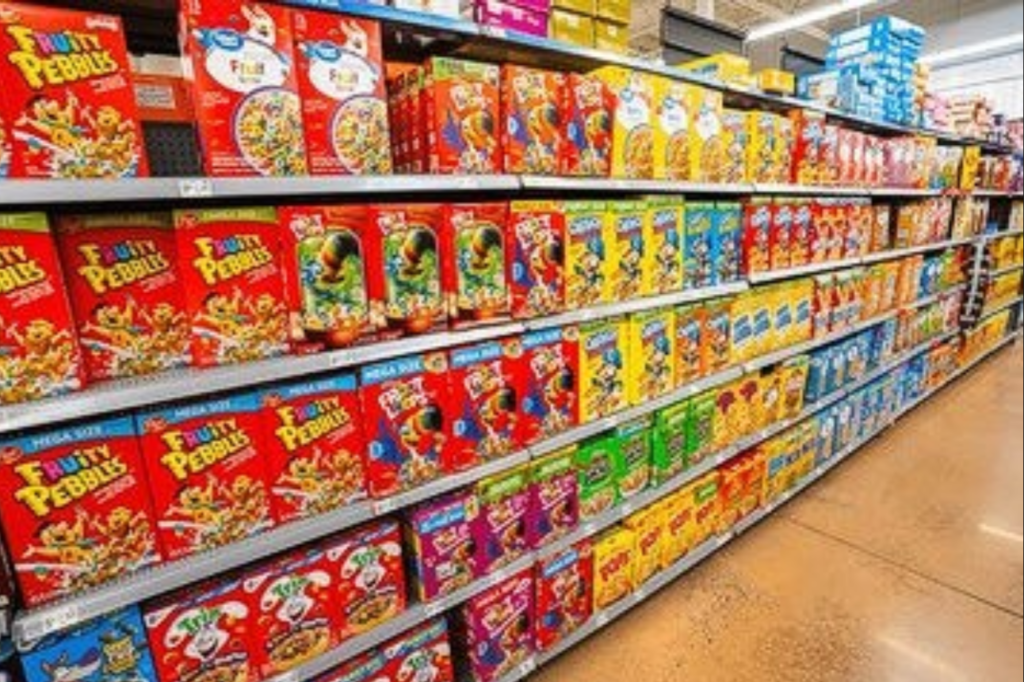
There is a very good reason why you see so much red, yellow, and orange in the cereal aisle. These colors are scientifically known to grab our attention and can even trigger a sense of excitement or hunger. When you are walking through a neutral-colored store, a bright red box jumps out at you instantly. Brands use these “high-energy” shades to make sure their product is the first thing your eyes land on. It is a colorful psychological game that has been played by marketing teams for a very long time.
Beyond just grabbing attention, consistent color schemes help you find what you need quickly. You probably don’t even have to read the words “Cheerios” or “Frosted Flakes” to know which box is which; you just look for that specific yellow or blue. This creates “brand recognition,” where your brain shortcuts the decision-making process because you recognize the color pattern. By combining eye-catching shades with a look you already know and trust, cereal companies make it incredibly easy for you to stay loyal to your favorite morning snack without having to think twice.
Back Panel Fun
The fun of a cereal box doesn’t stop once you turn it around. For decades, the back panel has been a prime spot for entertainment, featuring everything from word searches to complex mazes. This tradition turned the breakfast table into an interactive experience long before smartphones existed. By providing games and trivia, brands give kids a reason to stay engaged with the packaging while they eat. It makes the product feel like more than just food, it turns it into a toy or a morning activity.
This “back-of-the-box” strategy is a great way to encourage repeat purchases. If a child is halfway through a cool puzzle or wants to read the next fun fact, they are going to ask for that same box next time you go to the store. It builds a sense of playful loyalty that other snacks just can’t match. Instead of being something that gets thrown away immediately, the box becomes a part of the morning ritual. It is a simple, low-cost way for companies to add extra value to their product while keeping families entertained during the busiest part of the day.
Designed For Freshness
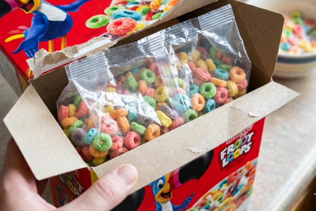
While the outside of the box is all about marketing, the inside is all about science. Every box comes with a sealed inner liner that keeps your cereal from going stale. This “bag-in-box” system was a revolutionary move in the early 20th century, helping to solve the problem of crackers and flakes getting soggy in humid weather. The outer cardboard provides the structural strength needed to stack the boxes, while the plastic or waxed-paper bag creates an airtight seal that locks in the crunch and flavor we all love.
This two-part system is still the industry standard because it works so well. The cardboard is easy to open and close, acting like a protective shell that keeps the inner bag from getting crushed. It also allows you to roll the bag down to keep things fresh for days or even weeks. This balance of durability and convenience is why the design hasn’t changed much in over a hundred years. It is a practical solution that ensures your breakfast tastes just as good on Friday as it did when you first opened the box on Monday morning.
Perception Of Value
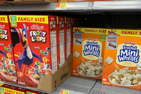
Have you ever noticed how “Family Size” cereal boxes seem to dominate the shelves? This is a deliberate design choice aimed at changing your perception of value. Even if the price per ounce is nearly the same as a smaller box, our brains are wired to think that a bigger package equals a better deal. Large boxes take up more physical space, making them feel more substantial and “worth it.” It is a visual trick that influences how we weigh our options while we are standing in the aisle.
Labels like “Mega Pack” or “Giant Size” are added to reinforce this feeling of saving money. By using a larger canvas, brands can also fit bigger images and bolder text, making the value proposition even more clear. This strategy is especially effective for parents who are trying to feed a hungry household and are looking for the most “bang for their buck.” The box isn’t just a container; it is a visual argument that you are getting a great deal. It proves that in the world of shopping, how big a product looks can be just as important as the price tag.
Built For Promotions
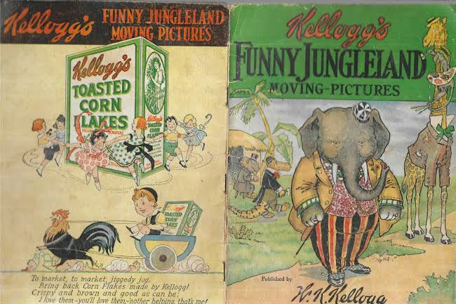
Cereal boxes have a long, nostalgic history of being used for promotions and prizes. Who could forget the excitement of digging through a box of flakes to find a plastic whistle or a colorful sticker? This tradition of “premiums” started in the early 1900s when W.K. Kellogg offered a “Funny Jungleland Moving Pictures Book” to customers. The sturdy, hollow design of the box makes it the perfect vessel for these extras, allowing brands to include toys or coupons without damaging the food inside.
Even though physical toys are less common today, cereal boxes still serve as a hub for digital promotions, like QR codes for movie tickets or video game credits. These “limited-time offers” create a sense of urgency that encourages shoppers to buy the box right now. It turns a routine grocery purchase into a fun reward for the family. By using the packaging as a promotional tool, brands keep their products feeling fresh and exciting. It is a classic marketing move that has been making breakfast a little more special for children and collectors for over a century.


