
A Trip Down The Memory Lane

Walking down the breakfast aisle today feels like a trip through a laboratory of health-conscious choices and organic alternatives, but those who grew up in the seventies remember a much louder and brighter reality. It was a time when the morning ritual was defined by eye-watering sugar content and vibrant cartoon mascots that promised adventure with every spoonful. We did not worry about glycemic indices or artificial dyes because we were far too busy trying to fish a plastic submarine out of the bottom of a cardboard box while the milk slowly turned a murky shade of chocolate or neon pink.
This era of breakfast history represents a shared cultural touchstone that shaped our childhood palates and provided the fuel for endless afternoons of outdoor play. While many of these iconic brands have since been reformulated to meet modern nutritional standards, the original versions remain etched in our memories as the ultimate morning indulgence. Looking back at these crunchy classics allows us to revisit a simpler period of the American and global domestic life where the biggest decision of the day was simply choosing which colourful character would accompany us at the kitchen table before the school run began.
Apple Jacks
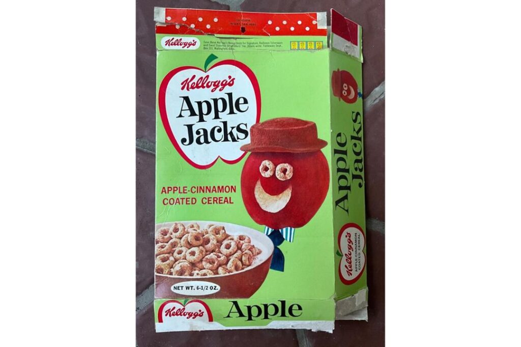
Kellogg’s first introduced this cinnamon-infused delight to the masses in 1965 and it quickly became a staple for children who craved a fruity yet spicy start to their mornings. Throughout the early seventies, the cereal was famously represented by the Apple Guy, a jovial character who eventually gave way to the more modern duo of Apple and Cinnamon. The rings were originally orange and green but the green hue was actually a later addition to the aesthetic as the brand sought to make the bowl look even more vibrant and appealing to young eyes.
The magic of this particular cereal resided in the way the cinnamon sugar coating would dissolve into the milk to create a sweet nectar that was often better than the cereal itself. Despite the name suggesting a heavy fruit influence, the actual apple content was always quite minimal and the flavour profile was dominated by a distinct warmth that set it apart from its purely citrus-based competitors. It remains a nostalgic heavyweight for anyone who remembers the satisfying crunch of those sturdy rings and the rush of energy they provided during the era of flares and Saturday morning cartoons.
Cap’n Crunch
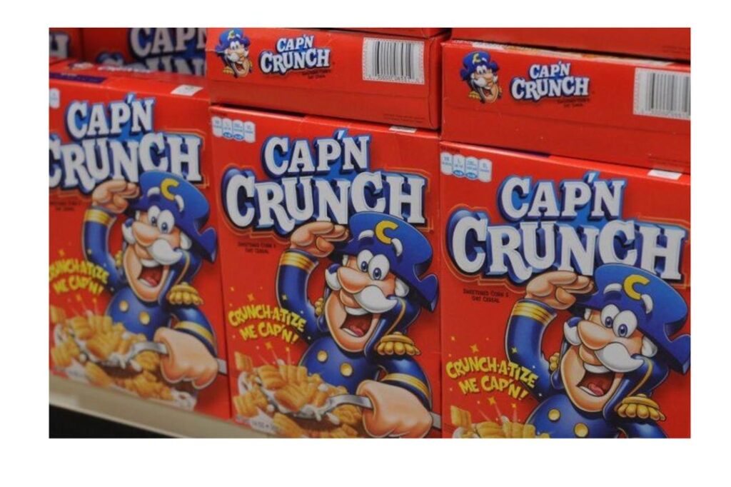
Horatio Magellan Crunch first set sail on the sea of breakfast milk in 1963 and he was an immediate sensation thanks to the unique manufacturing process of his signature golden nuggets. Created by Quaker Oats, this cereal was famously designed to stay crunchy even when submerged in milk for extended periods because the developers used a special oil coating. This innovation meant that children could take their time eating without the fear of their breakfast turning into a soggy mess, though many veterans of the era will fondly remember how the roof of their mouth felt after a particularly enthusiastic bowlful.
The character of the Captain was designed by the same legendary team responsible for Rocky and Bullwinkle, which gave the marketing a sophisticated and humorous edge that appealed to both parents and children alike. During the mid-seventies, the brand expanded its lore with various sidekicks and villains like Jean LaFoote the Barefoot Pirate who tried to steal the precious cargo. It was a sugary masterpiece that relied on a corn and oat base to provide a very specific toasted sweetness that has been remarkably difficult for any generic brand to truly replicate over the decades.
Cap’n Crunch With Crunch Berries
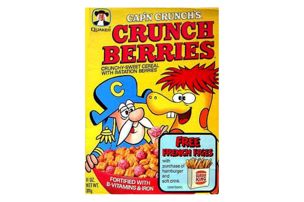
By the time 1967 rolled around, the original Captain needed a bit of a colourful update to keep up with the psychedelic trends of the decade and thus the Crunch Berries version was launched. These small and spherical treats were originally all red but they provided a burst of artificial fruitiness that contrasted beautifully with the original savoury-sweet pillows of the standard recipe. The introduction of the Smedley Elephant character in the television commercials helped to cement this variation as a standalone classic that many children preferred over the original sea-faring version.
Eating a bowl of this cereal felt like a treasure hunt because you would always try to balance the perfect ratio of berries to crunch pieces in every single spoonful. The way the red dye would slowly bleed into the cold milk created a pinkish hue that felt incredibly futuristic and indulgent during a time when food science was becoming a major part of the domestic experience. It was a vibrant celebration of everything that seventies breakfast culture stood for and it remains a primary example of how adding a bit of colour could turn a standard meal into an event.
Cap’n Crunch Vanilly Crunch
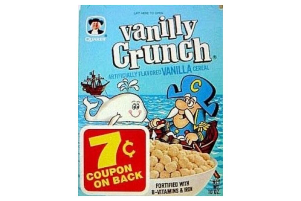
One of the more elusive yet beloved members of the fleet was Vanilly Crunch which featured a charming mascot known as Seadog who acted as the loyal companion to the Captain. Launched in the early seventies, this version moved away from the fruit-forward trends of the time to focus on a smooth and creamy vanilla profile that felt almost like eating dessert for breakfast. The pieces were shaped like small and rounded whales which added a whimsical nautical touch to the morning routine and made the cereal stand out on the crowded supermarket shelves.
While it did not enjoy the same eternal longevity as the berry-filled version, it occupies a very special place in the hearts of those who remember its distinct aroma and the way it made the milk taste like a melted milkshake. The marketing for this variety was particularly focused on the fun of the whale shapes and the gentle sweetness that provided a different sensory experience compared to the more aggressive fruit flavours of the era. It serves as a reminder that the seventies were a time of great experimentation in the cereal aisle as companies raced to find the next big hit.
Cocoa Puffs
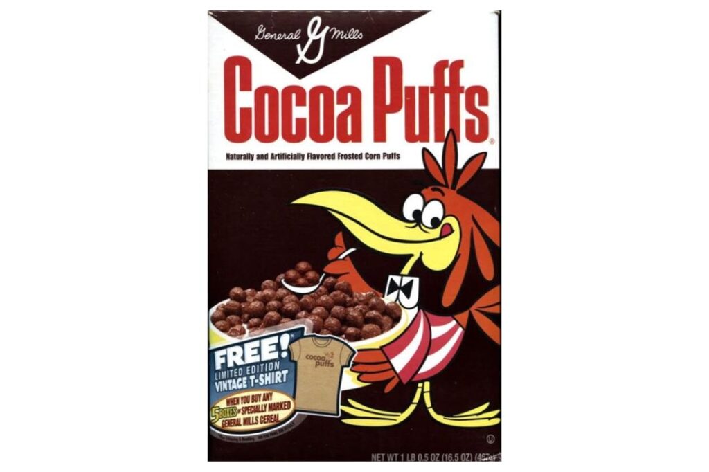
General Mills struck gold when they released this chocolatey marvel in 1958 and by the mid-seventies it had become a cultural phenomenon thanks to its iconic mascot Sonny the Cuckoo Bird. Sonny was famously “cuckoo for Cocoa Puffs” and his frantic energy in the animated commercials perfectly mirrored the sugar rush that many children experienced after a large bowl. The cereal consisted of small and spherical corn puffs that were heavily coated in a rich cocoa glaze which stayed incredibly crispy until the very last bite was consumed.
The true highlight of the experience was undoubtedly the chocolate milk that remained at the bottom of the bowl because the cocoa coating was designed to wash off into the liquid. This secondary treat was often the main motivation for finishing the cereal and it felt like a double win for any child lucky enough to have a box in the pantry. In an era before gourmet chocolate was a common household item, these puffs provided a reliable and accessible way to satisfy a cocoa craving while still technically eating a meal that was part of a balanced breakfast.
Corn Pops (Sugar Pops)
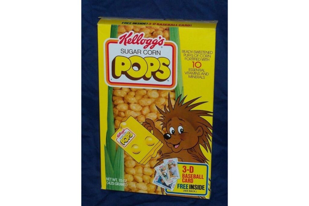
Long before they were known simply as Corn Pops, this cereal was proudly marketed as Sugar Pops and the name perfectly described the crunchy and glazed kernels inside the box. During the seventies, the brand went through several identity shifts and featured mascots like Poppy the Porcupine and eventually the rugged Cowboy Pete who promoted the cereal as a hearty treat. The puffed corn was unique because it lacked the uniform shape of other cereals and instead looked like irregular golden nuggets that had been dipped in a thick and shiny syrup.
The texture was particularly notable because it was simultaneously light and airy yet also quite sticky which gave it a satisfying chew that few other cereals could match. It was often sold in a bright yellow box that seemed to glow on the kitchen table and it represented the unapologetic use of sugar as a primary flavour component during that decade. Even as the name began to change to sound more wholesome, the core experience remained one of pure and unadulterated sweetness that provided a massive boost of energy to help children get through a long day of primary school.
Count Chocula
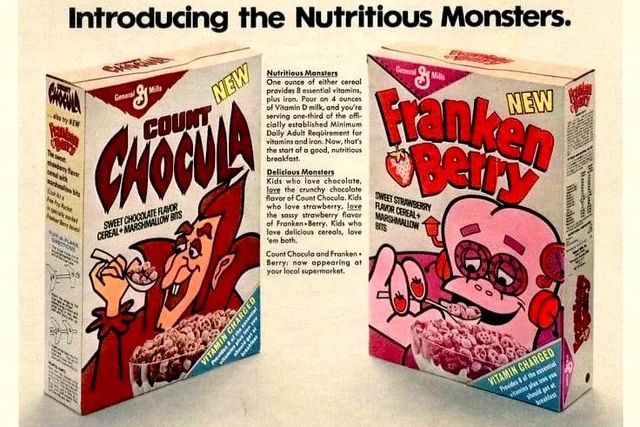
In 1971, General Mills changed the breakfast landscape forever by introducing the two Monster Cereal line and the star of the show was undoubtedly the misunderstood vampire known as Count Chocula. This was the first chocolate-flavoured cereal to include marshmallow bits which were affectionately known as “marbits” and they added a soft and chewy texture to the crunchy cocoa bats. The Count himself was never scary but instead came across as a charming and slightly neurotic aristocrat who was obsessed with his own delicious creation.
This cereal was a pioneer in the way it combined different textures and it helped to establish the idea that breakfast could be a playful and themed experience rather than just a chore. The dark and moody packaging stood out amongst the bright yellows and oranges of the other boxes and it became a permanent fixture of the seventies pop culture landscape. Even today, the arrival of this cereal on shop shelves is seen as a seasonal event that triggers a massive wave of nostalgia for those who remember the original recipe and the joy of finding a bowl full of chocolate ghosts.
Freakies
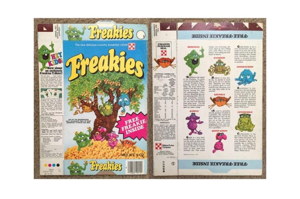
The Freakies were a short-lived but incredibly memorable addition to the seventies breakfast scene and they were based around a group of strange creatures who lived inside a magical tree. Launched by Ralston in 1973, the cereal itself was a simple sweetened grain ring but the real draw was the elaborate world-building and the colourful characters like BossFreeky and Snorkeldorf. The brand leaned heavily into the collectible nature of the era and children were encouraged to gather all the different figures and stickers that were hidden inside the boxes.
There was a certain psychedelic charm to the Freakies that perfectly captured the aesthetic of the early to mid-seventies and it felt much more counter-culture than the corporate offerings from Kellogg’s or Post. The jingle was infectious and the idea of a secret society of monsters living in a tree provided hours of imaginative play for kids across the country. Although it eventually faded from the shelves, it remains a cult classic that represents the peak of character-driven marketing in the cereal industry during a time when personality was just as important as taste.
Froot Loops
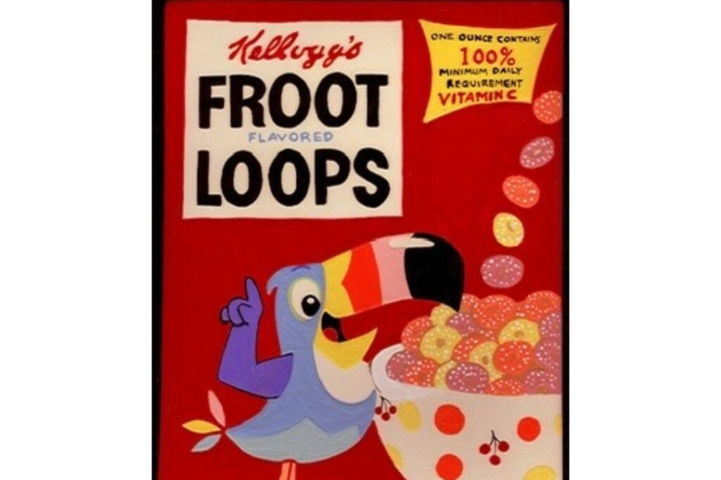
Toucan Sam has been the ambassador of these colourful rings since 1963 and his advice to “follow your nose” became one of the most successful advertising slogans in history. During the seventies, the cereal was a riot of primary colours and each loop was supposedly a different fruit flavour although most fans would agree they all shared a singular and delicious citrus-like profile. The scent that wafted from a freshly opened box was unmistakable and powerful enough to fill an entire kitchen with the aroma of artificial lime and lemon.
The brilliance of this cereal was its visual appeal because a bowl of Froot Loops looked like a confetti party in a sea of milk and it was impossible to feel grumpy while eating it. The loops were light and held their crunch well and they provided a sensory experience that was as much about the vibrant hues as it was about the sugary taste. Toucan Sam’s sophisticated voice and his exotic jungle adventures gave the brand an international flair that made it feel like a tiny tropical holiday at the start of every mundane weekday morning.
Frosted Flakes
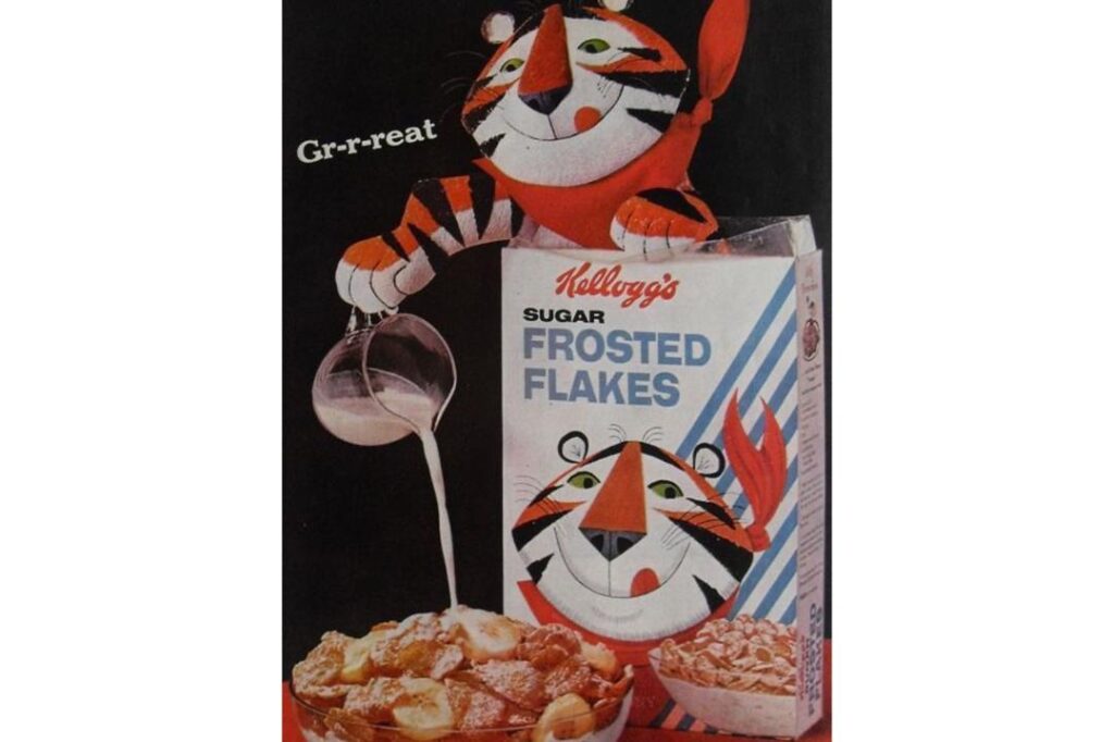
Tony the Tiger is perhaps the most famous cereal mascot of all time and his catchphrase regarding these sugar-coated corn flakes is known by generations of breakfast eaters. Known as Frosties in the United Kingdom, this cereal took the traditional and somewhat bland corn flake and transformed it into a sparkling and sweet masterpiece by adding a thick layer of frosted sugar. By the middle of the seventies, Tony had evolved from a simple character into a motivational figure who encouraged children to participate in sports and live an active lifestyle.
The simplicity of the product was its greatest strength because it didn’t need fancy shapes or multiple colours to be incredibly satisfying to eat. There was a very specific sound associated with a spoonful of these flakes and the way the sugar would eventually settle into a gritty but tasty residue at the bottom of the bowl was a highlight for many. It was a cereal that felt slightly more grown-up than the monster-themed alternatives but it still delivered the massive hit of sweetness that defined the era of seventies childhood nutrition and household habits.
Grape-Nuts
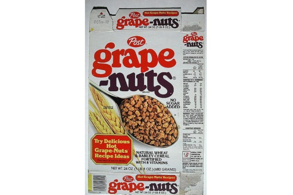
C.W. Post first developed this iconic cereal back in 1897 and it remains one of the most unique entries on our list because it contains neither grapes nor nuts. By the time the seventies arrived, it had secured its place as the “serious” choice for breakfast lovers who wanted something substantial and hearty to start their day. The cereal is made from a dense mixture of wheat and barley that is baked into a giant loaf and then ground into tiny and rock-hard granules which provide a legendary crunch that can be heard from several rooms away.
During the middle of the decade, the brand was famously associated with the naturalist Euell Gibbons who asked viewers if they had ever eaten a pine tree in a series of memorable television adverts. This marketing strategy successfully positioned the cereal as a wholesome and rugged option for those who enjoyed the outdoors and a healthy lifestyle. While other cereals were relying on bright colours and marshmallows, Grape-Nuts relied on its incredible durability and the way it absorbed warm milk or honey to create a comforting and filling porridge-like experience that many children grew to appreciate as they matured.
Honeycomb
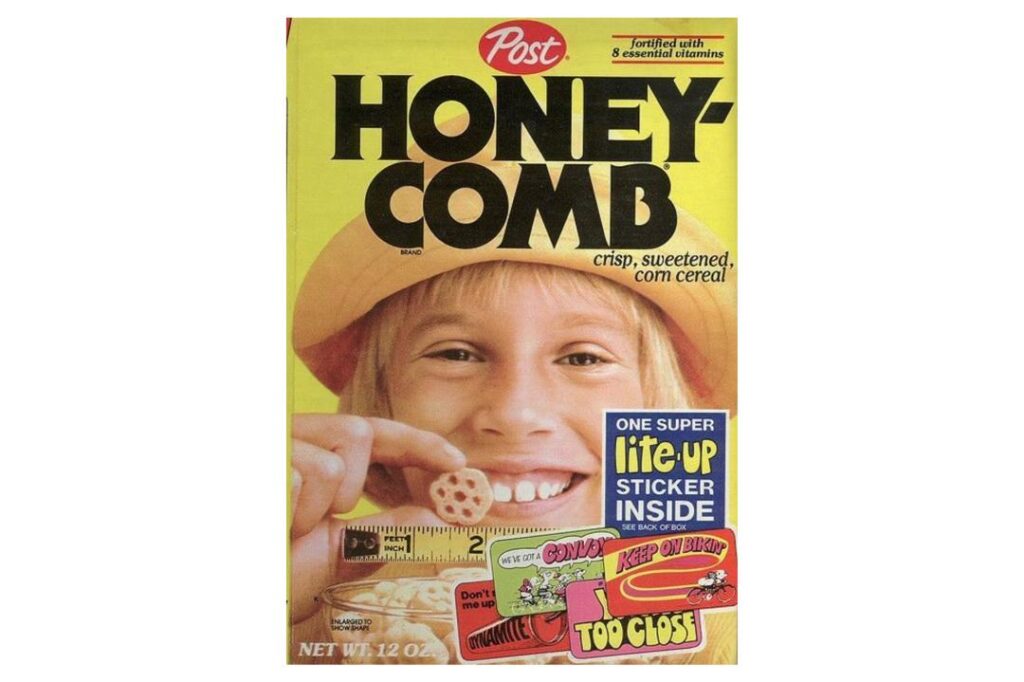
Post launched this massive cereal in 1965 and it immediately stood out because the pieces were shaped like large and hexagonal honeycombs that were almost too big for a standard spoon. The seventies were a golden era for the brand as it introduced the “Honeycomb Hideout” commercials where a group of cool kids would hang out in a secret clubhouse and share their favourite snack. The cereal was appreciated for its light and airy texture which offered a very gentle crunch and a subtle honey sweetness that was not as overwhelming as some of its more chocolatey or fruity rivals.
The sheer size of the individual pieces meant that a bowl would often look overflowing even if there were only a few dozen bits inside and this created a sense of abundance that kids absolutely loved. It was also a very popular choice for dry snacking because the holes in the middle made them easy to pick up and eat while watching afternoon television or playing in the garden. Even though it lacked a singular cartoon mascot, the brand built a sense of community and adventure around the product that made it feel like a central part of the seventies childhood social fabric.
Kaboom
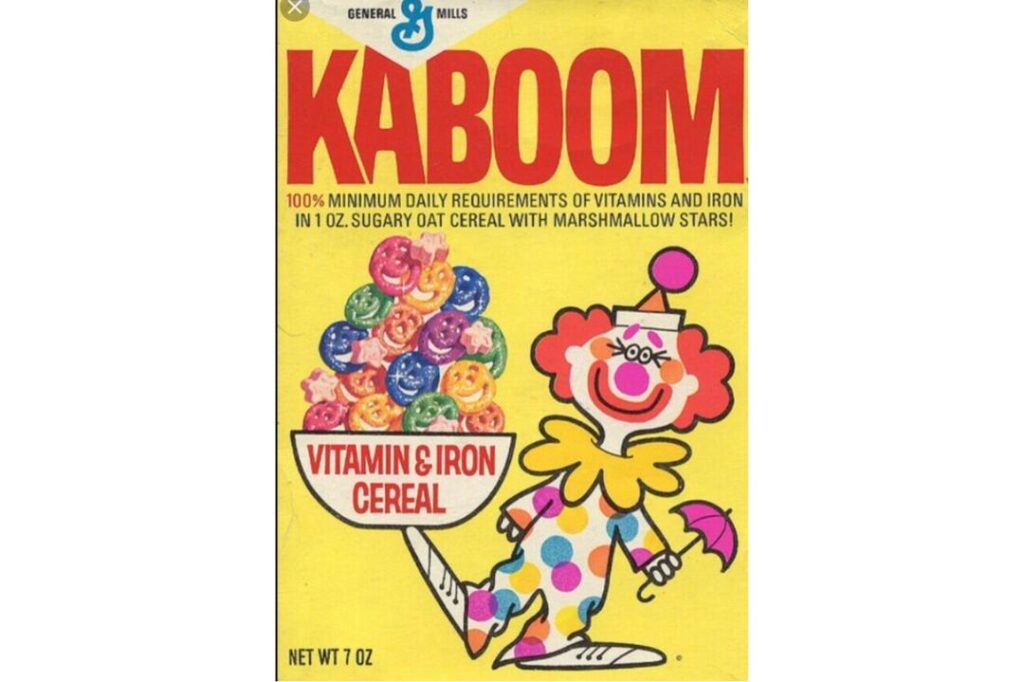
This circus-themed delight was introduced by General Mills in 1969 and it featured one of the most vibrant and slightly chaotic box designs ever to grace a breakfast table. The cereal consisted of corn-based stars and bright marshmallow bits shaped like clown faces which created a festive and theatrical atmosphere during the morning rush. The clown mascot was a cheerful figure who promised a “big bang” of flavour and the cereal certainly delivered on that front with its intense sweetness and various neon-coloured components that transformed the milk into a multi-coloured spectacle.
While it was essentially a variation on the oat-based marshmallow cereals of the time, the circus branding gave it a unique personality that resonated with children who were fascinated by the big top. It was the kind of cereal that felt like a special treat and it was often used as a reward for getting through a difficult week of school or chores. The intricate shapes of the marshmallows were a marvel of seventies food engineering and they provided a soft and pillowy contrast to the crunchy stars which made every mouthful a bit of a surprise in terms of texture and taste.
Life
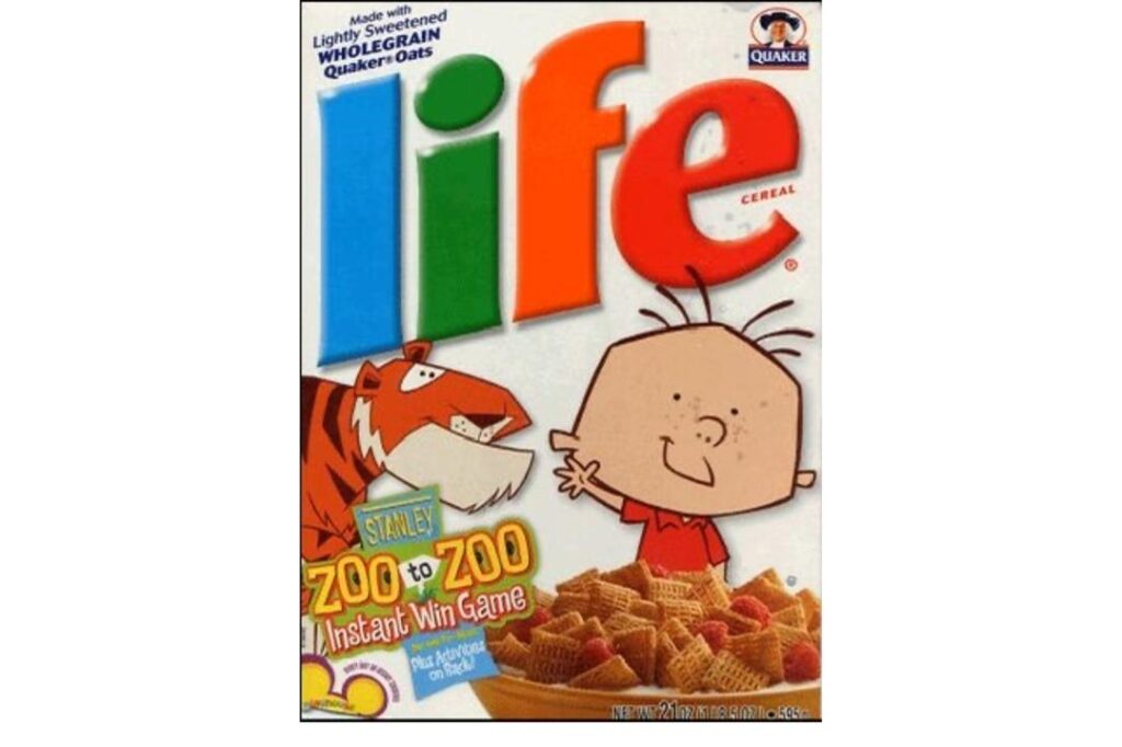
Quaker Oats brought Life cereal to the market in 1961 and it quickly became a household name thanks to one of the most enduring advertising campaigns in history. We all remember little Mikey who supposedly hated everything but surprisingly loved this particular cereal which was a major selling point for parents with picky eaters. The cereal was composed of small and square pieces made from toasted oats and sugar that were woven together into a delicate lattice structure which felt much more sophisticated than a standard puff or flake.
The beauty of the original recipe was its understated sweetness and the way the milk would get trapped inside the little woven squares to create a juicy and crunchy explosion with every bite. It was often marketed as a high-protein option that would give children the energy they needed for a long day of play and it occupied a middle ground between the “health” cereals and the pure sugar bombs. For many children of the seventies, Life represented a reliable and comforting staple that felt a little bit more grown-up while still being delicious enough to warrant a second bowl on a slow Sunday morning.
Lucky Charms
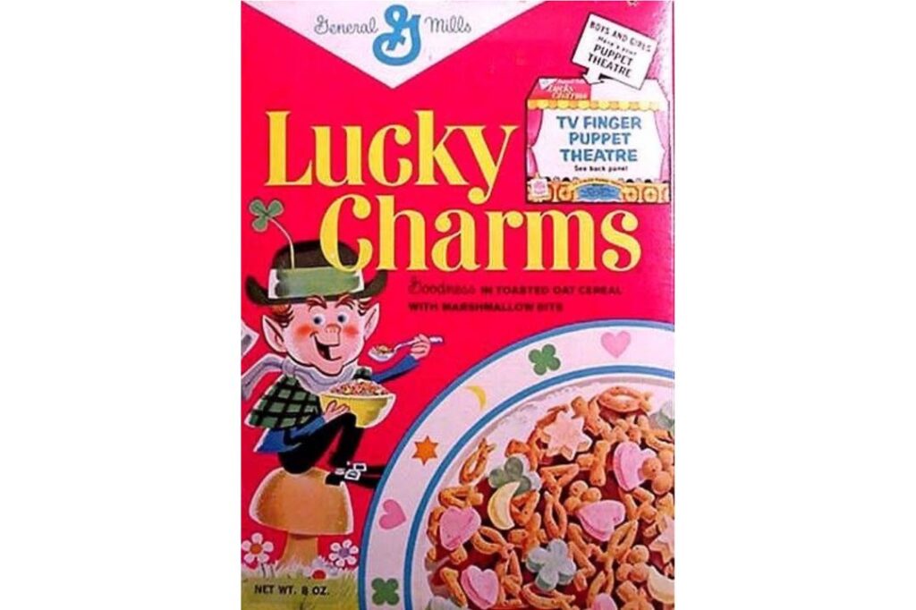
General Mills launched this magical creation in 1964 and it holds the distinction of being the first cereal to ever include marshmallows in the mix. By the time the seventies were in full swing, Lucky the Leprechaun was already a superstar who spent his days protecting his “hearts, stars, horseshoes, clovers, and blue moons” from thieving children. The base of the cereal was made from toasted oat pieces shaped like bells and fish but let’s be honest because everyone was really only there for the colourful and sugary marshmallow “charms” that dotted the landscape.
The genius of this product was the way it turned breakfast into a game where kids would systematically eat around the marshmallows so they could save a concentrated pile of sugar for the very end. The texture of the dehydrated marshmallows was uniquely chalky at first but they would soften beautifully in the milk to become sweet and melting clouds of joy. It remains one of the most culturally significant cereals of the era because it perfectly combined the whimsy of Irish folklore with the industrial capability of producing miniature and multi-coloured sugar shapes on a massive scale for the masses.
Quake
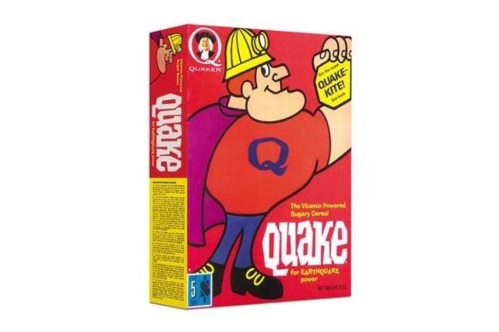
In the great cereal rivalry of the early seventies, Quake was the rugged and muscular partner to the more whimsical Quisp and the two brands were often marketed together in a battle for supremacy. Quake featured a burly miner character who lived underground and the cereal itself was shaped like small and crunchy wagon wheels with a delicious honey and oat flavour profile. The brand went through a bit of an identity crisis during the decade and eventually the mascot was redesigned to be a thinner and more athletic version of the character to appeal to changing tastes.
The cereal was known for having a very substantial crunch that could stand up to even the warmest milk and it felt like a hearty choice for those who wanted a bit of substance in their bowl. The marketing encouraged kids to take sides in the “Quisp vs. Quake” debate which was a clever way to keep both brands in the spotlight during a very competitive time for the industry. While it eventually lost the popularity contest to its more alien-themed sibling, Quake remains a legendary part of the seventies breakfast landscape for anyone who appreciated a solid and dependable crunch with their morning sugar fix.
Quisp
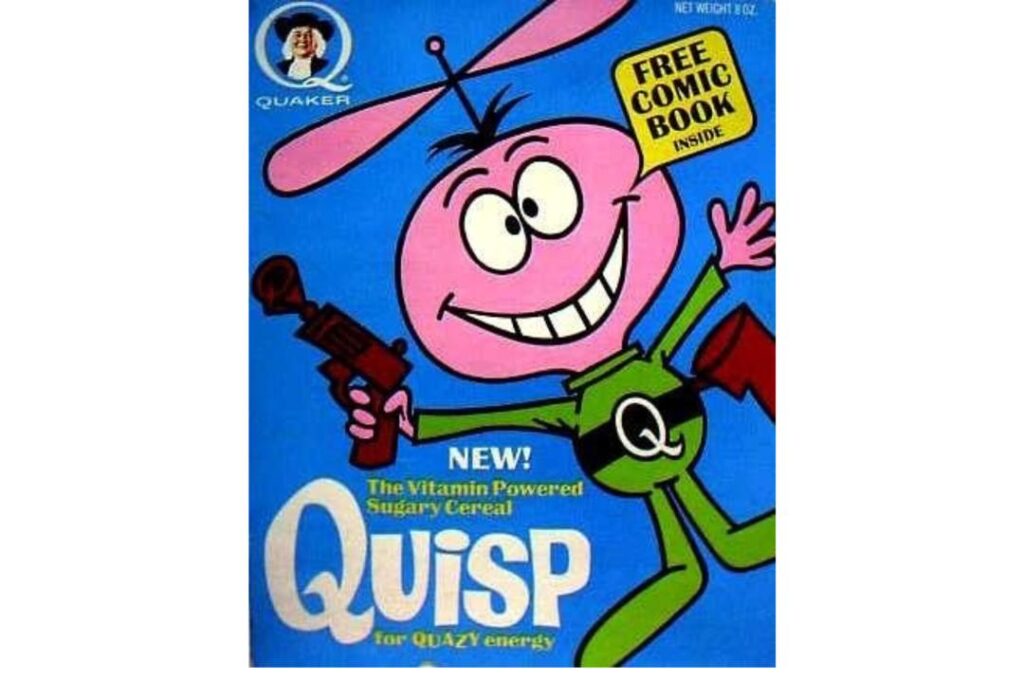
Quisp was the saucer-shaped counterpart to Quake and it featured a manic little pink alien who arrived from outer space to bring a new kind of sweetness to Earth. Launched by Quaker Oats in 1965, the cereal was essentially a corn-based product that had been pressed into the shape of tiny UFOs which made it incredibly fun to eat. The light and crispy texture was a hit with children who enjoyed the way the little saucers would float on top of the milk like a fleet of invading spaceships ready to take over the kitchen.
The rivalry between Quisp and Quake was one of the first examples of interactive marketing because children were actually invited to vote for which cereal should stay on the shelves. Quisp eventually won the popular vote because its personality was more in tune with the space-age fascination of the late sixties and early seventies. It was a cereal that leaned into the absurdist humour of the era and provided a sense of wonder and fun that made the morning routine feel like a science fiction adventure rather than just another bowl of grain and milk before school.
Rice Krispies
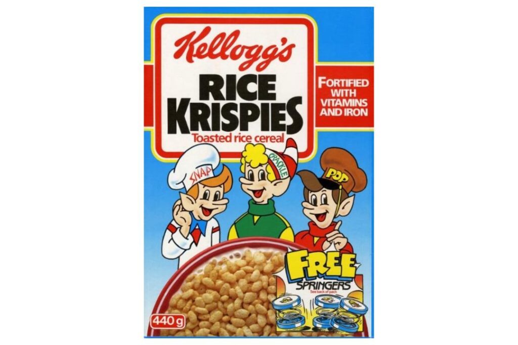
Snap, Crackle, and Pop were already well-established icons by the seventies and they continued to lead the way for this simple yet revolutionary toasted rice cereal. The magic of this brand was entirely auditory because the sound of the rice bubbles reacting to the cold milk was a fundamental part of the childhood experience. It was one of the few cereals that felt light and refreshing and it was frequently used as a base for making sticky marshmallow treats which became a staple of every birthday party and school fete across the country.
The marketing during this decade was very focused on the family experience and the idea that a simple bowl of rice could bring a bit of excitement to the table. While it was lower in sugar than many of its contemporaries, it was often topped with a generous spoonful of white sugar by children who wanted to give it an extra kick. The reliability of the brand was its greatest asset and the three little elves provided a friendly and consistent presence that made the cereal feel like a permanent and unshakeable member of the household pantry during a time of great change.
Sugar Smacks
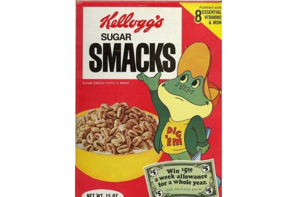
Known today as Honey Smacks, this cereal was unashamedly sweet and featured a wide variety of mascots during the seventies including the iconic and laid-back Dig’em Frog. The cereal consisted of puffed wheat that had been heavily glazed with sugar and honey which resulted in a very specific sticky texture and a deep golden colour. It was one of the sweetest options on the market and the way the honey glaze would coat the teeth and the tongue was a sensation that many adults still remember with a mixture of fondness and slight dental concern.
Dig’em Frog brought a sense of cool and effortless style to the brand which helped it compete with the more frenetic energy of other cereal mascots. The puffed wheat was light and easy to eat but the flavour was incredibly bold and lingering which made it a favourite for those who really wanted to taste the sugar. It represented the peak of the “sugar-coated” era of breakfast food where the primary goal was to create a product that was as close to a confection as possible while still being served in a bowl with a splash of milk.
Sugar Pops
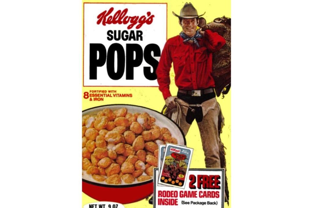
This was the original name for what we now know as Corn Pops and during the early seventies it was still proudly celebrating its sugary roots with a bright and unapologetic marketing campaign. The cereal was a puffed corn product that had been glazed to a high shine and it offered a very unique combination of a crunchy exterior and a soft and airy interior. It was famously promoted by a series of cowboy characters who would ride through the desert to deliver a “shot” of energy to anyone who was feeling a bit sluggish in the morning.
The name change eventually occurred as the industry started to move away from using the word “sugar” so prominently but for a long time it was a badge of honour for this particular brand. The cereal was incredibly popular because it didn’t get soggy as quickly as flakes or rice bubbles and it provided a very consistent and reliable level of sweetness. For a child of the seventies, opening a box of Sugar Pops was like opening a treasure chest of golden nuggets that promised a morning filled with energy and a very satisfied sweet tooth before the day really began.
Super Sugar Crisp
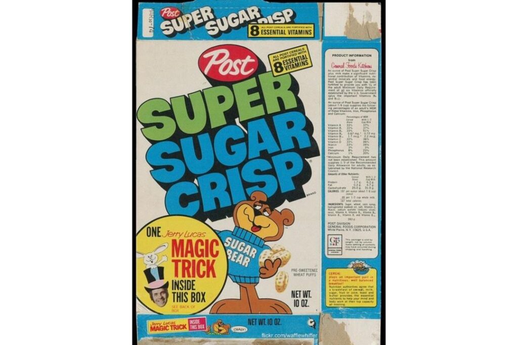
Sugar Bear was the undisputed king of cool during the mid-seventies and his smooth and deep-voiced crooning made this cereal feel like the most relaxed choice on the shelf. Post launched this puffed wheat classic under the name Super Sugar Crisp to emphasize the thick and crunchy candy coating that enveloped every single grain. The texture was notably different from its rivals because it had a satisfyingly dense and tooth-rattling crunch that didn’t immediately vanish the moment it touched the milk. Sugar Bear’s laid-back attitude in the television commercials suggested that eating this cereal was the key to staying calm and collected even when things got a bit hectic.
The packaging was often a bright and cheerful blue which made the golden-brown wheat puffs pop visually and it was a common sight in kitchen cupboards across the country. It was one of those cereals that felt like a bridge between a breakfast food and a legitimate snack because many children would grab a handful of the sticky puffs to eat dry while playing. The name eventually evolved to be more health-conscious but for those who lived through the seventies it will always be remembered for its unapologetic commitment to a heavy and sweet glaze. It remains a definitive example of how a strong mascot could turn a simple puffed grain into a cultural icon that defined the morning routine of an entire generation.
Trix
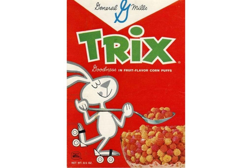
General Mills brought a splash of neon colour to the breakfast table with Trix and the brand was defined by the never-ending plight of the Trix Rabbit who was constantly told that his favourite treat was “for kids.” During the seventies, the cereal consisted of bright and fruit-flavoured spheres that were famous for their intense citrus and berry notes which could be smelled the moment the inner wax paper bag was pinched open. The Rabbit’s frantic attempts to disguise himself just to get a single spoonful created a narrative of desire and reward that made every bowl feel like a precious prize for the children who were actually allowed to eat it.
The colours were incredibly bold for the time and they represented the peak of artificial food aesthetics which was a major trend in the mid-seventies domestic market. While the shapes would eventually change to fruit-inspired silhouettes in later decades, the seventies version was all about those perfect and crunchy spheres that rolled around the bottom of the bowl. It was a cereal that celebrated the joy of being a child and the exclusive nature of the breakfast experience which was a clever way to build brand loyalty among the younger demographic. The milk would inevitably turn a muddy but delicious shade of purple or pink by the end of the meal and that was considered a badge of honour for anyone who had successfully finished their portion before the school bus arrived.
The era of unrestricted sugar and playful mascots was a unique moment in history that relied on the massive output of a few central factories to feed a generation of growing children.
Like this story? Add your thoughts in the comments, thank you.


