
The Album Art Fans Still Treat Like Scripture

The 1970s represented a golden era where the long-playing record was far more than just a medium for music because it served as a physical gateway into the artist’s soul. During this decade, the canvas of a twelve-inch square sleeve offered a sprawling space for visionary designers and photographers to craft icons that would define generations. Fans did not just listen to the music but they lived inside these gatefold sleeves while they studied every hidden detail and cryptic credit. This was a time when the visual identity of an album was just as vital as the melodies etched into the vinyl, turning record shop bins into galleries of modern art that reflected the turbulent, psychedelic, and rebellious spirit of the age.
This fascination with album art persists today because these covers act as a tactile connection to a pre-digital world where art was something you could hold in your hands. Whether it was the surreal landscapes of progressive rock or the stark and gritty minimalism of the punk movement, these covers helped to build the mythology of the rock star. We revisit these masterpieces not merely for the sake of nostalgia but to celebrate a period when the marriage of sight and sound was perfected. These twenty selections represent the pinnacle of that creative explosion and they remain the sacred texts of record collections across the globe, proving that a great cover is truly timeless.
The Dark Side Of The Moon
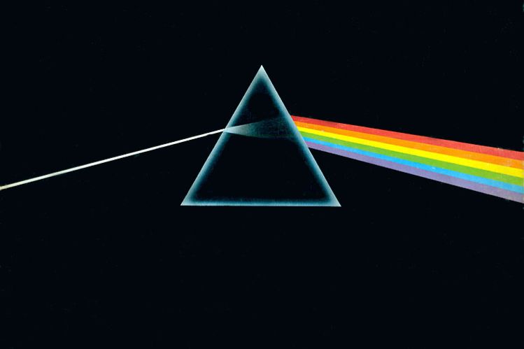
The prism design created by Storm Thorgerson and Aubrey Powell of the Hipgnosis design partnership remains perhaps the most recognisable image in the history of music. Released on 1 March 1973, this masterpiece of minimalism was born from a desire for a clean and elegant graphic that moved away from the band’s previous photographic covers. The light refracting through the glass represents the band’s stage lighting and the heavy lyrical themes of the record such as madness and ambition. It is a testament to the power of simple geometry that this single triangle has become a universal shorthand for progressive rock mastery and cosmic exploration.
The brilliance of this sleeve lies in its continuity and the way the spectrum of light travels across the gatefold and into the inner heart of the packaging. George Hardie was the illustrator who actually drew the line work and he ensured that the rainbow lacked the colour indigo because the band preferred a simpler palette. This artwork helped the album stay on the Billboard charts for an astonishing 741 weeks as fans were drawn to its mysterious and scientific aesthetic. Even today, the image feels incredibly modern and it continues to be printed on millions of t-shirts because it perfectly captures the ethereal and timeless atmosphere of Pink Floyd’s most famous work.
Unknown Pleasures

When Joy Division released their debut album on 15 June 1979, the stark white-on-black lines of the cover signalled a profound shift in the visual language of post-punk. The image was originally discovered by band member Bernard Sumner in The Cambridge Encyclopaedia of Astronomy and it depicts one hundred consecutive pulses from the first pulsar ever discovered. This data visualisation known as CP 1919 represents the death of a star and it perfectly mirrors the cold and hauntingly beautiful soundscapes found within the music. Peter Saville was the designer who took this scientific chart and turned it into an enigmatic symbol that feels both ancient and futuristic at the same time.
There is a deliberate absence of text on the front cover because the band wanted the imagery to speak for itself without the distraction of marketing or branding. This decision forced the listener to engage directly with the mysterious pulses and it created an air of intellectual mystery that helped define the band’s legacy. The texture of the original textured card sleeve added a tactile quality that made the record feel like a precious artefact rather than a mass-produced product. It remains one of the most parodied and celebrated designs in history because it manages to be incredibly stylish while also being deeply rooted in the physical reality of the universe.
Aladdin Sane
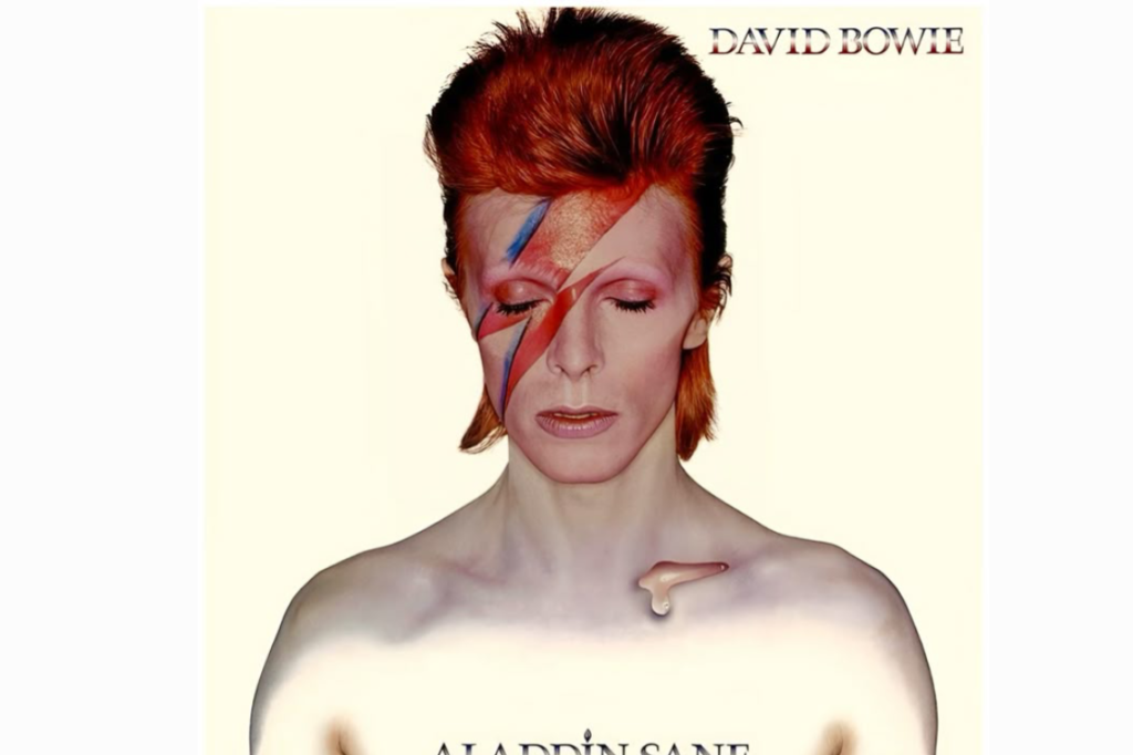
David Bowie’s sixth studio album arrived on 13 April 1973 with a cover photograph that would become the definitive image of the Thin White Duke’s career. Photographed by Brian Duffy at his studio in London, the image features Bowie with a bold red and blue lightning bolt painted across his face which symbolised a split personality and the pressures of fame. The small teardrop on his collarbone was a late addition that added a touch of vulnerability to the otherwise superhuman glam-rock persona. It was the most expensive cover ever produced at the time because the seven-colour process required to capture the vibrance of the bolt was incredibly complex and costly.
The lightning bolt has since become an international symbol for artistic reinvention and it is often cited as the ultimate example of how makeup can be used as a form of high art. Pierre La Roche was the makeup artist responsible for the look and he helped to create a visual identity that felt dangerously alien yet strangely beautiful. This portrait captured Bowie at the very height of his powers as he transitioned from the Ziggy Stardust era into something more American and experimental. The image is so powerful that it almost overshadows the music itself because it perfectly encapsulates the shimmering and theatrical essence of the early seventies glam movement.
Abbey Road
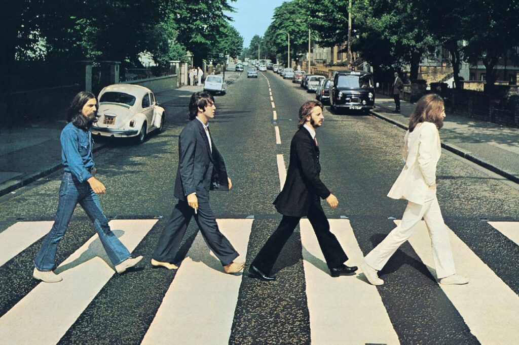
Although the sessions began in late 1969, the impact of this cover dominated the early seventies and it remains the most imitated photograph in pop culture. On a hot August morning, photographer Iain Macmillan stood on a stepladder while a policeman held up traffic so that The Beatles could walk across the zebra crossing outside their studio. The image is deceptively simple yet it is filled with tiny details that fueled the infamous Paul is Dead conspiracy theory such as his bare feet and the cigarette in his hand. It was a radical departure for the time because the band’s name did not appear on the front cover which proved that they were now more famous than any brand.
The street itself has become a site of pilgrimage for millions of fans who want to recreate that famous stroll and this has turned a regular North London road into a global landmark. There is a sense of finality in the photograph as the four men walk away from the studio that had been their creative home for the better part of a decade. The bright blue sky and the leafy trees of St John’s Wood provide a serene backdrop for the end of an era. It is a remarkably human photograph that captures the world’s biggest band in a moment of casual motion and it continues to inspire awe for its effortless cool and historical significance.
London Calling
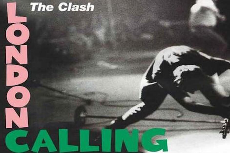
The Clash released their double-album masterpiece on 14 December 1979 with a cover that perfectly bridged the gap between the fifties rock and roll era and the fury of punk. Photographer Pennie Smith captured the moment Paul Simonon smashed his Fender Precision Bass onto the stage at The Palladium in New York City out of sheer frustration with the stagnant crowd. Although Smith initially thought the photo was too out of focus for a cover, graphic designer Ray Lowry saw the raw energy and insisted on using it. The pink and green lettering was a direct homage to Elvis Presley’s debut album which served to reclaim rock and roll for a new and angry generation.
This image is widely considered the greatest rock photograph of all time because it captures the visceral and physical nature of the genre in a single frame. The blurred motion and the stark black and white contrast convey a sense of urgency that matches the political and social commentary found in the tracks. It serves as a violent rejection of the polished and over-produced stadium rock that dominated the late seventies and it remains a symbol of rebellion. By echoing the typography of the past while displaying the destruction of the present, The Clash created a visual statement that was both respectful of its roots and revolutionary in its intent.
Rumours
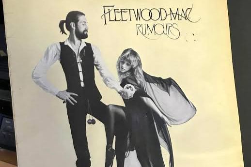
When Fleetwood Mac released Rumours on 4 February 1977, the cover offered a whimsical and theatrical glimpse into the complex interpersonal dynamics of the band. The photograph features Mick Fleetwood and Stevie Nicks in their stage costumes with Nicks draped in her flowing Rhiannon robes and Fleetwood holding a pair of wooden toilet chains. This surreal touch was a quirky piece of tour memorabilia that Fleetwood had adopted as a lucky charm and it added a layer of eccentricity to the sophisticated pop aesthetic. The elegant font and the soft sepia tones suggested a timeless quality that matched the polished production and the deeply personal songwriting of the record.
The chemistry between the members is palpable in this image even though it only features two of the five musicians who made the album a global phenomenon. It captures a specific brand of California cool that was synonymous with the mid-seventies while also hinting at the folklore and mysticism that Stevie Nicks brought to the group. Because the album was recorded amidst a whirlwind of breakups and internal strife, the poise and elegance of the cover feel like a deliberate contrast to the chaos behind the scenes. It remains one of the best-selling albums of all time and its cover is a vital part of the mythos that continues to enchant new listeners.
Houses Of The Holy
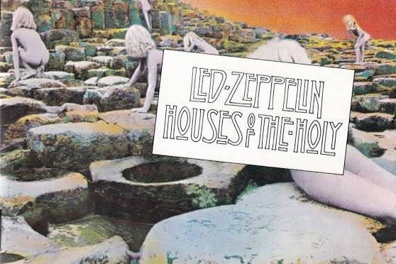
Led Zeppelin often pushed the boundaries of visual art and their 1973 release featured a haunting and otherworldly cover inspired by the science fiction novel Childhood’s End. Designed by the Hipgnosis team, the image shows several children climbing the Giant’s Causeway in Northern Ireland toward an unseen light at the summit. The ethereal orange glow and the strange purple tint of the sky were achieved through a complex multi-exposure process that took weeks to perfect in the darkroom. It was a bold move for the band to move away from their usual occult imagery toward something that felt more like a psychedelic dreamscape or a prehistoric myth.
The shoot was notoriously difficult because of the constant rain and the young models had to be painted silver so that the light would catch their skin in a specific way. This created an image that feels both ancient and alien which perfectly complemented the band’s move into more experimental and synthesiser-heavy sounds. Many fans spent hours debating the meaning of the children’s journey and this sense of mystery helped to maintain the band’s legendary status. It is a stunning example of how a record sleeve can become a piece of high-concept art that challenges the viewer to look beyond the surface and imagine a different world entirely.
Hotel California
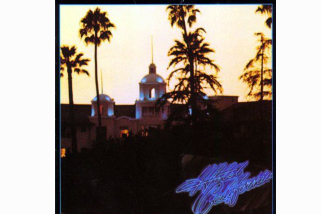
The Eagles perfectly captured the dark underbelly of the American Dream with their 1976 magnum opus and the cover image of the Beverly Hills Hotel at sunset is iconic. Photographers David Alexander and Kosh wanted to capture the hotel at the Golden Hour to create an atmosphere of fading glamour and decadence. They chose a specific angle that made the building look like a gothic castle or a place of mystery rather than a luxury destination for celebrities. This visual metaphor for the entrapment and excess of the Los Angeles music scene became the defining image of the decade’s end and it hinted at the disillusionment hidden behind the sunshine.
The orange and gold hues of the sky suggest a beautiful end to an era while the palm trees silhouetted against the light add a sense of tropical isolation. This cover became so famous that the hotel actually considered legal action because people began to associate the building with the dark themes of the lyrics. It remains a masterclass in using a real-world location to create a fictional atmosphere that resonates with the listener on a deep and emotional level. The image serves as a postcard from a place that everyone wants to visit but no one can ever truly leave and it continues to represent the peak of seventies soft-rock sophistication.
Tubular Bells
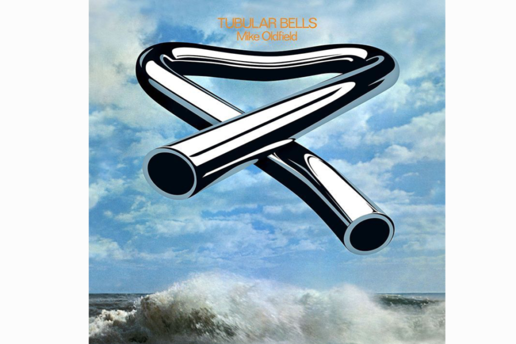
Mike Oldfield was only nineteen when he recorded his debut album and the cover art for the 1973 release is as unique and innovative as the instrumental music itself. Trevor Key created the image of a bent chrome tube floating over a serene seascape which was a literal interpretation of the distorted tubular bell used in the climax of the record. The image was achieved by photographing a piece of scrap metal and then using early retouching techniques to give it a reflective and surreal finish. It became one of the first truly iconic covers for the Virgin Records label and it helped to launch the career of Richard Branson by standing out in record shops.
The contrast between the heavy and industrial look of the metal and the natural beauty of the waves creates a sense of peaceful tension that reflects the shifting moods of the composition. Because the album gained massive fame after its use in the horror film The Exorcist, the cover took on a slightly more ominous and mysterious reputation for many fans. It is a brilliant example of conceptual art where a single object is used to represent an entire musical journey without the need for faces or figures. This minimalist approach was very influential and it proved that an abstract image could be just as commercially successful as a traditional portrait.
Bitches Brew
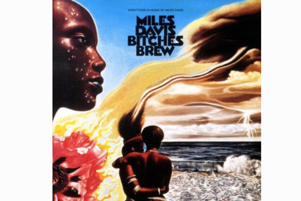
Miles Davis changed the face of jazz on 30 March 1970 and the double-album cover by German painter Mati Klarwein is a vibrant explosion of Afrofuturism and surrealism. The painting features a stunning array of African imagery combined with psychedelic elements such as a pair of hands interlaced like a cloud and a striking contrast between light and dark figures. Klarwein’s style was heavily influenced by Salvador Dalí and he used his intricate brushwork to create a visual world that felt as dense and experimental as the jazz-fusion music. It was a bold statement of black pride and cosmic exploration that shattered the traditional expectations of how a jazz record should look.
The use of vibrant colours and symbolic imagery like the ocean and the sun helped to convey the idea that this music was a force of nature that could not be contained by genre boundaries. This artwork was essential in attracting a younger and more rock-oriented audience to Miles Davis’s music because it looked like nothing else in the jazz section of the store. The gatefold sleeve allowed the painting to wrap around the entire package which gave the listener a panoramic view of Klarwein’s dreamlike vision. It remains a landmark in album design because it treated the record sleeve as a canvas for high-level fine art and it helped to define the visual language of the seventies.
Parallel Lines
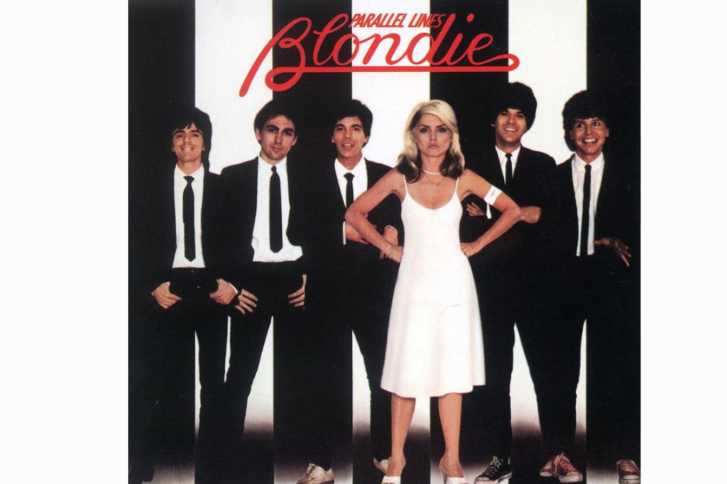
The imagery for Blondie’s 1978 breakthrough masterpiece is a masterclass in New Wave aesthetics and remains a perfect example of how to market a band’s visual identity. Photographed by Edo Bertoglio, the cover features the band dressed in matching black suits while Debbie Harry stands defiantly in the centre wearing a contrasting white dress. The background consists of bold vertical black and white stripes that create a sense of optical vibration and modern energy which perfectly matched the sharp and punchy pop-punk tracks inside. Although the band famously disliked the photo at the time because they felt it marginalised the male members, it became the image that launched them into global superstardom.
The brilliance of this design lies in its simplicity and the way it balances the gritty cool of the New York underground with a polished and commercial appeal. The stripes are synonymous with the late seventies aesthetic and they helped the record stand out on the shelves of busy high street shops across Britain and America. It was a visual manifesto for a band that was ready to bridge the gap between disco and rock and roll while maintaining a sophisticated and fashion-forward edge. This sleeve proved that a strong graphic concept could be just as powerful as a complex painting and it continues to influence the worlds of fashion and photography today.
Never Mind The Bollocks
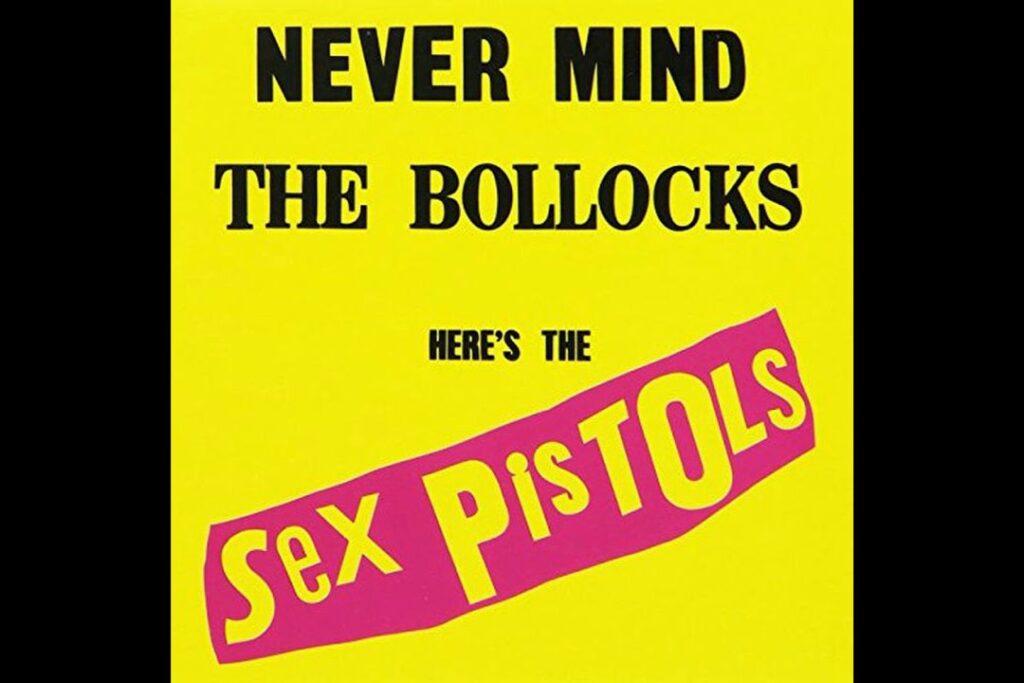
When the Sex Pistols released their only studio album on 28 October 1977, the bright yellow and neon pink cover felt like a deliberate physical assault on the senses. Jamie Reid was the anarchist artist responsible for the design and he used a ransom-note style of cut-out lettering to create a look that was intentionally crude and confrontational. By avoiding a photograph of the band entirely, Reid focused the attention on the provocative title which led to the record being banned by several major retailers and even becoming the subject of a high-profile obscenity trial. This was the ultimate visual representation of the punk movement’s desire to tear down the established order.
The lack of traditional artistry was the point because it reflected the DIY ethos of the subculture and the raw and unpolished nature of the music itself. The clashing colours and the jagged fonts were designed to be seen from across a crowded room and they served as a warning that this was not a safe or conventional pop record. It stripped away the pretension of the progressive rock era and replaced it with a sense of immediate and chaotic urgency that defined the youth culture of the UK. Even decades later, the cover remains a symbol of ultimate rebellion and it serves as a reminder of a time when music could still truly shock the world.
Bridge Over Troubled Water
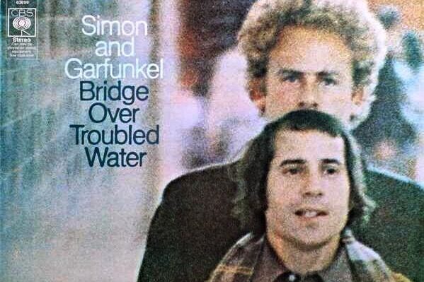
The final studio album from Simon and Garfunkel arrived on 26 January 1970 with a cover that captured the quiet and introspective mood of a world moving out of the sixties. Photographed by Abbott Mills on a cold winter day in New York City, the image shows Paul Simon slightly out of focus in the background while Art Garfunkel’s face is sharp and clear in the foreground. This layout was a subtle reflection of the creative tensions within the duo because Paul wrote all the songs while Art provided the soaring and iconic lead vocals. The muted colours and the heavy winter coats give the image a sense of weight and maturity that perfectly suits the folk-rock anthems.
The setting of the photograph on a city street corner adds a layer of urban realism that made the duo feel relatable to millions of listeners who were navigating their own personal struggles. It is a humble and understated image that relies on the genuine expressions of the two men rather than any flashy graphic effects or elaborate costumes. This simplicity helped the album become one of the best-selling records of all time because the artwork felt as honest and comforting as the title track itself. It remains a poignant visual farewell for one of the most successful partnerships in music history and it captures a specific moment of transition in the American cultural landscape.
Trans-Europe Express
Kraftwerk redefined the future of electronic music on 5 March 1977 and the cover of their sixth album perfectly captured the concept of a sleek and automated European identity. The image features the four band members in hand-tinted portraits that were inspired by the glamour of the 1930s and the golden age of cinema which created a strange contrast with their synthesised sound. This retro-futuristic aesthetic was a deliberate move to distance themselves from American rock tropes and embrace a distinctly continental European heritage. The clean lines and the mannequin-like poses of the band members suggested a world where humans and machines were beginning to merge into something entirely new.
The choice of clothing and the formal styling gave the band an air of intellectual mystery that set them apart from the long-haired rock stars of the mid-seventies. By using a style that looked back to the past to represent the music of the future, Kraftwerk created a timeless visual language that remains incredibly influential in the world of techno and synth-pop. The cover feels like a still from a lost film or a travel poster for a high-speed journey across a digital landscape and it helped to establish the band as the pioneers of the electronic age. It is a masterclass in branding that proved that being cool could be about precision and restraint rather than just volume and excess.
Tapestry
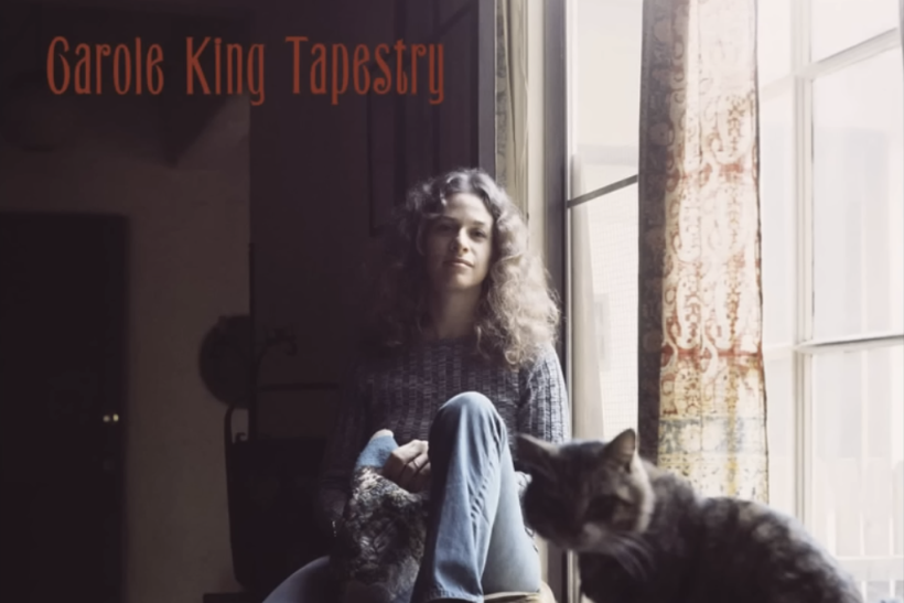
Carole King’s 1971 masterpiece is the ultimate example of a cover that feels like a warm and personal invitation into an artist’s private world. The photograph by Jim McCrary shows King sitting in the window of her Laurel Canyon home with her cat, Telemachus, perched comfortably in the foreground. The soft afternoon light and the presence of a hand-stitched tapestry nearby create an atmosphere of domestic peace and authentic craftsmanship that resonated with millions of women during the decade. It was a radical departure from the hyper-masculine rock covers of the time because it celebrated the beauty of the everyday and the quiet strength of the singer-songwriter.
The image feels remarkably unposed and natural which helped to establish Carole King as a relatable and trustworthy voice for a generation of listeners. This sense of intimacy was crucial to the album’s success because the songs themselves were deeply personal reflections on love and friendship and self-discovery. By allowing fans to see her in her own environment without the distractions of stage makeup or elaborate sets, she created a lasting bond with her audience. The cover has become a cultural touchstone for the organic and earth-toned aesthetic of the early seventies and it remains a beautiful reminder of the power of simplicity and genuine emotion in art.
Breakfast In America

Supertramp took a satirical and playful approach to the American Dream for their 1979 release with a cover that turned the New York skyline into a diner breakfast. Designed by Mike Doud and Mick Haggerty, the image features an actress named Kate Murtagh dressed as a waitress who is posing as the Statue of Liberty while holding a glass of orange juice. Behind her, the skyscrapers of Manhattan are recreated using piles of boxes and kitchen utensils while the harbour is represented by a blue tabletop. This clever use of forced perspective and everyday objects created a surreal and humorous image that reflected the band’s move toward a more commercial and upbeat sound.
The bright and vibrant colours were a perfect match for the polished and radio-friendly tracks that dominated the airwaves at the end of the decade. It won the Grammy Award for Best Recording Package because the attention to detail in the miniature city was so impressive and the concept was incredibly original. This cover captured the sense of fun and absurdity that was often missing from the serious world of progressive rock and it helped the album become a massive global hit. It remains an iconic piece of pop art that perfectly encapsulates the transition from the experimental seventies into the more visual and video-oriented culture of the early eighties.
American Beauty
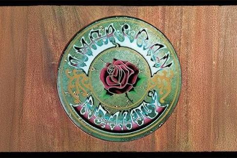
The Grateful Dead moved toward a more acoustic and country-influenced sound on 1 November 1970 and the cover of this album is a stunning example of psychedelic folk art. Created by the duo Mouse and Kelley, the central graphic features a beautifully detailed rose and a stylized font that is actually a clever ambigram. When the text is viewed in a certain way, the words American Beauty can also be read as American Reality which provided a subtle and deep commentary on the state of the nation. This dual meaning was a hallmark of the band’s intellectual depth and their roots in the counterculture of San Francisco during the late sixties.
The warm colours and the intricate wood-block style of the illustration gave the record a timeless and organic feel that matched the harmony-heavy songs like Ripple and Friend of the Devil. This artwork helped to solidify the band’s visual identity as the leaders of the jam-band scene while also appealing to a broader audience who appreciated the craftsmanship of the design. It is a piece of art that rewards close inspection and it perfectly captures the spirit of a band that was always looking for deeper meanings beneath the surface of things. The rose has since become an enduring symbol for the band’s legacy and it continues to appear on countless pieces of merchandise and fan art.
The Rise And Fall Of Ziggy Stardust
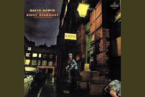
David Bowie returns to the list with the 1972 cover that introduced the world to his most famous alter ego in the shadows of a rainy London street. Photographed by Brian Ward outside a furrier’s shop on Heddon Street, the image shows Bowie as an alien rock star standing under a sign that reads K. West. The dark and moody atmosphere was enhanced by hand-colouring the original black and white photograph which gave the scene a strange and theatrical quality that felt like a science fiction movie. It captured the moment when the mundane reality of post-war Britain was being invaded by the glittering and flamboyant energy of glam rock.
The phone box on the back cover and the discarded boxes on the pavement provided a gritty and urban backdrop that made the character of Ziggy Stardust feel like he had just landed from another planet. This image was instrumental in creating the mythology of the album and it turned a quiet London side street into a permanent site of pilgrimage for fans from around the world. It is a masterpiece of storytelling through a single frame because it perfectly balances the themes of stardom and isolation and urban decay. This cover remains a definitive statement on the power of reinvention and it is the image that most people think of when they remember the genius of David Bowie.
Sticky Fingers
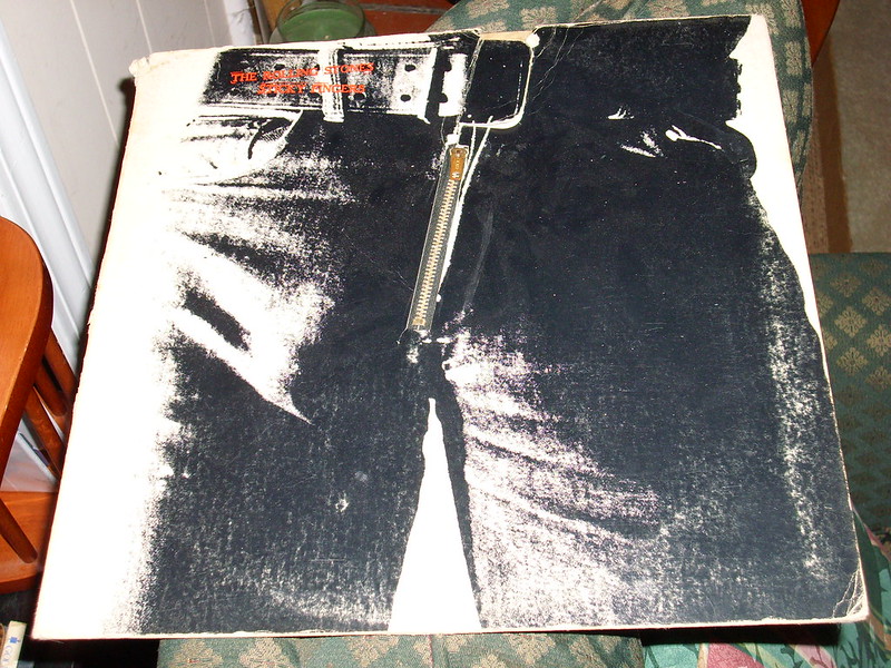
The Rolling Stones launched their own record label on 23 April 1971 with a cover designed by the legendary pop artist Andy Warhol that was as scandalous as the band’s reputation. The original vinyl release featured a working metal zipper on a pair of tight jeans which fans could pull down to reveal a pair of white cotton briefs underneath. This tactile and interactive element was a stroke of marketing genius that made the album an immediate must-have item for collectors and curious teenagers alike. It was a bold and sexually suggestive statement that perfectly captured the hedonistic and rebellious spirit of the band during their most creatively fertile period.
Although the man in the photograph was long rumoured to be Mick Jagger, it was actually one of Warhol’s many muses and the mystery only added to the allure of the artwork. The zipper caused several problems for record shops because it would often scratch the vinyl of the other albums stacked next to it but this only added to its legendary status as a dangerous object. This cover represented the intersection of high art and rock and roll and it proved that the packaging of a record could be a provocative piece of performance art in its own right. It remains one of the most famous and controversial designs in history and it perfectly encapsulates the grit and glamour of the Stones.
Like this story? Add your thoughts in the comments, thank you.


