
Why This Decade’s Covers Still Spark Arguments

The 1980s represented a golden era where the visual identity of an artist was just as vital as the melodies pressed into the vinyl. During these years, the album sleeve evolved from a simple protective jacket into a high-stakes piece of contemporary art that defined cultural movements and sparked intense playground debates. Fans did not just buy a record for the music because the physical object served as a totem of their identity, which is why these images remain so deeply etched into our collective memory today.
This decade saw a shift toward bold experimentation because the rise of MTV and global superstardom demanded a visual language that was both shocking and sophisticated. From the moody minimalism of post-punk to the neon-soaked excess of pop, the artwork of the eighties captured a world in transition. We still argue about these covers because they represent a time when music felt tangible and every brushstroke or photograph told a story that was meant to last forever.
Rio By Duran Duran

The artwork for Duran Duran’s second studio album remains one of the most celebrated symbols of the glamorous eighties pop aesthetic. Created by the talented illustrator Patrick Nagel, the cover features a stylized, fashion-forward woman whose sharp features and enigmatic smile perfectly captured the high-gloss aspirations of the New Romantic movement. It was released in May 1982 and the image quickly became an icon of the era because it blended a clean graphic design style with a sense of jet-set luxury that the band championed through their music videos. Fans often recall how the striking pink and purple hues felt incredibly modern at the time and this helped the record stand out on crowded shop shelves across the globe.
While many covers of the decade relied on photography, this illustrated approach gave the band a timeless and sophisticated edge that still feels fresh decades later. The designer Malcolm Garrett was responsible for the overall layout and he ensured that the typography complemented Nagel’s work without ever distracting from the central figure. Interestingly, the original painting was actually quite large and it remains a prized piece of art history today because it represents the moment when pop music fully embraced the world of high fashion and graphic illustration. This cover did more than just house a record since it defined a specific brand of British cool that resonated with millions of listeners who wanted to live in that vibrant and colourful world.
Unknown Pleasures By Joy Division

Although technically released in the final months of 1979, this haunting design defined the visual language of the early eighties post-punk scene and remains a constant fixture on t-shirts and posters today. The image is actually a data plot of signals from the first discovered pulsar and it was chosen by the band after they found the diagram in a Cambridge Encyclopaedia of Astronomy. Peter Saville was the mastermind behind the minimalist aesthetic and he famously decided to print the white lines against a textured black background without any text on the front. This bold move forced the listener to engage with the mystery of the music because there were no names or titles to guide their initial expectations of the sound.
The genius of this cover lies in its scientific coldness which somehow manages to feel deeply emotional and human when paired with the late Ian Curtis’s baritone vocals. It is a rare example of a design that has transcended its original purpose to become a universal symbol for underground culture and brooding intellectualism. Since its release, the image has been dissected by fans and scholars alike who find new meaning in those jagged white peaks that seem to pulse with a hidden energy. It proved that a cover did not need a face or a logo to be iconic because the sheer power of the abstract imagery was enough to leave a permanent mark on the history of modern music.
Purple Rain By Prince
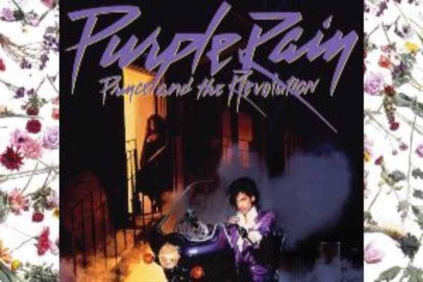
Prince solidified his status as a global phenomenon with the release of this soundtrack in June 1984 and the cover art is nothing short of legendary. The photograph depicts the artist sitting astride a customized Honda motorcycle while he is framed by an archway in a misty backlot setting that feels both cinematic and intimate. Clad in his signature purple trench coat with a ruffled shirt, he stares directly into the camera with a look of absolute confidence that defined the Minneapolis sound for a generation. The use of flowers around the border adds a touch of romanticism and psychedelic flair which perfectly mirrors the eclectic mix of rock, R&B, and pop found within the grooves of the vinyl.
This image was crucial because it helped to build the mythology of the Purple One as a mysterious and multi-talented superstar who existed in his own vivid universe. Every element of the composition was carefully curated to project a sense of royalty and rebellion while the purple lighting creates an atmosphere that is both moody and electric. Fans often point to this cover as the pinnacle of eighties stardom because it captures a performer at the very height of his creative powers. It remains a masterclass in branding and visual storytelling because it tells you exactly what kind of emotional journey you are about to embark upon before the needle even touches the record.
Power Corruption And Lies By New Order
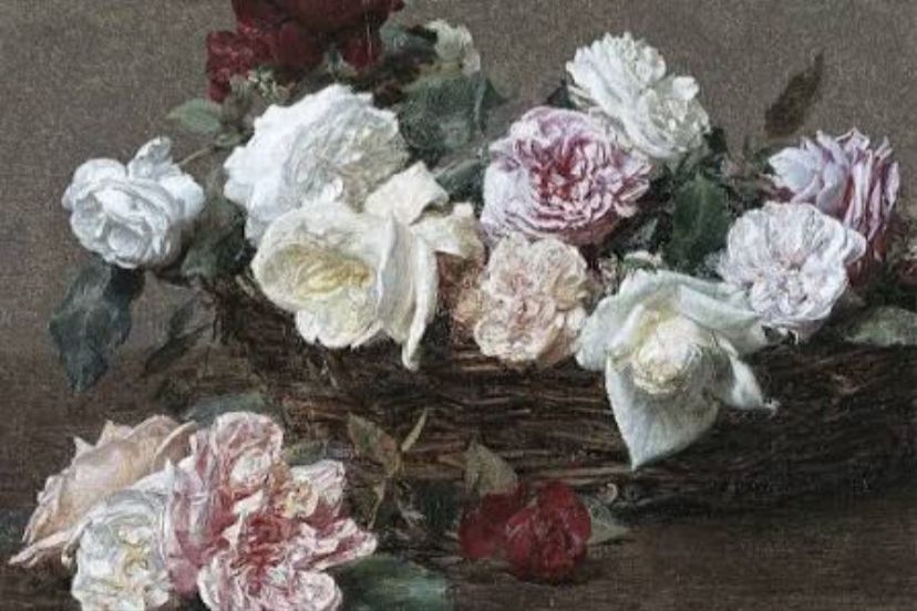
Peter Saville returned to create another masterpiece for New Order in 1983 and he chose a strikingly different path from his previous work with Joy Division. The cover features a beautiful nineteenth-century painting by Henri Fantin-Latour titled A Basket of Roses which Saville found on a postcard at the National Gallery. By juxtaposing this classical and delicate floral arrangement with the cold and industrial sound of electronic dance music, he created a visual tension that was incredibly sophisticated. He also included a mysterious colour-coded wheel in the corner that could be used to decode the band’s name and the album title because he wanted to maintain a sense of anonymity and artistic purity.
This specific design is often cited by art students and music fans as a high point of British graphic design because it challenged the traditional conventions of how a rock band should present themselves. The contrast between the old world beauty of the oil painting and the modern technology of the music inside created a feeling of timelessness that few other albums achieved. It suggested that New Order were moving away from the shadows of their past and into a new era of light and melody even though they remained elusive. The cover remains a testament to the idea that pop art can be high art because it brought classical aesthetics into the bedrooms of teenagers who were looking for something deeper than just another hit single.
Grace Jones Island Life By Grace Jones
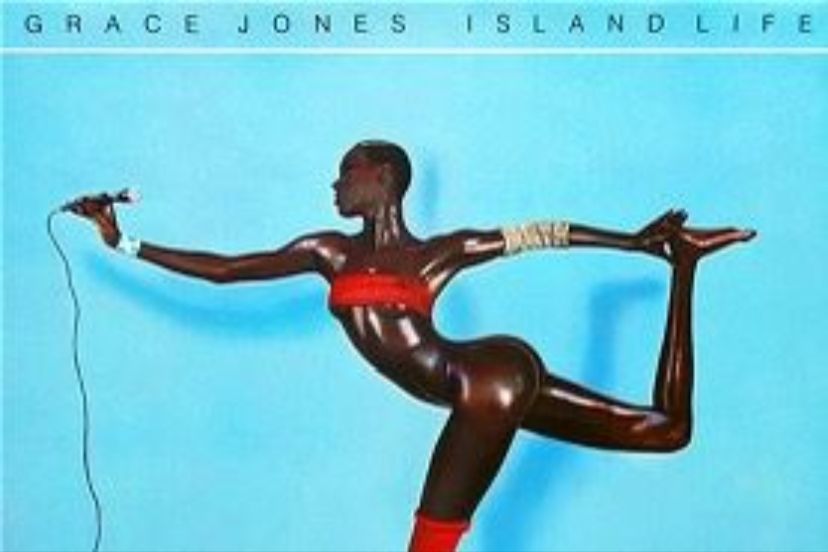
Jean-Paul Goude created one of the most physically impossible and visually stunning images of the decade for this 1985 compilation album. The cover features Grace Jones in a gravity-defying pose that suggests she is a superhuman statue rather than a mere mortal and this was achieved through a complex process of photo-montage. Goude cut and pasted different parts of her body to elongate her limbs and create an arabesque shape that would be impossible for any human to hold in real life. This resulted in a masterpiece of minimalism and strength that perfectly encapsulated her fierce persona and the avant-garde nature of her music which blended reggae with new wave and disco.
The stark blue background provides a vivid contrast to her dark skin and the sharp lines of her silhouette and this made the record jump out from the shelves in an almost aggressive way. It is an image that celebrates the female form as a powerful and geometric entity rather than just an object of desire and this resonated strongly with the burgeoning feminist and queer movements of the time. Fans still marvel at the technical skill involved in creating such a seamless illusion before the invention of modern digital editing software. It remains a definitive piece of eighties iconography because it pushed the boundaries of what a photograph could represent and turned an album cover into a monumental work of surrealist art.
The Queen Is Dead By The Smiths
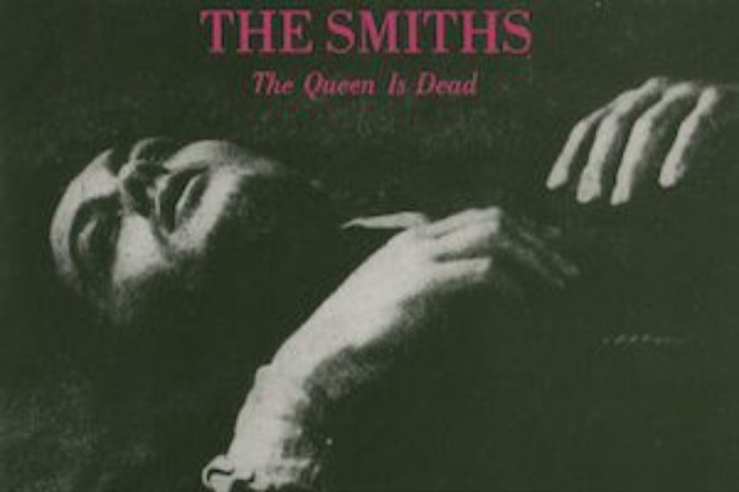
Released in June 1986, the cover for this seminal indie album features a grainy green-tinted film still of the French actor Alain Delon from the 1964 movie L’Insoumis. Morrissey was famous for hand-picking the artwork for every Smiths release and he chose this image because it captured a sense of tragic beauty and cinematic melancholy that matched his lyrics. The sight of Delon lying on the floor looking exhausted and defeated resonated with a generation of youth who felt alienated by the glossy mainstream culture of the mid-eighties. By using a cult film star instead of a band photo, they established a unique visual identity that felt more like a literary movement than a typical pop group.
The choice of the bold pink typeface for the title provided a jarring contrast to the somber green image and this subtle subversion was a hallmark of the band’s style. It was a cover that demanded to be studied and understood because it felt like a secret handshake for those who appreciated independent cinema and outsider poetry. Even today, the image is synonymous with the rainy streets of Manchester and the intellectual yearning of British guitar music because it feels so deeply personal. It proved that you did not need a massive budget or flashy effects to create a lasting impression as long as you had a clear vision and a connection to the history of art and film.
Born In The U S A By Bruce Springsteen
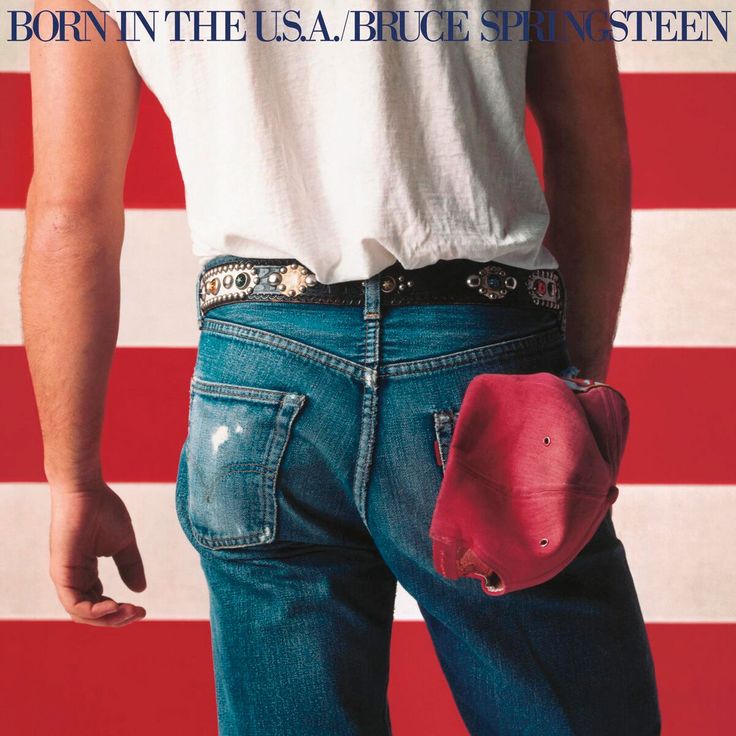
Annie Leibovitz captured what is perhaps the most famous backside in music history for Bruce Springsteen’s massive 1984 release. The image features The Boss standing in front of the American flag with his back to the camera while he wears a pair of worn-out Levi’s and a red cap tucked into his pocket. It is a deceptively simple photograph that sparked a huge amount of political debate because some saw it as a patriotic celebration while others viewed it as a gritty depiction of the working-class struggle. The framing and the focus on the denim and the flag created a powerful symbol of American identity that was both humble and heroic at the same time.
This cover was instrumental in turning Springsteen into a stadium-filling superstar because it made him feel like an everyman that anyone could relate to regardless of their background. The absence of his face on the front cover was a bold choice that allowed the audience to project their own stories onto the image of the blue-collar worker. It became an instant classic because it tapped into the visual language of the heartland and the promise of the American dream during a period of great economic change. Fans still love this cover for its honesty and its lack of pretension because it represents a time when rock music was deeply rooted in the realities of daily life for the average person.
Synchronicity By The Poly
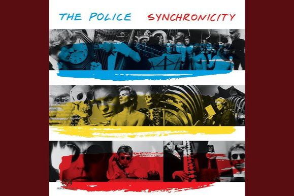
The final studio album from The Police was released in June 1983 and it featured a clever and colourful design that made use of a horizontal striping technique. There were actually thirty-six different variations of the cover available which featured different combinations of black and white photographs of Sting, Stewart Copeland, and Andy Summers. Each photo was overlaid with primary yellow, red, and blue brushstrokes that gave the record a frantic and artistic energy that mirrored the tension within the band at the time. This gimmick encouraged fans to collect multiple versions of the same album and it turned the act of buying a record into a more interactive and personalized experience.
The concept was inspired by the idea of synchronicity developed by Carl Jung and the fragmented nature of the design perfectly captured the sense of disconnectedness and meaningful coincidence. By breaking the band members into separate strips of imagery, the cover subtly hinted at the creative friction that would eventually lead to their breakup shortly after the world tour. It is a visually busy and intellectually stimulating piece of work that stands out because it avoided the typical group portrait in favour of something more abstract and modern. The bright splashes of colour were a perfect fit for the early eighties aesthetic and ensured that the album remains one of the most recognizable products of the MTV generation.
Like A Virgin By Madonna
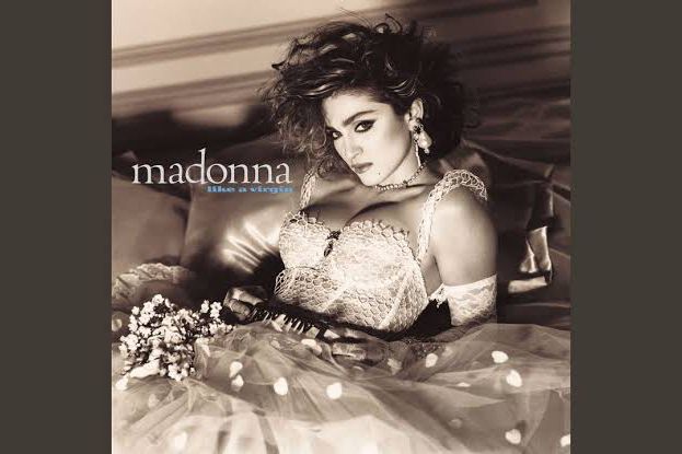
When Madonna released her second album in November 1984, she became an instant cultural lightning rod and the cover art played a massive role in that transformation. Photographed by Steven Meisel, she is seen reclining on a bed of white satin while she wears a wedding dress and a belt buckle that famously says Boy Toy. This juxtaposition of bridal innocence with overt sexuality was a calculated move that challenged social norms and made her a hero to millions of young women. The image was soft and romantic yet it possessed an underlying sense of rebellion that defined her career and the provocative spirit of the decade.
The cover helped to establish the aesthetic of the eighties which was all about layering accessories and mixing high and low fashion in a way that felt entirely new. Fans were obsessed with her lace gloves and crucifixes and this look was replicated in high schools and malls across the world almost overnight. It was more than just a promotional photo because it served as a manifesto for self-expression and female empowerment in a male-dominated industry. Even now, the image of Madonna in that white dress remains one of the most iconic photographs in the history of pop culture because it captured the exact moment a star became a legend. It proved that a well-executed visual concept could be just as influential as the music itself when it came to capturing the public imagination.
Brothers In Arms By Dire Straits

The 1985 release from Dire Straits featured a cover that was as clean and precise as the digital recording technology used to create the music. It depicts a 1937 National Style O Resonator guitar floating against a serene blue sky with a few wispy clouds and this simple image became synonymous with the high-fidelity sound of the eighties. The guitar itself belonged to Mark Knopfler and the photograph was taken by Deborah Feingold who managed to make the cold metal of the instrument look warm and inviting. This was one of the first major albums to be promoted heavily on the new Compact Disc format and the sleek artwork was perfectly suited for the smaller jewel cases that were beginning to replace vinyl.
This cover became a symbol of the decade’s obsession with technological progress and sophisticated production values because it looked so polished and professional. The bright blue hues and the metallic gleam of the guitar suggested a sense of calm and mastery that appealed to a wide demographic of music listeners around the world. It is a rare example of a cover that is both understated and incredibly effective because it relies on a single powerful object to convey the entire mood of the album. Fans still associate this image with the soaring guitar solos and the smooth rock sound that dominated the airwaves during the mid-eighties and it remains a masterclass in minimalist branding.
Appetite For Destruction By Guns N’ Roses
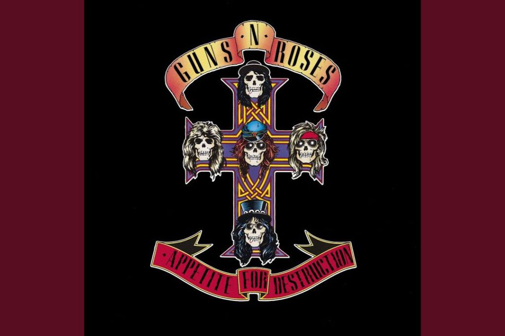
When this hard rock masterpiece arrived in July 1987, it carried an image that would define the gritty underbelly of the Los Angeles scene. The cover features a Celtic cross adorned with the skull portraits of the five band members, which was actually a secondary choice after the original robotic scene was deemed too controversial for retailers. Designed by Billy White Jr., the tattoo-style graphic perfectly captured the dangerous and rebellious spirit of a band that was quickly becoming the most notorious group on the planet. The vibrant colours and intricate line work gave the album a visual edge that matched the raw and unfiltered energy of the music found on the disc.
This artwork was pivotal because it helped to establish a visual brand for the band that was both menacing and iconic at the same time. Fans across the globe began to see these skulls as symbols of a new kind of rock royalty that rejected the polished hair metal trends of the time. The cross design became so popular that it was replicated on millions of t-shirts and even inspired countless real-life tattoos among the dedicated fanbase. It remains a testament to the power of a strong graphic identity because it managed to translate the chaotic energy of the Sunset Strip into a single and unforgettable emblem of rock history.
Hounds Of Love By Kate Bush
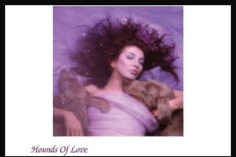
Kate Bush has always been an artist who prioritises her visual presentation and her 1985 masterpiece is perhaps her most intimate and beautiful cover. The photograph shows Kate reclining in a soft purple light while she is flanked by two large and gentle Weimaraner dogs that seem to protect her. This image was captured by her brother John Carder Bush and it manages to feel both ethereal and grounded which reflects the two distinct sides of the record. The use of pastel tones and the dreamy soft focus helped to create a sense of safety and vulnerability that resonated deeply with listeners who were drawn into her unique sonic world.
The choice to include the dogs was a stroke of genius because it added a layer of warmth and companionship to an album that explored themes of love and isolation. It stands out from other eighties covers because it avoids the typical neon and sharp angles in favour of a more organic and painterly aesthetic. Fans often discuss how the cover feels like an invitation into Kate’s private sanctuary where the boundaries between reality and mythology are blurred. This image helped to solidify her status as a visionary who controlled every aspect of her art and it remains one of the most beloved and evocative portraits in the history of British music.
Disintegration By The Cure
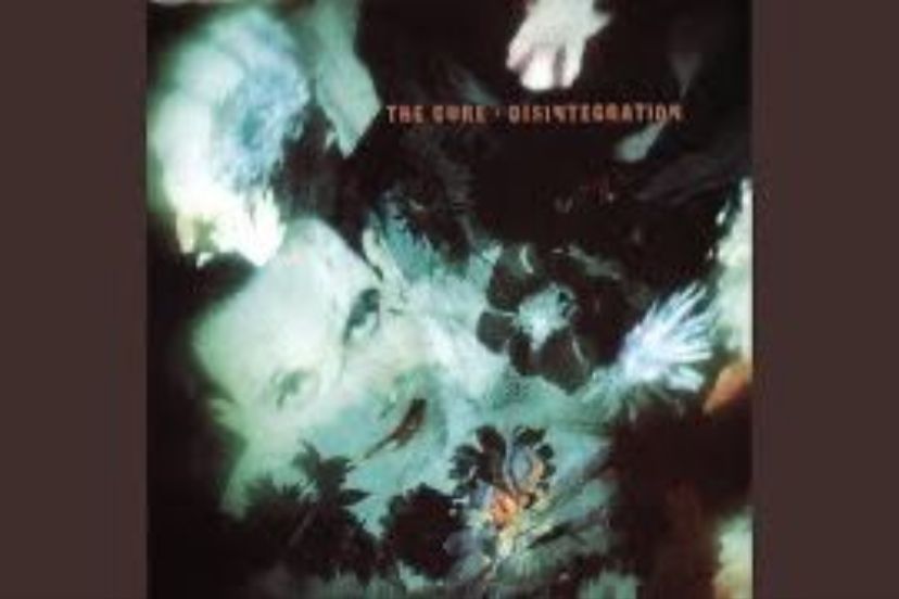
As the eighties drew to a close in 1989, The Cure released an album that would become the definitive statement of gothic melancholia. The cover features a blurred and haunting portrait of Robert Smith surrounded by decaying flowers and autumn leaves that seem to float in a dark and watery void. Designed by the long-time collaborators at Parched Art, the image perfectly mirrors the lush and atmospheric soundscapes of the music which was famously described as being unbearably sad. The smudged textures and deep blues and greens created a sense of drowning in emotion which was exactly what the band wanted to convey to their devoted followers.
This specific artwork is often cited as a high point of the decade’s alternative scene because it captured a mood rather than just a face. It felt incredibly personal and introspective at a time when much of the mainstream was focused on superficial glamour and bright lights. For many fans, the sight of Robert Smith’s obscured features through the layer of flora represented the feeling of being lost in one’s own thoughts and memories. It remains a powerful piece of visual storytelling because it manages to be beautiful and unsettling all at once which ensured its place as a cornerstone of the decade’s visual legacy.
Sign O The Times By Prince
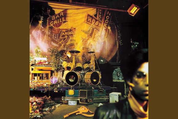
Prince makes a second appearance on this list with the sprawling 1987 double album that many critics consider to be his greatest achievement. The cover is a fascinating and cluttered tableau that looks like the aftermath of a massive party or a theatrical production that has just finished. It features a drum kit with the iconic peace sign and various props scattered around a stage while a blurred image of Prince stands in the foreground. This was a departure from his previous covers because it felt more like a piece of installation art that invited the viewer to look closer and find hidden details within the colourful chaos.
The artwork perfectly represented the eclectic and experimental nature of the music which touched on everything from funk and soul to social commentary and rock. By placing himself in the background, Prince suggested that the music and the message were more important than the celebrity persona he had built over the years. This sense of mystery and depth made the record feel like a significant cultural event rather than just another pop release in a crowded market. It remains a fan favourite because it captures the restless creativity of an artist who was constantly pushing the boundaries of what a pop star could be and how they should look.
True Blue By Madonna

For her third studio album in 1986, Madonna worked with the legendary photographer Herb Ritts to create a cover that was inspired by the classic Hollywood glamour of the past. The image is a stylized profile shot of the singer with her head tilted back and her eyes closed which highlights her porcelain skin and her iconic blonde crop. The cool blue tint of the photograph gave the record a sophisticated and artistic feel that helped to transition her image from a pop provocateur into a global icon of style. It was a masterclass in minimalism that proved Madonna could command attention without the need for elaborate costumes or provocative props.
This cover is often compared to a marble statue because of its classical beauty and the way it celebrates the contours of the face and neck. It was a bold move that showed a new level of maturity and confidence which was reflected in the more personal songwriting found on the tracks inside. Fans were struck by how different she looked compared to her earlier eras and this ability to reinvent herself became her greatest strength as an entertainer. The image remains one of the most famous photographs of the twentieth century because it captured the essence of stardom in its purest and most elegant form during the height of the eighties.
1984 By Van Halen
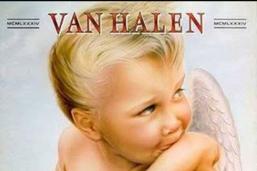
Released appropriately in January 1984, this album features one of the most recognizable and humorous covers in the history of hard rock. It depicts a young cherub with a mischievous expression who is sneaking a cigarette while he leans against a cloud with a pack of smokes nearby. The painting was created by Margo Nahas who had originally been asked to paint a group of dancing girls but she offered this piece instead and the band loved it immediately. This cheeky and slightly rebellious image perfectly matched the high-energy and fun-loving spirit of the music that made Van Halen the kings of the arena rock circuit.
The cover was actually censored in some parts of the world because of the depiction of a smoking child but this only added to the record’s notoriety and appeal among teenage fans. It was a brilliant piece of branding that stood out from the typical leather and studs seen on most heavy metal albums of the period. By using a classical figure like a cherub in a modern and subversive way, the band showed that they didn’t take themselves too seriously even though their musical talent was immense. It remains a definitive piece of eighties pop art that continues to spark smiles and conversations among music lovers of all ages.
No Jacket Required By Phil Collins
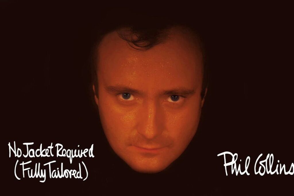
Phil Collins became an inescapable presence in the mid-eighties and the cover for his 1985 solo album is a perfect example of his straightforward and relatable appeal. The image is a simple and tight close-up of his face bathed in a warm and glowing orange light that makes him look like he is standing next to a fire. There are no fancy graphics or hidden meanings here since the focus is entirely on the man and his expression of quiet intensity and sincerity. This approach helped to build a strong personal connection with his audience who saw him as an ordinary guy who just happened to be a world-class songwriter.
The warm colour palette was a deliberate choice that made the album feel accessible and inviting to a massive global audience across many different cultures. At a time when many artists were hiding behind masks or heavy makeup, Phil’s decision to be seen so clearly was a refreshing change that paid off in millions of record sales. It is an image that is inextricably linked to the smooth and polished pop-rock sound that dominated the radio for much of the decade. Fans still appreciate this cover for its honesty and its lack of pretension because it represents a time when a great voice and a simple photograph were all you needed to reach the top.
So By Peter Gabriel
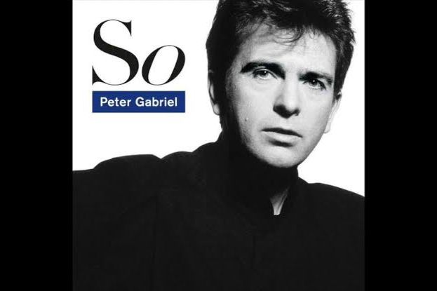
Peter Gabriel released his most commercially successful album in 1986 and he chose a cover that was as striking as the innovative music videos that accompanied the singles. The photograph is a high-contrast black and white portrait of Gabriel taken by Trevor Key which captures him in a moment of intense focus and clarity. The simplicity of the composition was a reaction to the overly complex and busy covers he had used for his previous self-titled albums throughout the late seventies and early eighties. By stripping away the distractions, he allowed his own features to tell the story of an artist who had finally found his definitive sound and vision.
The use of shadows and light in this portrait gives it a timeless quality that has prevented it from looking dated like many other products of the mid-eighties era. It reflects the soulful and rhythmic nature of the songs like Sledgehammer and In Your Eyes which blended world music influences with modern pop sensibilities. This cover is often praised for its dignity and its artistic restraint which signaled that Gabriel was a serious musician who was also capable of topping the charts. It remains a powerful example of how a well-executed portrait can become an iconic symbol of a creative peak that resonates with fans for many decades after its initial release.
Treasure By Cocteau Twins
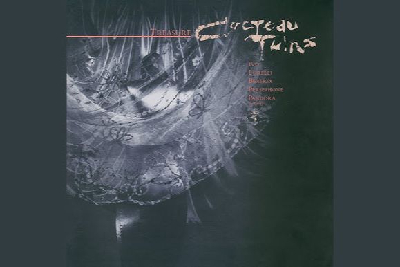
The 1984 release from the Cocteau Twins features a cover that is just as mysterious and beautiful as the ethereal vocals of Elizabeth Fraser. Designed by 23 Envelope, the artwork shows a close-up of delicate lace and fine fabric that is draped in a way that suggests hidden depths and secret histories. The soft textures and the muted tones created a visual language that was perfectly suited to the band’s dream-pop sound which often felt like it was drifting in from another dimension. It was a cover that encouraged the listener to slow down and appreciate the intricate beauty of the small details rather than looking for a quick thrill.
This aesthetic became highly influential within the independent music scene because it showed that you could create a powerful atmosphere without using traditional imagery. The focus on texture and light gave the album a tactile quality that made the physical vinyl feel like a precious object that needed to be handled with care. Fans often talk about how the cover feels like a visual representation of the shimmering guitar layers and the nonsensical yet emotional lyrics found within the music. It remains a masterclass in atmospheric design that proved that the most lasting images are often the ones that leave the most to the imagination of the viewer.
The Number Of The Beast By Iron Maiden
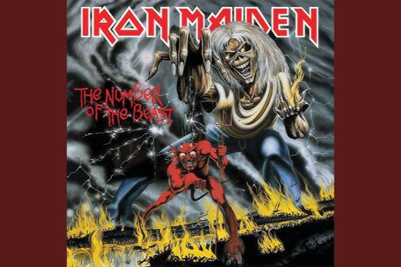
Iron Maiden’s third studio album arrived in March 1982 and it featured one of the most controversial and instantly recognisable illustrations in the history of heavy metal. Created by the artist Derek Riggs, the cover depicts the band’s skeletal mascot, Eddie, manipulating the Devil like a puppet while the Devil himself controls a smaller version of Eddie. This clever and provocative layered concept was originally intended for a single but it was deemed so powerful that the band saved it for this full-length release. The vibrant reds of the hellish landscape and the intricate detail of the characters made it an immediate standout on record shop shelves across the world because it was so much more detailed than its peers.
The artwork sparked a massive amount of debate because some religious groups in America saw it as a literal promotion of the occult which actually helped the notoriety and sales of the record. Despite the dark imagery, the painting possesses a comic-book energy and a sense of dark humour that became a staple of the band’s identity for decades to come. Fans spent hours studying the small details in the background because Riggs often hid secret messages and artistic flourishes within the chaotic scene. It remains a definitive piece of eighties iconography because it proved that heavy metal could be visually sophisticated and narratively complex while still maintaining its rebellious and high-energy edge that fans loved.
The reliance on a single creative factory or specific design house often leads to a homogenized culture where every artist begins to look the same.
Like this story? Add your thoughts in the comments, thank you.


