
1. The Velvet Underground And Nico

Before album covers were expected to sell excitement, this one chose stillness. The pale banana against a blank background felt almost awkward on a record store wall full of color and faces. It did not explain itself or offer clues. That silence was intentional. In the late sixties, this kind of restraint felt bold. The cover asked the viewer to slow down and look closer, to sit with discomfort rather than rush past it. It suggested that the music inside would not follow familiar paths or provide easy pleasure.
What made the image last was its refusal to perform. Over time, listeners began to associate that quiet confidence with the album’s sound and attitude. The cover never chased relevance, which is why it still feels relevant. It became a symbol of trusting the audience to engage without instruction. Even now, the image feels modern because it resists explanation. It reminds us that some of the most influential art arrives quietly, waits patiently, and lets curiosity do the rest.
2. The Freewheelin Bob Dylan
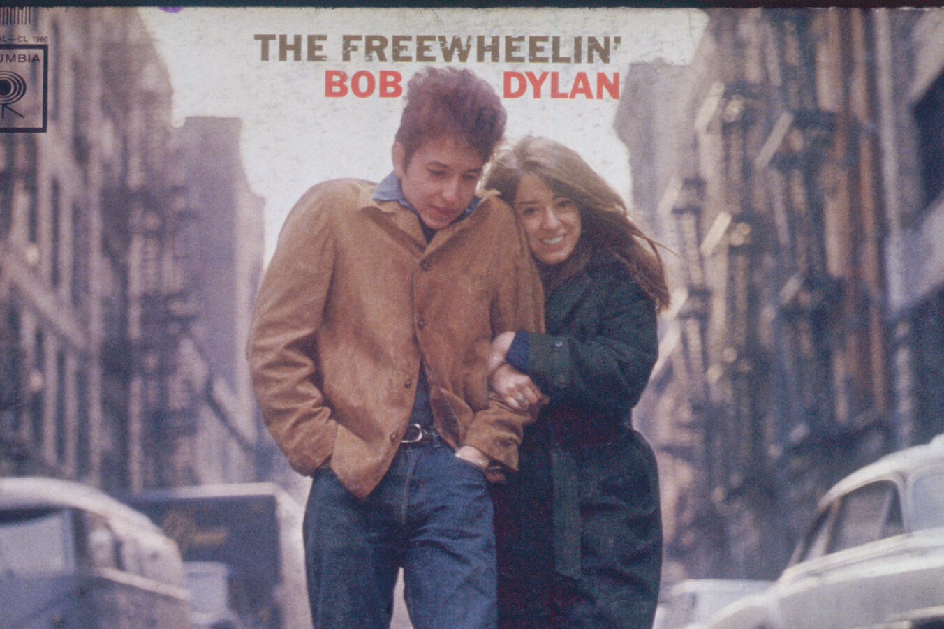
This cover feels like a moment borrowed from real life. Bob Dylan walks down a city street with someone close beside him, bundled against the cold, caught mid step. There is no pose, no performance, just movement and closeness. In the early sixties, this honesty mattered. The image suggested that the music came from lived experience rather than distance or myth. It felt approachable, like a photograph taken by a friend rather than a promotional tool.
The cover endured because it made connection feel natural. Listeners saw themselves in it, or at least the version of themselves they wanted to be. The city looks familiar, not romanticized. Over time, the image became tied to authenticity and trust. It still resonates because it captures intimacy without trying to frame it as special. The cover reminds us that sometimes the most lasting images are the ones that feel ordinary, honest, and quietly shared.
3. Sgt Pepper’s Lonely Hearts Club Band
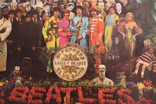
This cover does not reveal itself all at once. Faces, colors, and symbols crowd the frame, inviting attention and curiosity. People lingered over it, pointing things out, debating meanings, discovering something new each time. In the late sixties, this abundance reflected the cultural moment perfectly. Everything felt layered, busy, and full of influence. The cover turned listening into an event before the record ever played.
What gave the image lasting power was its generosity. It never exhausted itself. Each viewing offered another detail to notice. Over time, the cover became inseparable from the idea that albums could be complete worlds. It trusted viewers to engage deeply rather than glance and move on. Even now, the image feels alive because it rewards patience. It reminds us that art can be interactive without instructions, inviting people to return again and again.
4. Are You Experienced
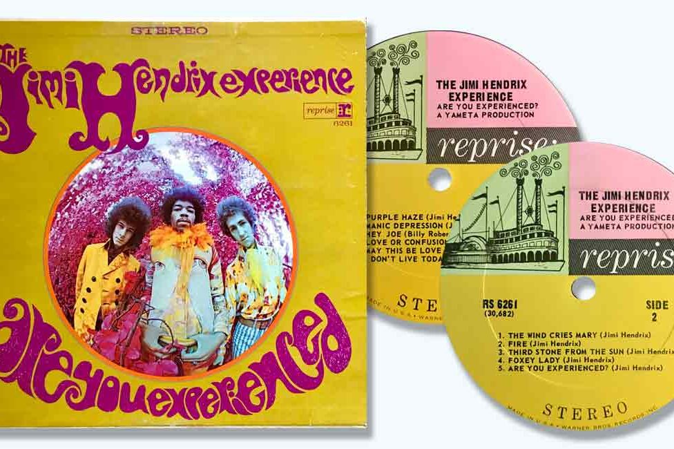
This cover relies on presence more than explanation. Jimi Hendrix’s gaze feels steady and unpredictable at the same time. The image bends reality just enough to signal that something unfamiliar is coming. Before hearing a note, listeners sensed that expectations might not hold. That anticipation mattered in a decade hungry for new sound and new freedom. The cover prepared people for experimentation without spelling it out.
Its endurance comes from trusting mood over message. The image does not tell you how to feel. It creates atmosphere and lets curiosity take over. Over time, the cover became tied to the idea of creative possibility. It still feels alive because it does not date itself with excess or trend. The focus remains human, grounding innovation in emotion. The cover reminds us that sometimes a single expression can suggest change more effectively than any elaborate design.
5. Blonde On Blonde

This cover feels slightly out of focus, as if clarity slipped away at the last moment. That softness feels intentional. The image mirrors music layered with thought, restlessness, and ambiguity. Nothing about it feels polished or finished. In the mid sixties, that imperfection resonated with listeners navigating uncertainty and change. The cover did not offer answers. It accepted confusion as part of the experience.
What makes the image last is its honesty. It does not tidy itself up for comfort. Over time, listeners connected that blur with emotional depth rather than flaw. The cover feels unedited, like a moment someone chose not to correct. It remains compelling because it allows ambiguity to exist without apology. The image reminds us that not everything meaningful arrives sharp and clear. Sometimes truth lives in the places that refuse to settle.
6. Out Of Our Heads
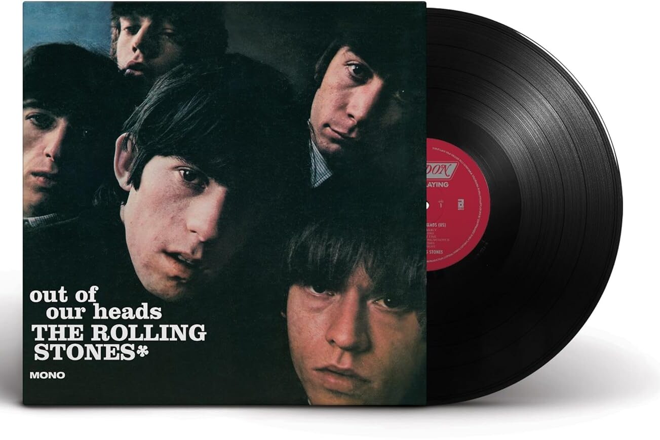
This cover does not try to charm or soften its message. The faces look restless, almost impatient, as if the photograph interrupted them mid thought. Nothing feels carefully arranged for comfort. The expressions suggest tension and movement rather than ease. In the mid sixties, that unease felt honest. Youth culture had not yet learned how to polish rebellion into something neat. This image captured it in its raw state. It reflected a moment when attitude mattered more than approval and uncertainty felt closer to truth than confidence.
What gives the cover lasting power is its refusal to smooth itself out over time. It never tried to explain or correct its roughness. Listeners sensed immediately that the music inside would carry the same edge. Over the years, the image became a reference point for authenticity rather than style. It still resonates because it reminds us that rebellion once looked awkward and unresolved. That awkwardness is exactly why the cover endures, standing as proof that honesty often ages better than perfection.
7. Astral Weeks
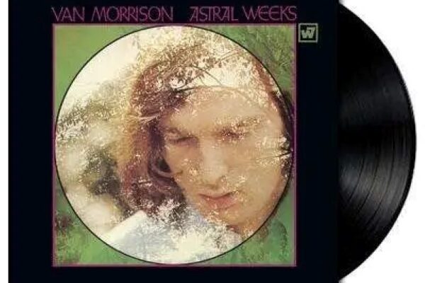
This cover feels quiet in a way that asks for patience. The portrait is turned inward, thoughtful and distant, as if the subject is listening to something unheard. Shadows soften the image, creating intimacy rather than drama. There is no performance here, no attempt to impress. Instead, the cover suggests that listening will require stillness. In a decade filled with visual noise, this restraint felt intentional. It prepared the listener for music that unfolded gently and emotionally rather than announcing itself loudly.
The image has endured because it respects silence. It does not rush meaning or demand reaction. Over time, listeners came to associate the cover with emotional honesty and reflection. It feels personal, like something meant for a quiet room and a private moment. The artwork continues to resonate because it honors vulnerability without explaining it. It reminds us that some albums ask us not to watch closely, but to listen carefully and let feeling take its time.
8. A Clockwork Orange Made The Theater Uncomfortable On Purpose
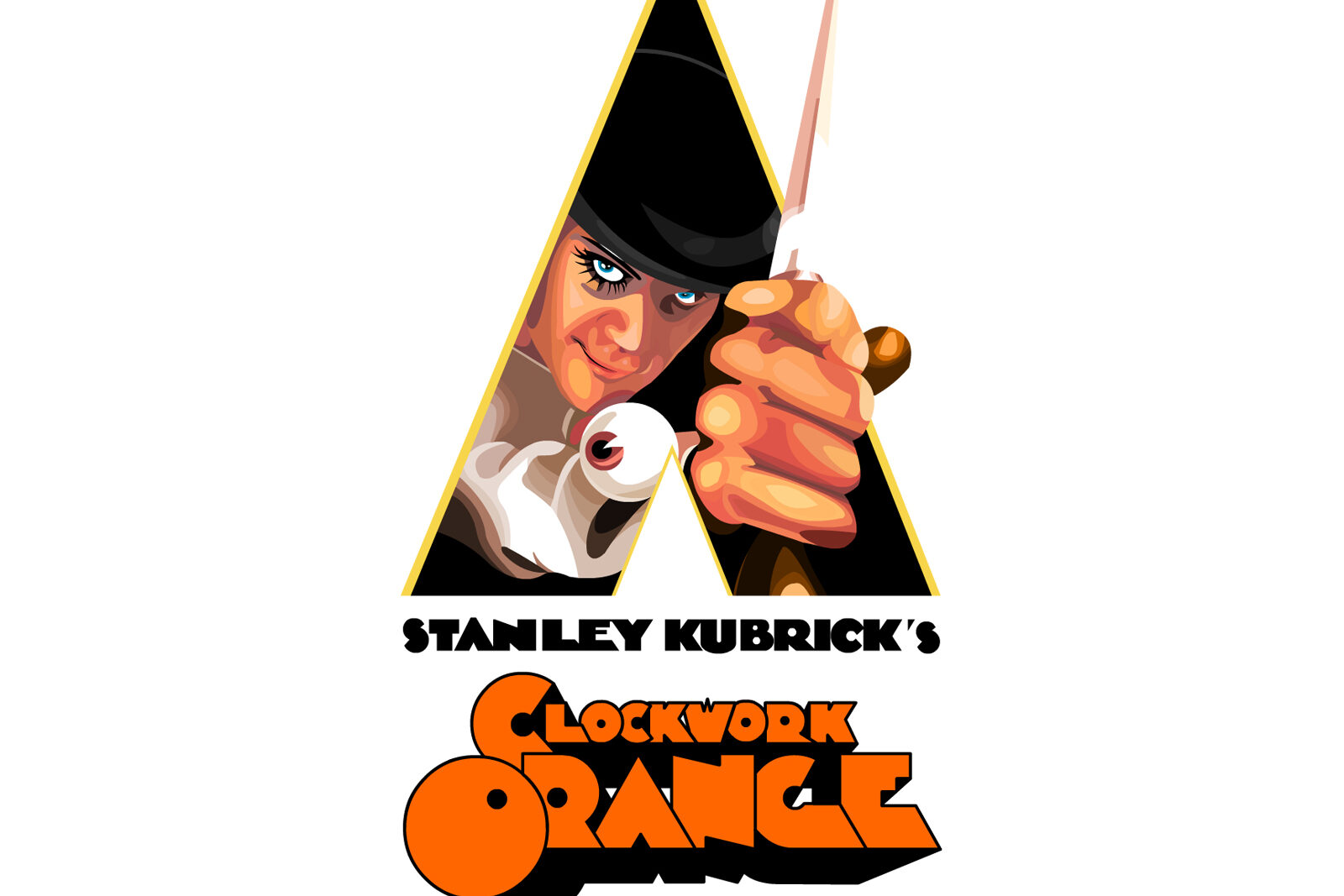
A Clockwork Orange created an atmosphere inside movie theaters that felt tense before the story even settled in. Audiences watched carefully, unsure how to react to what they were seeing. Sitting in a crowded room made that uncertainty stronger, because reactions stayed restrained and cautious. People shifted in their seats, listening closely to dialogue and music that felt deliberately unsettling. The experience was not about relaxation or escape. It was about sitting with discomfort while surrounded by others doing the same.
The film challenged viewers without offering relief. Scenes lingered, ideas felt confrontational, and silence in the theater carried weight. Watching it with others intensified that feeling, as no one wanted to be the first to break the mood. After the lights came up, conversations started slowly, often circling questions rather than conclusions. Moviegoing became a shared confrontation with difficult ideas, where the presence of others made the experience harder to dismiss and impossible to ignore.
9. Music From Big Pink
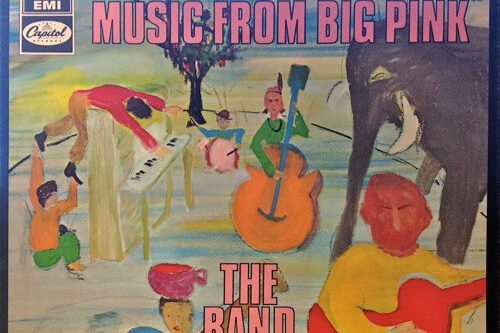
This cover does not hurry the viewer. The painted scene feels warm and familiar, like a place remembered rather than visited. It suggests roots, continuity, and shared history. In a decade full of experimentation and visual noise, this grounded feeling stood apart. The image invited calm instead of excitement, offering a sense of home before the music began. It hinted that the songs inside would value connection over spectacle and tradition over novelty.
The artwork has lasted because it never competed for attention. Instead, it offered presence. Over time, listeners came to associate the cover with comfort and authenticity. It became a visual companion to music that honored the past without feeling stuck in it. The cover still resonates because it does not demand interpretation. It simply exists, reminding us that sometimes the most meaningful art is the kind that lets us settle, breathe, and feel quietly connected.
10. The Beatles
This cover chose absence over imagery. At first glance, the blank surface felt confusing, even unsettling. No colors, no faces, no clues. That emptiness forced listeners to bring themselves into the experience. It turned anticipation inward before the music even began. In a culture growing louder, the silence felt deliberate. The cover suggested trust between artist and audience, asking listeners to meet the music without guidance or distraction.
Over time, the simplicity revealed its strength. The space allowed listeners to project their own emotions and expectations freely. The cover became a quiet statement about openness and curiosity. It did not decorate the music or explain it. It made room. Even now, the image feels intentional rather than empty. It reminds us that meaning does not always arrive packaged. Sometimes it arrives open, shaped by the listener and deepened through repeated listening over time.
11. Pet Sounds
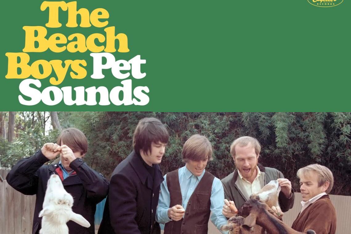
This cover feels gentle before the music even begins. The image suggests playfulness and calm, almost disarming in its simplicity. Nothing about it feels urgent or aggressive. In the mid sixties, that softness mattered. It hinted that the album was turning inward, valuing feeling over flash. The cover prepares the listener for intimacy, for songs that explore vulnerability rather than bravado. It frames the music as something personal, meant to be absorbed slowly rather than consumed quickly. That emotional invitation is what made people pause and lean in.
What gives the cover lasting power is how well it matches the heart of the music. Over time, listeners have come to see it as a visual expression of sincerity. The image does not compete with the sound. It supports it. Decades later, the cover still feels honest and unforced. It reminds us that art does not need to look serious to carry depth. Sometimes warmth and openness are what allow emotion to land most deeply and remain long after trends fade.
12. Disraeli Gears
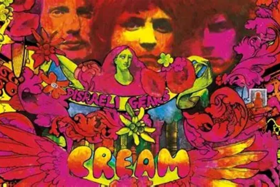
This cover feels like stepping into someone else’s imagination. Colors swirl and collide, creating a sense of movement and density that invites exploration. At first glance, it can feel overwhelming, but that is part of its appeal. In the late sixties, this kind of visual intensity reflected a growing curiosity about perception and altered states. The image suggested that the music inside would challenge familiar structures and expectations. It promised something immersive rather than comfortable.
The artwork has endured because it rewards attention. Each look reveals another detail, another texture, another moment of surprise. Over time, listeners began to associate the cover with experimentation and freedom. It still feels alive because it does not settle into a single meaning. The image mirrors music that thrives on exploration. It reminds us that album art can act as an extension of sound, pulling the listener into a shared sensory experience that continues unfolding long after the first encounter.
13. The Doors
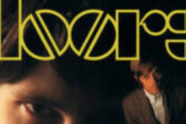
This cover relies on presence rather than excess. The faces are close, intense, and unavoidable. There is a sense of confrontation here, as if the band is meeting the listener head on. In the mid sixties, that directness felt bold. The image did not soften itself or offer reassurance. It suggested that the music would be equally unapologetic. The cover prepared listeners for sound that explored darker emotional territory without compromise.
What keeps the image relevant is its focus on mood. It does not rely on trend or decoration. Instead, it captures a feeling of intensity that remains recognizable. Over time, the cover became associated with atmosphere and depth. It still resonates because it feels committed to its identity. The artwork reminds us that sometimes the strongest visual statements are the ones that choose clarity of emotion over visual complexity.
14. Abbey Road
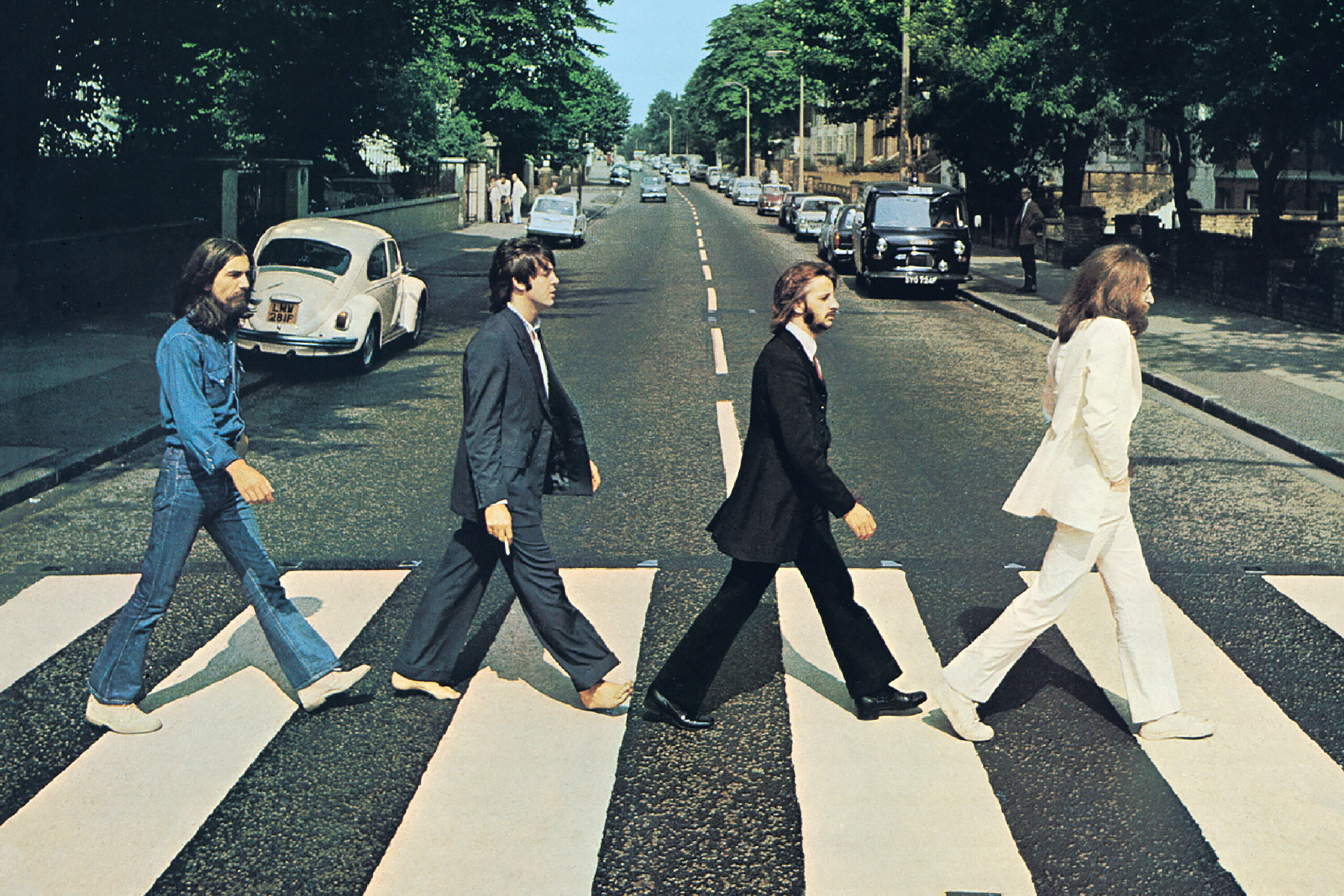
This cover feels simple at first glance, almost casual. Four figures crossing a street, caught mid movement, with no attempt at spectacle. That ordinariness was intentional. In the late sixties, this approach felt confident. The image did not explain itself or frame the band as distant icons. Instead, it placed them in a shared, everyday space. That familiarity made the music feel accessible and human.
Over time, the cover became one of the most recognizable images in music history, not because it tried to be iconic, but because it felt natural. Listeners connected with the idea that art could exist within ordinary moments. The image has endured because it balances simplicity and meaning effortlessly. It reminds us that sometimes the most powerful visuals are the ones that look like life continuing as usual, quietly inviting us to walk alongside.
15. Electric Ladyland
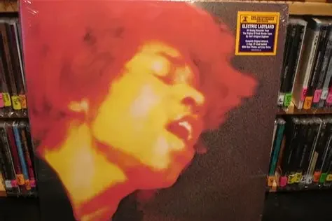
This cover feels layered and expressive, reflecting a sense of freedom that defined its era. The imagery suggests openness, experimentation, and emotional exposure. Nothing about it feels restrained. In the late sixties, that boldness mirrored a cultural shift toward self expression and exploration. The cover prepared listeners for music that pushed boundaries and blurred categories. It hinted that the album would not settle for safe territory.
What gives the image longevity is its alignment with the spirit of the music. Over time, listeners have come to see the cover as a visual statement of artistic independence. It still feels daring because it does not apologize for its intensity. The artwork reminds us that album covers can be extensions of creative identity. When sound and image share the same fearless energy, they continue to resonate across generations.
16. Beggars Banquet

This cover feels deliberately restrained, almost plain, especially when placed against the louder visuals of its time. Instead of spectacle, it offers a sense of pause. The design suggests intention rather than emptiness, as if the band chose to step back and let the music speak first. In the late sixties, that decision felt confident. It hinted at maturity and control, signaling that the album was less about shock and more about substance. The cover prepares the listener for songs rooted in observation, irony, and reflection rather than excess or fantasy.
What makes the image endure is how well it matches the album’s tone. Over time, listeners came to appreciate the quiet authority it carries. The cover does not demand attention, yet it holds it. It feels grounded, steady, and aware of its own voice. Even now, it stands as a reminder that sometimes the most effective visual statements are the ones that trust restraint. The artwork reflects an album comfortable with its identity, confident enough to speak softly and still be heard clearly.
17. A Love Supreme

This cover feels focused and reverent. The portrait is calm, serious, and intentional, drawing attention to expression rather than environment. There is a sense of purpose here that feels almost spiritual. In the mid sixties, this approach set it apart. The image suggested that the music was not meant to entertain casually but to be experienced fully. It prepared the listener for something introspective, disciplined, and deeply personal.
The cover has lasted because it captures devotion without excess. It does not rely on symbolism or decoration. It relies on presence. Over time, listeners have connected the image with sincerity and commitment. The artwork continues to resonate because it feels timeless, not tied to trend or era. It reminds us that album covers can reflect intention and belief as clearly as sound, setting the emotional tone before the first note begins.
18. In The Court Of The Crimson King
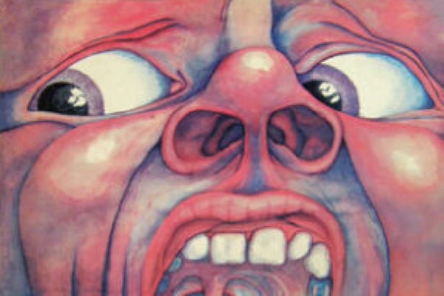
This cover feels impossible to ignore. The face dominates the frame, expressive and unsettling, pulling the viewer in immediately. There is intensity here, bordering on discomfort. In the late sixties, this boldness felt shocking and fresh. The image suggested that the music inside would challenge expectations and emotional comfort. It did not promise ease. It promised experience.
What gives the cover longevity is its emotional honesty. The expression feels raw rather than theatrical. Over time, listeners have come to see the image as a reflection of the music’s complexity and ambition. It still feels powerful because it does not soften its impact. The artwork reminds us that album covers can confront as much as they invite, and that strong emotional reactions often lead to deeper engagement.
19. Forever Changes

This cover feels reflective and slightly distant, like a thought held quietly. The imagery suggests observation rather than participation, inviting the viewer to look inward. In the late sixties, this tone resonated with listeners navigating change and uncertainty. The cover prepared them for music that felt thoughtful, layered, and emotionally aware. It did not promise answers. It offered reflection.
The image has endured because it captures a feeling rather than a moment. Over time, listeners have returned to it during different phases of life, finding new meaning each time. The artwork remains effective because it respects ambiguity. It mirrors music that rewards patience and emotional openness. The cover reminds us that some albums stay with us not because they explain, but because they understand.
20. Stand
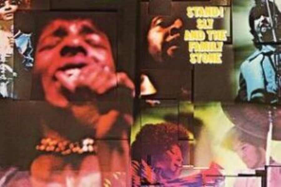
This cover feels open and communal. The imagery suggests togetherness and optimism without forcing it. There is a sense of shared energy, of voices coming together rather than standing apart. In the late sixties, this feeling mattered deeply. Music was often about unity and expression, and the cover reflected that spirit clearly. It prepared listeners for songs that felt inclusive and outward looking.
What makes the image last is its warmth. Over time, listeners have associated the cover with sincerity and collective experience. It does not feel distant or abstract. It feels inviting. The artwork continues to resonate because it reflects music meant to be shared. It reminds us that album covers can express connection and hope simply by showing people coming together, grounded in sound and shared feeling.
21. Tommy

This cover feels theatrical even before the music begins. The imagery suggests spectacle, movement, and narrative, hinting that the album is more than a collection of songs. In the late sixties, this mattered. Albums were beginning to stretch beyond singles into full stories, and this cover reflected that ambition. It invites the listener to expect drama, character, and progression. The visual elements feel purposeful, framing the record as an experience meant to unfold over time rather than something to dip into casually.
What gives the cover longevity is how clearly it matches the scope of the music. Over the years, listeners have come to see it as a visual doorway into a larger world. The image does not overwhelm with detail, but it carries enough suggestion to spark imagination. It remains effective because it respects storytelling. The cover reminds us that album art can signal scale and intention, preparing listeners for journeys that feel cohesive, immersive, and memorable long after the final track fades.
22. Led Zeppelin
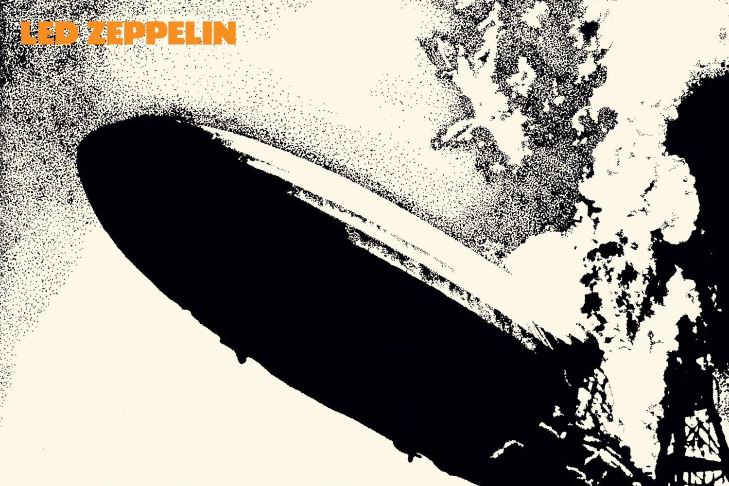
This cover feels mysterious without trying too hard. The imagery is stark, symbolic, and slightly unsettling, offering no easy explanation. In the late sixties, this sense of myth making felt fresh. The cover did not introduce the band directly. Instead, it created atmosphere, hinting at something powerful and unfamiliar. It suggested that the music inside would draw from older forces and heavier emotion rather than contemporary trends.
The image has endured because it trusts symbolism. Over time, listeners have projected their own meanings onto it, which keeps it alive. The artwork does not age quickly because it never tied itself to a specific moment. It feels timeless and elemental. The cover continues to resonate because it understands restraint and mystery. It reminds us that sometimes the strongest visual statements are the ones that reveal just enough to pull us in and leave the rest to sound and imagination.
23. Let It Bleed
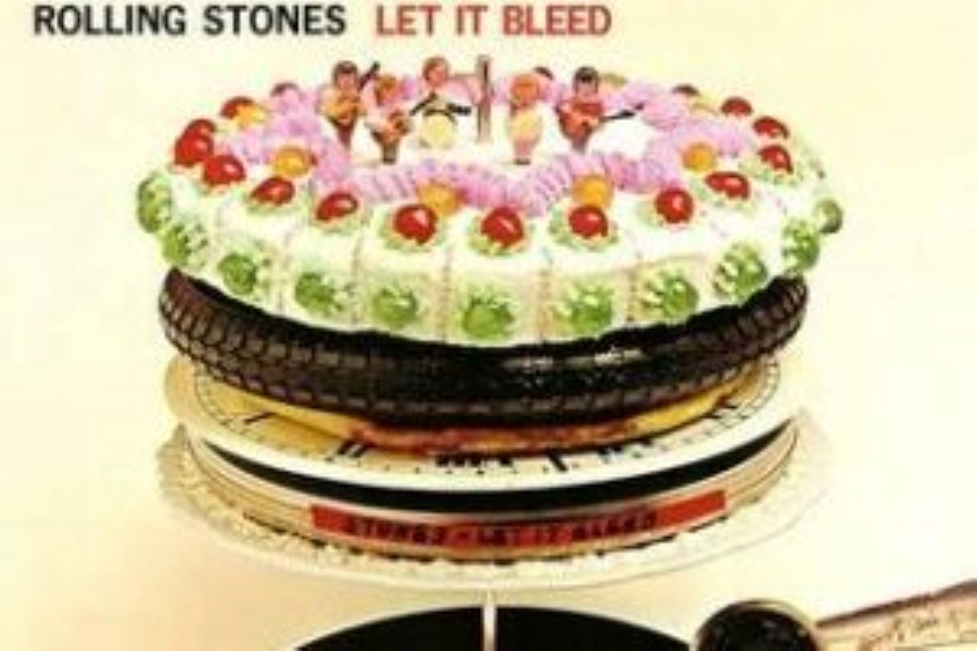
This cover feels chaotic in a way that reflects its time. Objects stack and balance uneasily, suggesting tension and instability. Nothing feels entirely secure. In the late sixties, that visual language resonated with listeners experiencing cultural and personal upheaval. The image prepared the audience for music that explored darker themes without gloss or comfort. It suggested honesty rather than polish.
What gives the cover staying power is how clearly it captures unease. Over the years, listeners have returned to it because it feels truthful rather than dated. The imagery remains striking because it does not soften its message. It reflects music that confronts rather than reassures. The cover reminds us that album art can mirror emotional complexity, allowing disorder and discomfort to exist openly without resolution, much like the era that produced it.
24. Nashville Skyline
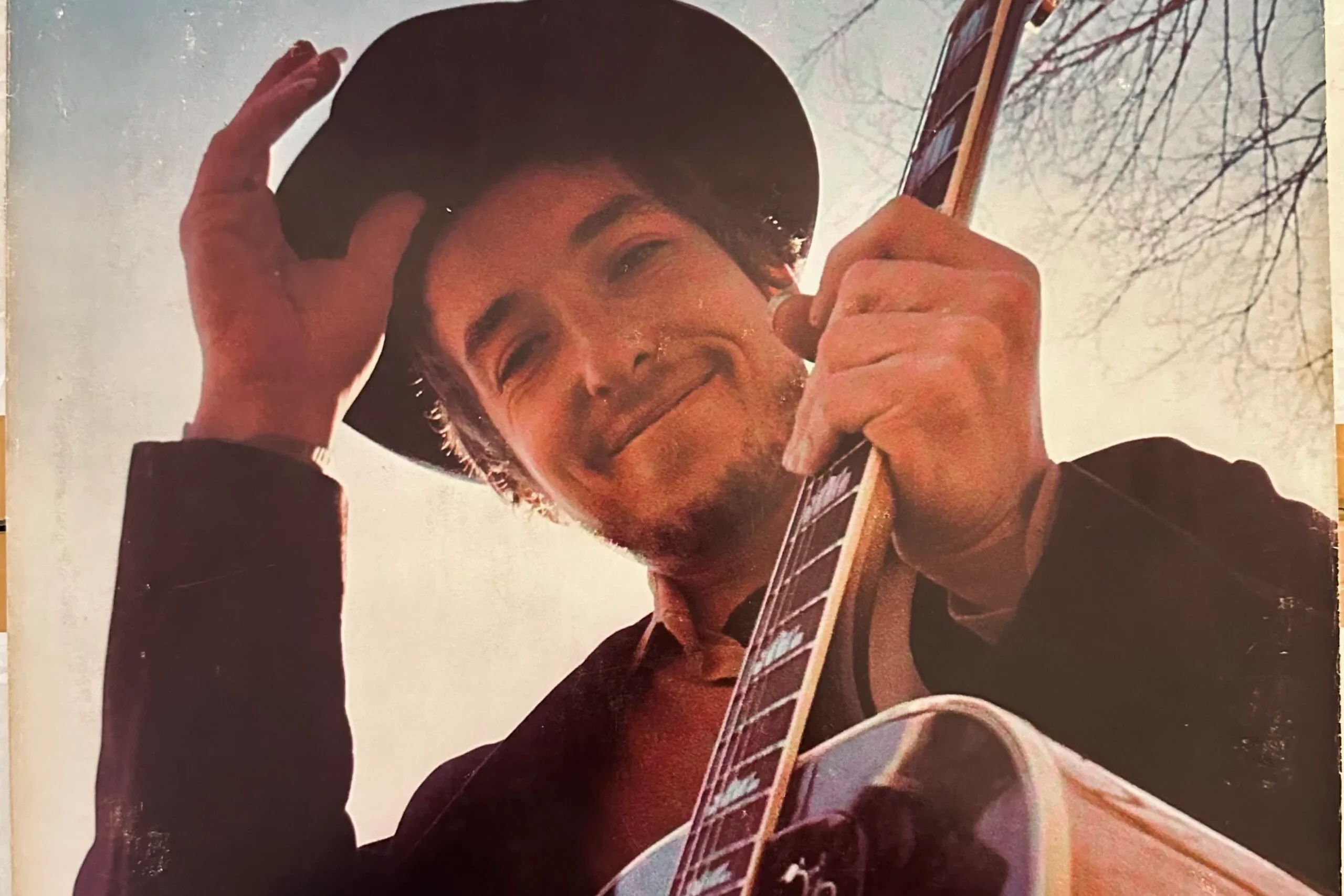
This cover feels warm and grounded, offering a sense of ease. The portrait is relaxed, approachable, and intentionally simple. In the late sixties, this shift toward calm felt notable. It suggested a change in direction, a willingness to slow down and embrace clarity. The image prepared listeners for music that felt rooted and conversational rather than restless or experimental.
The cover has lasted because of its sincerity. It does not try to impress or provoke. Over time, listeners have associated it with openness and reinvention. The artwork feels personal, like an invitation rather than a statement. It remains effective because it reflects authenticity. The cover reminds us that sometimes stepping into a new sound is best done quietly, with confidence that does not need decoration to feel complete.
25. Everybody Knows This Is Nowhere
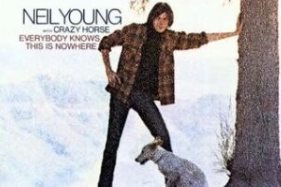
This cover feels expansive and relaxed, suggesting space rather than confinement. The image hints at distance, travel, and escape from routine. In the late sixties, that feeling resonated deeply. Many listeners were drawn to ideas of freedom and simplicity, and the cover reflected that desire visually. It prepared the listener for music that felt loose, exploratory, and unhurried.
What keeps the image relevant is its sense of openness. It does not crowd the viewer or dictate emotion. Over time, listeners have connected it with authenticity and emotional honesty. The cover remains effective because it mirrors music that feels unforced and grounded. It reminds us that album art can communicate mood through space alone, allowing the listener to breathe, imagine, and settle into sound without pressure or expectation.
26. The Band
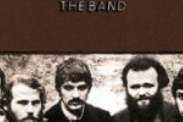
This cover feels rooted in quiet confidence. The image does not rely on spectacle or dramatic framing. Instead, it presents its subjects plainly, as if inviting the viewer into a room already in use. There is a sense of familiarity here, of people comfortable in their own space. In the late sixties, that grounded feeling mattered. Music was becoming more reflective, and this cover mirrored that shift. It suggested that the album would value storytelling, history, and shared experience rather than flash or rebellion for its own sake.
The image has endured because it feels timeless. It does not chase fashion or attitude. Over time, listeners have connected the cover with authenticity and warmth. It feels lived in, like something meant to be returned to rather than consumed once. The artwork continues to resonate because it reflects music that values continuity and connection. It reminds us that sometimes the most powerful statements come from simply showing up as you are and letting the work speak quietly but clearly.
27. Magical Mystery Tour

This cover feels playful in a way that only works because it is intentional. The band appears in costume, colorful and slightly absurd, leaning into imagination rather than realism. In the late sixties, this sense of playful transformation mattered. Music was not just something you heard anymore. It was something you stepped into. The cover prepares the listener for experimentation and whimsy, suggesting that the album will blur lines between sound, story, and visual spectacle. It does not take itself too seriously, which is exactly why it works.
The image has endured because it captures freedom without explanation. Over time, listeners have returned to it as a reminder that creativity does not always need structure to be meaningful. The cover feels like permission to explore without needing direction. It remains effective because it embraces curiosity. The artwork reminds us that album covers can reflect joy, confusion, and invention all at once, creating space for sound to feel like discovery rather than destination.
28. Cheap Thrills

This cover immediately feels alive. The comic style artwork bursts with personality, movement, and humor, making it impossible to ignore. In the late sixties, this kind of visual boldness matched the raw energy of the music inside. The cover does not aim for polish. It aims for expression. It frames the album as something loud, communal, and emotionally charged, preparing the listener for sound that feels loose and unfiltered.
What gives the image longevity is its honesty. It does not hide behind sophistication. Instead, it celebrates messiness and feeling. Over time, listeners have come to appreciate how closely the artwork matches the music’s spirit. The cover still feels fresh because it does not pretend to be timeless. It embraces its moment fully. The artwork reminds us that album covers can be joyful, chaotic, and sincere all at once, and that energy, when captured honestly, does not fade easily.
29. Surrealistic Pillow
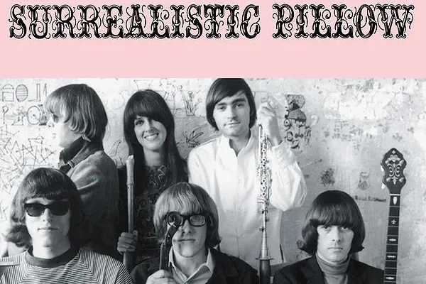
This cover feels dreamlike without drifting too far from reality. Faces and textures blend softly, creating an image that feels reflective rather than literal. In the mid sixties, this approach resonated with listeners exploring introspection and altered perception. The cover suggests that the music inside will move gently between clarity and abstraction. It prepares the listener for sound that feels emotional, thoughtful, and slightly removed from everyday logic.
The image has endured because it captures mood rather than message. Over time, listeners have returned to it because it feels personal and open ended. The artwork does not rush interpretation. It allows feeling to come first. The cover remains effective because it reflects a moment when music encouraged inward exploration. It reminds us that album art can suggest atmosphere rather than instruction, letting sound and emotion meet in quiet, lasting ways.
30. Axis Bold As Love
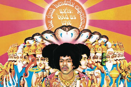
This cover feels expansive and symbolic, blending color, mythology, and imagination into a single striking image. It does not aim for realism. It aims for feeling. In the late sixties, this kind of visual ambition mirrored a growing interest in identity, spirituality, and expression beyond boundaries. The cover prepares the listener for music that feels exploratory and emotionally open, suggesting depth rather than restraint.
What makes the image lasting is its confidence. It does not simplify itself for comfort. Over time, listeners have come to see the cover as an extension of the album’s creative vision. It still resonates because it commits fully to its aesthetic. The artwork reminds us that album covers can be bold without being rigid, expressive without being chaotic. It closes the conversation not by ending it, but by leaving space for return, reflection, and continued listening.
We know we are just scratching the surface as so many album covers were amazing. Please let us know what album covers you would like us to add, and we will add to the next version of this story.


