
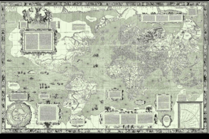
1. Ptolemy’s World Map
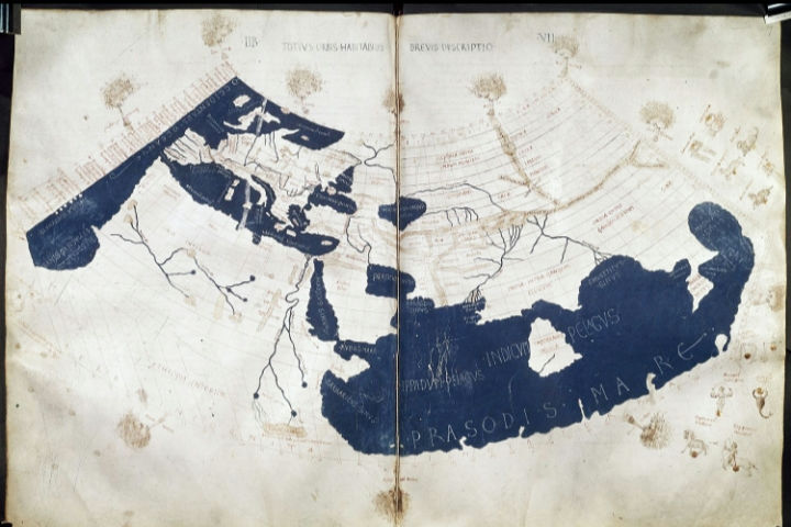
Maps have always shaped the way people understand the world, from ancient guesses about distant lands to scientific breakthroughs that redrew borders and oceans. Based on the writings of the Greek scholar Claudius Ptolemy around 150 AD, this map reshaped geographic knowledge for centuries. Ptolemy introduced a grid of latitude and longitude, helping future mapmakers organize the world with mathematical structure rather than myth. Even though large parts of the Earth were missing or distorted, his work brought a disciplined method to mapping. When rediscovered in the Renaissance, Ptolemy’s map influenced explorers who were sear,8ching for new routes, inspiring both accurate expectations and incorrect assumptions, like the belief that Earth’s landmasses extended much farther east and west than they really did.
2. The Hereford Mappa Mundi
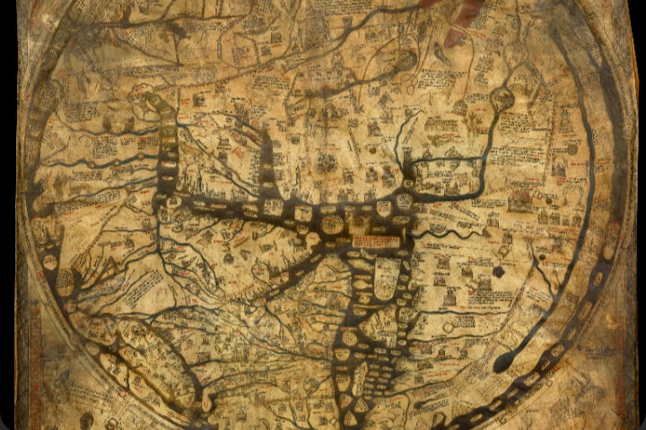
Created around 1300 in England, the Hereford Mappa Mundi is the largest surviving medieval world map and reveals how people believed the world was shaped spiritually and physically. Instead of focusing on geographic precision, it placed Jerusalem at the center and arranged continents to reflect religious importance. The map includes biblical stories, legendary creatures, and illustrations of distant cultures as Europeans imagined them. For medieval viewers, it served as both a teaching tool and a worldview guide, showing how faith and geography intertwined. Today, it offers a rare glimpse into how Europeans understood the world before scientific cartography took hold.
3. Zheng He’s Treasure Fleet Map
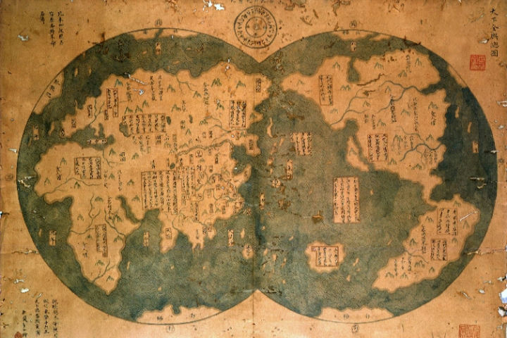
Attributed to China’s Ming Dynasty era, maps linked to the voyages of Admiral Zheng He charted routes across the Indian Ocean, reaching as far as East Africa. These maps reflected an advanced understanding of navigation long before many European explorations. They documented coastlines, ports, and maritime paths critical for diplomacy and trade. While some surviving copies are debated, China’s navigational mapping during this period undeniably showed that the Ming fleet possessed remarkable geographic knowledge. These charts also countered the long-held Western belief that major global exploration began only with European sailors.
4. Waldseemüller’s 1507 World Map
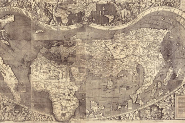
This map was the first known document to use the name “America,” applying it to the newly recognized continents west of Europe. Produced by German cartographer Martin Waldseemüller, it represented a major shift in European understanding by showing the New World as a separate landmass rather than part of Asia. Its bold labeling signaled acceptance of Amerigo Vespucci’s claim that these lands were distinct continents. With only one surviving copy today, the map is often called the “birth certificate of America” and remains one of the most influential artifacts in the history of cartography.
5. Mercator’s 1569 Projection
Gerardus Mercator’s 1569 world map revolutionized navigation by introducing a projection where straight lines allowed sailors to chart consistent compass courses across the ocean. While incredibly useful for maritime travel, the projection distorted landmasses, especially near the poles, making Greenland and Europe appear far larger than countries near the equator. Despite this, the map became the standard for navigation for centuries. It also shaped cultural perceptions of global size and importance, influencing how generations viewed the world politically and geographically.
6. The Blaeu Atlas Major
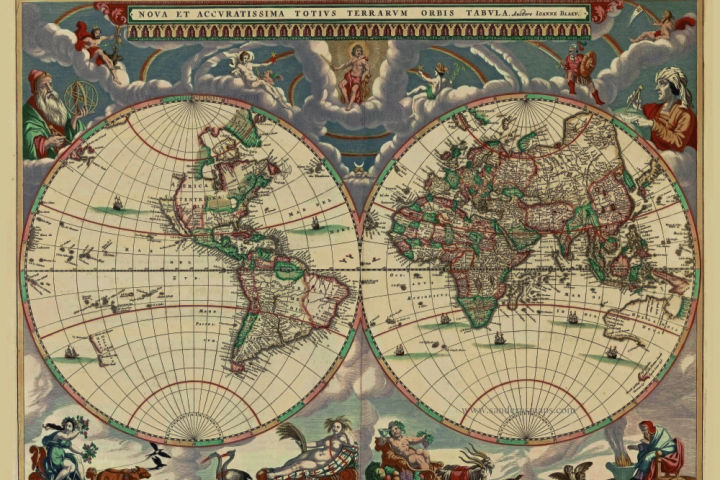
Published in 1662 by Dutch cartographer Joan Blaeu, the Atlas Major was the most ambitious atlas of its time, containing hundreds of maps that captured the height of the Dutch Golden Age of cartography. Its detailed coastlines, city plans, and regional maps pushed forward a more scientific understanding of geography. For many Europeans, the Atlas Major broadened awareness of territories far beyond their own borders, reflecting new discoveries across Asia, Africa, and the Americas. Lavishly decorated and widely distributed among scholars, it was a defining work that shaped how educated society visualized the world during an era of intense exploration and trade.
7. John Snow’s Cholera Map
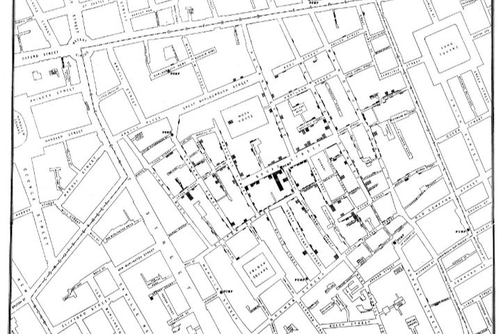
In 1854, physician John Snow created a map plotting cholera cases in London’s Soho district, revealing a cluster around the Broad Street water pump. His groundbreaking use of spatial data helped prove that cholera spread through contaminated water, not foul air as widely believed. This map not only changed public health practices but also marked the beginning of modern epidemiology. It showed how mapping could uncover invisible patterns and save lives, and it led to reforms in sanitation systems across major cities. Snow’s visual evidence remains one of the most famous examples of data-driven science in action.
8. Lewis and Clark’s Expedition Maps
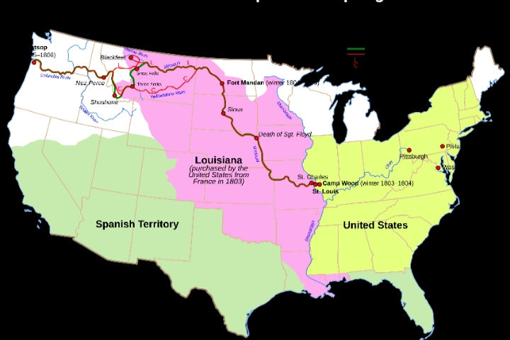
Between 1804 and 1806, Meriwether Lewis and William Clark produced maps of the American West that transformed the United States’ understanding of the continent. Their work charted rivers, mountain ranges, and tribal territories across vast areas previously unmapped by Americans. These maps corrected misconceptions, identified navigation routes, and influenced the nation’s westward expansion policies. They also documented Indigenous lands and settlements, offering valuable historical records. For many Americans, these maps shifted the mental image of the West from an unknown wilderness to a region with recognizable geography and resources.
9. The Treaty of Westphalia Map
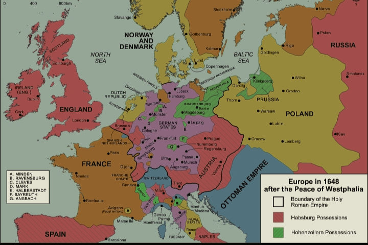
Maps created after the 1648 Peace of Westphalia redrew European borders following the Thirty Years’ War. These maps established the idea of sovereign states with defined territories, a political structure that shaped modern international relations. By illustrating newly recognized boundaries for countries like France, Sweden, and numerous German principalities, the maps helped reinforce the concept that states controlled their own internal affairs. This visual representation of political sovereignty changed how people understood nations, borders, and diplomacy. The influence of these territorial maps continues today, as Westphalian principles remain foundational in global politics.
10. Captain Cook’s Pacific Charts
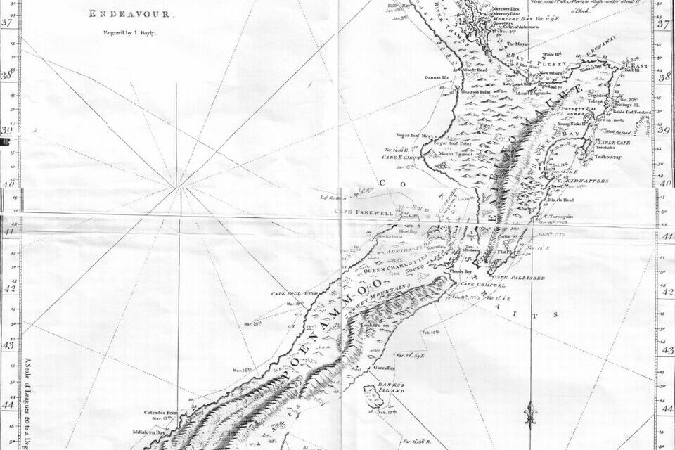
James Cook’s voyages during the late 1700s produced some of the most accurate maps of the Pacific Ocean ever made at the time. His meticulous charting of Australia’s eastern coast, New Zealand, and numerous Pacific islands challenged earlier misconceptions and incorrect coastlines. Cook’s maps improved navigation, reduced shipwrecks, and strengthened European understanding of the Pacific’s vast geography. They also influenced global trade routes and scientific exploration. For many Europeans, these charts opened a clearer window into a region that had long been surrounded by myth and speculation, replacing guesswork with precise detail.
11. The 1715 Freytag-Loringhoven Map of Europe
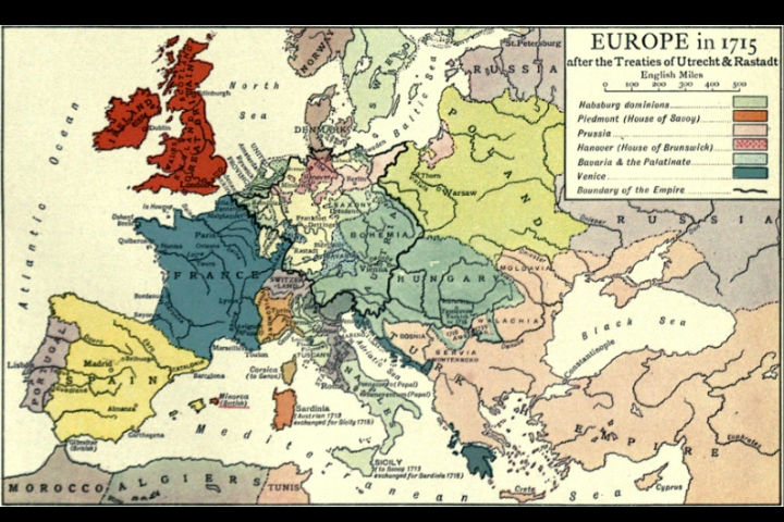
Created by Baron Johann von Freytag-Loringhoven, this early 18th-century map helped standardize Europe’s shifting political boundaries at a time when wars and alliances frequently altered the landscape. Its clarity and accuracy improved diplomatic negotiations by giving rulers a shared visual reference for territorial claims. The map showed emerging powers like Prussia and the Ottoman Empire’s influence in the Balkans, helping ordinary citizens and statesmen better grasp continental politics. By illustrating Europe with comparatively modern precision, it marked a turning point in the public’s geographic awareness and influenced later atlases used across the region.
12. The 1783 Treaty of Paris Map
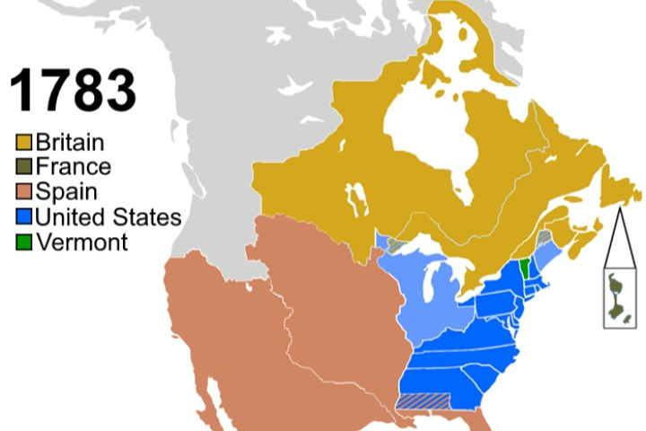
After the American Revolutionary War, the Treaty of Paris required a map to define the new nation’s borders. The resulting documents shifted long-held perceptions by officially recognizing the United States as an independent country stretching to the Mississippi River. The map highlighted Britain’s territorial losses and reshaped how Europeans viewed North America’s political future. It also clarified trade zones, Indigenous regions, and contested frontier boundaries. This visual confirmation of a new nation influenced how people worldwide understood the balance of power and helped set the stage for America’s westward expansion.
13. The 1801 Ordnance Survey of Great Britain
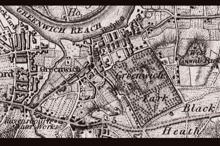
Britain’s first national mapping effort began with the 1801 Ordnance Survey, producing extremely detailed maps used for defense, infrastructure, and land management. These early sheets introduced a level of precision that had rarely been seen at a national scale. The maps changed how people understood their own communities by depicting roads, rivers, and settlements with scientific accuracy. They soon became essential tools for engineers and planners during the Industrial Revolution. For ordinary Britons, the Ordnance Survey reshaped the experience of travel and place, turning abstract distances into clear, measurable routes.
14. Humboldt’s Map of Isothermal Lines
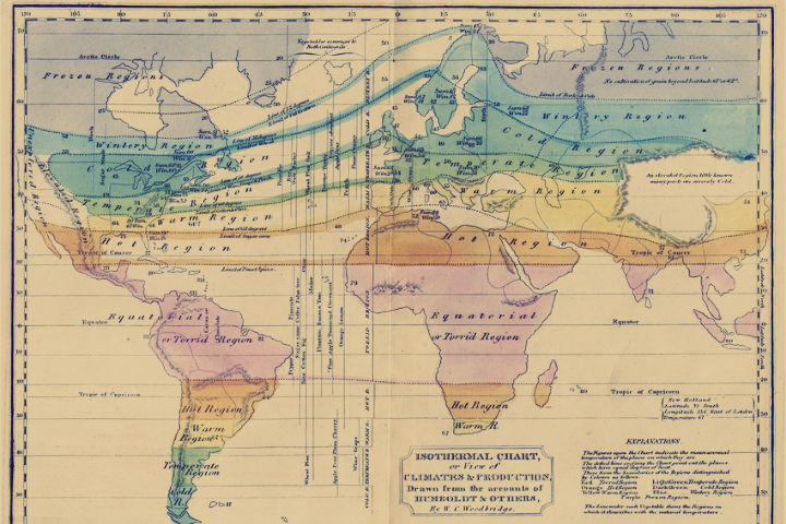
In the early 1800s, Alexander von Humboldt created the first map showing isothermal lines, bands connecting regions with similar average temperatures. This innovation changed how scientists understood climate patterns by revealing that temperature was influenced by more than latitude alone. His map demonstrated global climate zones and encouraged further research into atmospheric circulation, ocean currents, and plant distribution. By visualizing climate scientifically rather than relying on simple geographic assumptions, Humboldt’s work laid the foundation for modern climatology and biogeography, influencing environmental studies for generations.
15. The 1869 Minard Map of Napoleon’s March
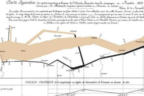
Charles Minard’s famous 1869 graphic depicting Napoleon’s disastrous 1812 march into Russia is often called one of the most powerful data visualizations ever created. The map uses a band of varying thickness to show the size of the army as it dwindled, paired with temperature data and geographic markers. It changed how people understood the human cost of military decisions by presenting information visually rather than through text alone. The map revealed how weather, distance, and poor planning contributed to the army’s collapse. Its clarity influenced modern data design, statistics, and military history.
16. The 1884 Scramble for Africa Maps
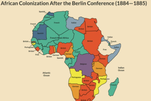
Maps drawn during and after the 1884 Berlin Conference displayed how European powers divided Africa into territories without regard for existing ethnic or cultural boundaries. These maps changed global perceptions by presenting Africa as a continent defined by colonial borders rather than Indigenous nations. They influenced political control, trade, and diplomacy for decades, and many of the borders created during this period still exist today. For people in Europe at the time, the maps helped justify imperial expansion. For Africans, they marked the beginning of profound political and social transformations that reshaped entire regions.
17. The 1904 Geologic Map of the United States
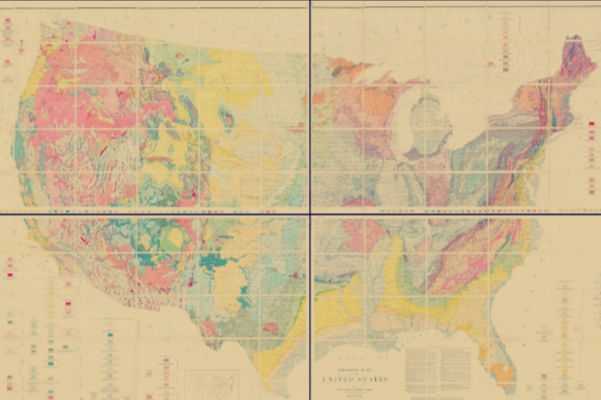
Produced by the U.S. Geological Survey, this detailed geologic map organized the nation’s rock formations, mineral deposits, and structural features in a way never before attempted on such a scale. It changed how Americans understood natural resources, influencing mining, conservation, and land-use planning. Engineers used it to guide railroad routes and water projects, while scientists relied on it to study earthquakes and mountain formation. By visually linking geography with geologic time, the map helped people recognize the deep natural history underlying familiar landscapes and encouraged more responsible resource management.
18. The 1921 Redlining Maps
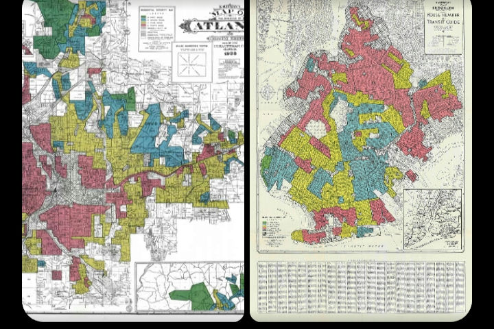
Created by the Home Owners’ Loan Corporation in the United States, redlining maps used color-coded grades to mark neighborhoods considered “risky” for lending. Although presented as economic tools, these maps were heavily influenced by racial and ethnic biases. They shaped lending policies for decades, restricting housing opportunities for many communities. Over time, the public learned how profoundly these maps influenced wealth distribution, schooling, and urban development. Today, they serve as historical evidence of institutional discrimination and help researchers understand patterns of inequality still visible in American cities.
19. The 1925 International Map of the World
The International Map of the World was a global effort to standardize cartography by creating a consistent, detailed map of Earth at a 1:1,000,000 scale. Proposed by German cartographer Albrecht Penck, it aimed to unify mapping practices across countries. Although the project was never completed, the maps that were published changed how scientists and governments thought about global cooperation. They promoted shared geographic standards, influenced military and scientific mapping, and laid groundwork for modern international mapping organizations. The project demonstrated the growing belief that global problems required global visual tools.
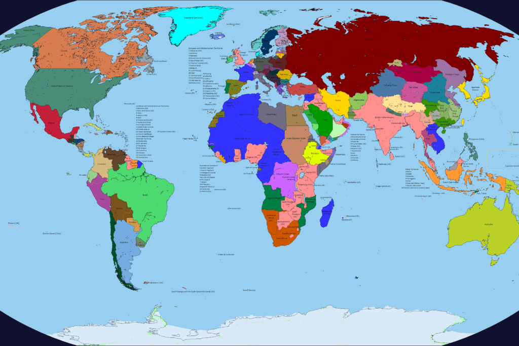
20. The 1945 United Nations World Map
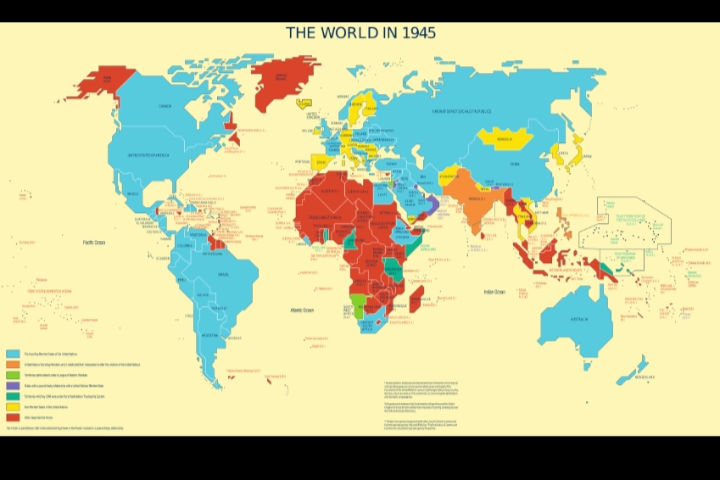
When the United Nations was founded in 1945, its early world maps visually represented a new era of international cooperation. Unlike older maps focused on empire or conquest, these maps emphasized equal nations working within a shared global system. They updated borders after World War II and highlighted areas under UN oversight. As decolonization accelerated, the maps changed frequently, influencing how people understood emerging nations and shifting political landscapes. For many viewers, these UN maps became symbols of diplomacy, peace, and a more interconnected world.
21. The 1962 Plate Tectonics Map
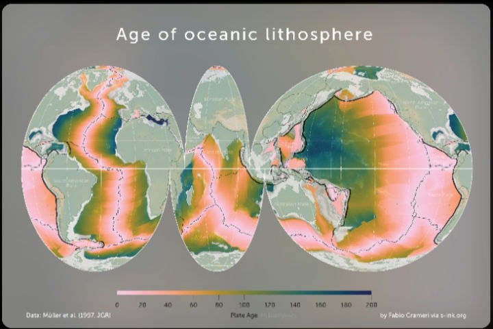
In 1962, geologist Harry Hess’s ideas on seafloor spreading inspired maps that showed mid-ocean ridges and deep-sea trenches in unprecedented detail. These visuals helped confirm the theory of plate tectonics, proving that continents move over Earth’s surface. The maps revealed symmetrical magnetic patterns on the ocean floor, offering strong evidence for crustal formation and movement. This discovery changed beliefs about earthquakes, volcanoes, and mountain building. It shifted Earth science from speculation to a unified theory that explained geological processes across the globe, reshaping how scientists understand the planet’s past and future.
22. The 1972 Blue Marble Image Map
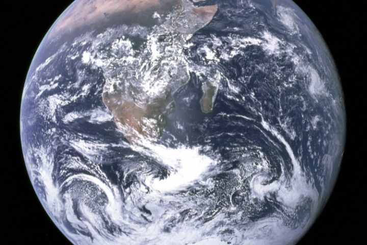
NASA’s 1972 Blue Marble photograph created a map-like view of Earth that changed how people thought about the planet. For the first time, the entire Earth appeared in a single, high-quality image, showing continents, oceans, and weather systems without borders or political markings. The image became an icon of environmental awareness, inspiring global conservation movements and strengthening the idea of Earth as a shared home. It offered a perspective that no traditional map could provide, helping people see the planet as fragile, interconnected, and worthy of protection.
23. The 2005 Google Earth World Map
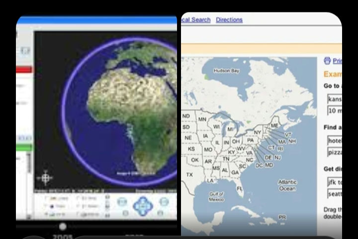
Google Earth launched in 2005 and offered interactive satellite imagery that allowed users to explore the world in unprecedented detail. Instead of viewing static paper maps, people could zoom into cities, mountains, oceans, and even their own neighborhoods. This accessibility changed how users learned geography and visualized global events such as disasters, environmental changes, and political conflicts. Journalists, researchers, and students adopted it as a tool for storytelling and investigation. By putting detailed global imagery into everyday hands, Google Earth transformed public expectations of what a map should be.
24. The 2013 IPCC Climate Change Risk Maps
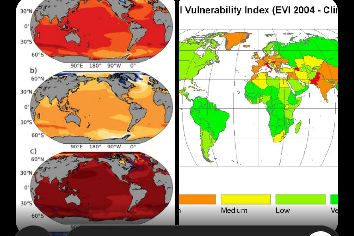
The 2013 Intergovernmental Panel on Climate Change maps visualized global risks related to rising temperatures, sea-level change, and extreme weather. These maps summarized thousands of scientific studies and made the realities of climate change easier for the public and policymakers to grasp. They highlighted vulnerable regions, predicted future impacts, and helped guide international climate negotiations. By turning complex data into clear visuals, these maps fundamentally changed how people understood environmental risks and the urgency of addressing them. They continue to influence planning, adaptation, and global climate policy.
Together, they remind us that every map is more than a guide. It’s a window into human curiosity, discovery, and imagination.
This story 24 Maps That Changed What People Believed was first published on Daily FETCH


