
You’ll question the sanity of these Ad creators

Advertising has always been a mirror of its time, reflecting societal norms, aspirations, and sometimes, its most bizarre quirks. Over the decades, some magazine ads have pushed boundaries, leaving us to wonder, “What were they thinking?” Let’s delve into seven such wild magazine ads that, believe it or not, were very real.
1. Skinny Dip Cologne
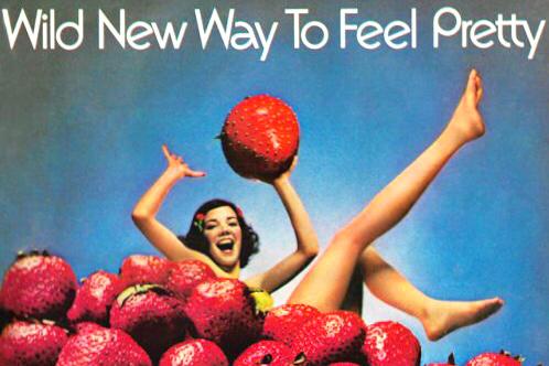
In the 1970s, an era known for its experimental advertising, Skinny Dip Wild Strawberry Cologne launched a campaign that was as audacious as it was fruity. The ad featured a woman gleefully lounging in a field of oversized strawberries, exuding a sense of carefree sensuality. The tagline, “Wild New Way to Feel Pretty,” encapsulated the brand’s attempt to merge natural imagery with a liberated feminine allure. While the ad might seem whimsical today, it was a bold move that challenged conventional beauty standards of its time. Source: pinterest.com
2. The Deadly Double
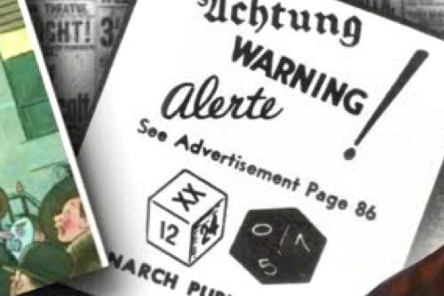
Back in November 1941, just weeks before the attack on Pearl Harbor, an advertisement appeared in The New Yorker that has since sparked intrigue and speculation. The ad, titled “Achtung! Warning! Alerte!”, depicted people in an air-raid shelter playing a game called “The Deadly Double.” What caught attention were the dice in the image, showing the numbers 12 and 7, which eerily corresponds to the date of the Pearl Harbor attack, i.e, December 7. The ad’s text encourages readers to prepare for air raids; a topic not commonly discussed in the U.S. at the time. During the war, intelligence officers investigated the advertisement, suspecting it might have been a secret warning, but found no substantial evidence. time.com
3. Coca-Cola’s Beachside Bliss
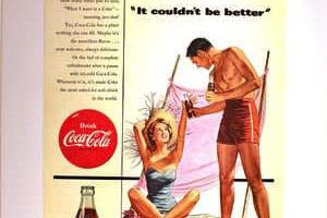
In the 1950s, Coca-Cola ads often depicted idyllic scenes of leisure and refreshment. One such ad showcased a couple enjoying a sunny day at the beach, with the man offering a bottle of Coke to his sunbathing partner. The caption, ‘It couldn’t be better’, aimed to associate the beverage with perfect moments of relaxation. While tamed by today’s standards, the overt display of affection and the woman’s revealing swimsuit were considered quite risqué at the time. Source: etsy.com
4. Karo Syrup’s Muscle-Bound Baby
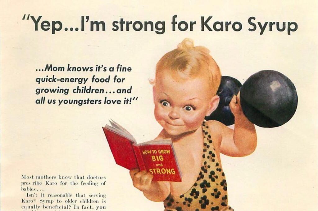
This is perhaps one of the most perplexing ads from the 1950s featuring a baby, clad in a leopard-print loincloth, lifting a barbell while reading a book titled “How to Grow Big and Strong.” The ad promoted Karo Syrup as a vital source of energy for growing children. The bizarre imagery of an infant bodybuilder was intended to be humorous and attention-grabbing, but by today’s standards, it raises eyebrows for its oddity and the implications of marketing sugary syrup as health food. Source: jp.pinterest.com
5. Benetton’s Controversial Embrace

In the 1990s, Benetton, a clothing brand, became synonymous with provocative advertising under the direction of photographer Oliviero Toscani. One of their most talked-about ads featured a priest and a nun sharing a passionate kiss. The image sparked outrage from religious communities but succeeded in drawing attention to the brand. Benetton’s campaigns often blurred the lines between advertising and social commentary, challenging viewers to confront uncomfortable issues. Source: theguardian.com
6. Joe Camel’s Cool Controversy

The Joe Camel campaign by R.J. Reynolds in the late 1980s and early 1990s featured a cartoon camel with a laid-back demeanor for his cigarette brand, often depicted in settings appealing to younger audiences. Despite the company’s claims that the ads targeted adults, studies revealed that children recognized Joe Camel as readily as Mickey Mouse. The backlash led to the campaign’s termination in 1997. Source: en.wikipedia.org
7. Thinx’s Period Piece

In 2015, Thinx, a company specializing in period-proof underwear, launched a subway ad campaign that was initially rejected for using the word “period” and suggestive imagery. The ads featured peeled grapefruit and runny eggs, as metaphors for menstruation, and challenging societal taboos. Eventual public outcry over the censorship led to the ads being displayed, marking a significant moment in the conversation about menstrual health and advertising. Source: slate.com
These ads reflect the times they were created in, pushing boundaries and sparking conversations. Curious about more eyebrow-raising ads from the past? Stay updated with our post!

