
Nirvana Nevermind Underwater Baby
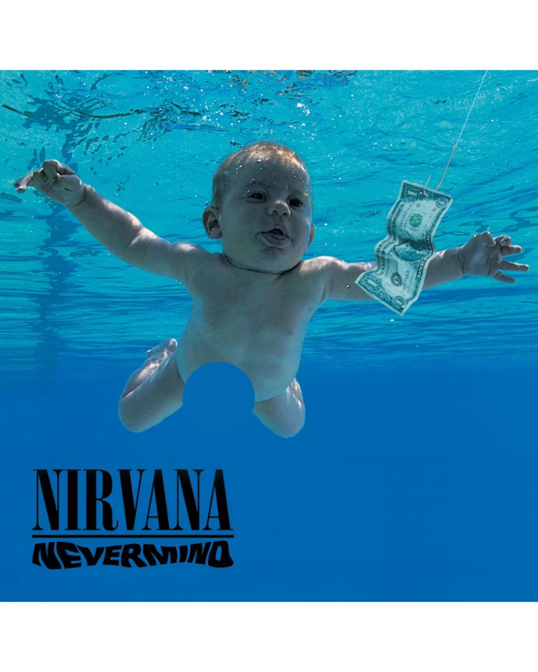
Released on 24 September 1991, the cover for Nirvana’s seminal album Nevermind remains one of the most instantly recognisable images in the history of rock music. It features four-month-old Spencer Elden swimming towards a dollar bill hooked on a fishing line and this striking visual was intended by Kurt Cobain to be a commentary on the loss of innocence and the early onset of greed. Photographer Kirk Weddle captured the shot at the Pasadena Rose Bowl Aquatics Center in a matter of seconds and while the label initially worried about the nudity, Cobain famously refused to compromise by suggesting a sticker should cover the baby’s parts with a note saying “if you’re offended by this, you must be a closet paedophile.”
The image has sparked decades of conversation regarding the commercialisation of childhood and the irony of an anti-corporate band becoming a global phenomenon through such a clever piece of marketing. Interestingly enough, the dollar bill was added later in post-production to complete the metaphor of the “hook” of capitalism that awaits every human being from birth. It has been parodied countless times by other artists and even the subject of a legal dispute in recent years as the now-grown “baby” sought to redefine his relationship with the image that made him a reluctant icon of the grunge movement. This cover didn’t just sell an album because it effectively defined the disillusioned spirit of the entire nineties generation.
Pulp Different Class Interiors
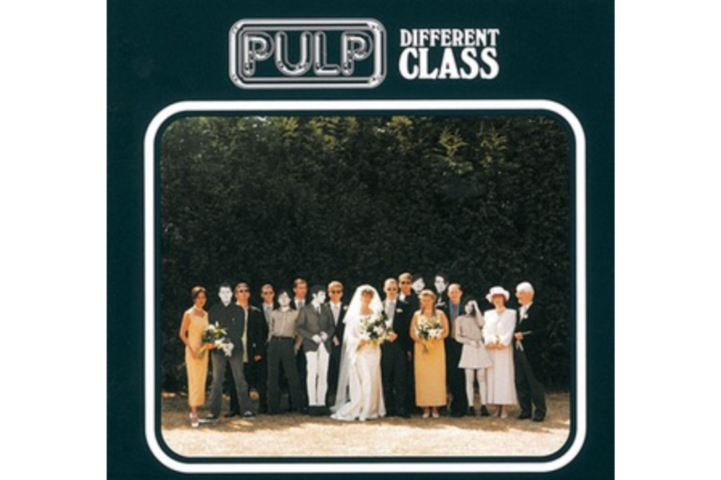
Pulp’s 1995 masterpiece Different Class featured a cover that was as much a social commentary as Jarvis Cocker’s sharp and witty lyrics regarding the British class system. The original artwork shows a group of life-sized cardboard cutouts of the band members standing awkwardly at a wedding reception which serves as a brilliant nod to the themes of social climbing and feeling like an outsider. Interestingly, the album was released with six different double-sided inserts allowing fans to choose their own cover from twelve different photographs of everyday British life. This clever design encouraged a sense of personal connection between the listener and the music while mocking the rigid structures of society that the album sought to dismantle.
The chosen wedding scene is particularly poignant because it captures that specific brand of British suburban discomfort that Cocker articulated so well in tracks like “Common People.” By including various interchangeable scenes like a supermarket aisle or a mundane kitchen, the band emphasised that their music belonged to the ordinary person rather than the glamorous elite. This interactive element was quite a novelty in the mid-nineties and helped the album stand out in the crowded Britpop market as a more intellectual and self-aware alternative to the laddish culture of the time. It remains a definitive visual statement on the complexities of social status and the art of being a well-dressed misfit in a world of boring conventions.
Primal Scream Screamadelica Sun
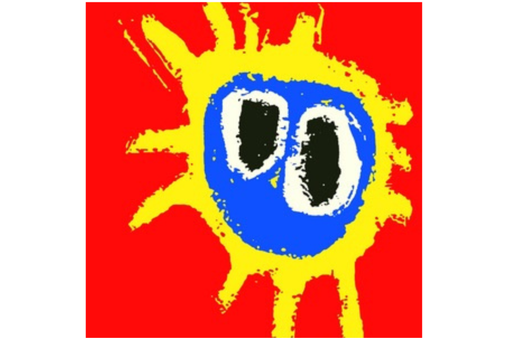
When Primal Scream released Screamadelica on 23 September 1991, they didn’t just change their sound but they also introduced the world to one of the most vibrant pieces of pop art ever to grace a record sleeve. Designed by the late Paul Cannell of Creation Records, the cover features a hand-painted, sun-like blob on a bright red background that perfectly encapsulated the kaleidoscopic, drug-fuelled euphoria of the emerging rave culture. It was a radical departure from the band’s previous rock-and-roll imagery and signaled their total immersion into the world of house music and psychedelic dance beats. The design has since become a ubiquitous symbol for the second “Summer of Love” and appears on everything from t-shirts to murals.
The simplicity of the artwork is its greatest strength because it conveys a feeling of warmth and sonic expansion without needing any text or band portraits to sell the vision. Cannell reportedly created the image while under the influence of the very substances that inspired the album’s hazy production and this authenticity resonated deeply with the youth of the early nineties. It broke the traditional rules of rock album design by embracing a minimalist and almost childlike aesthetic that felt incredibly fresh and daring at the time. Even today, the Screamadelica sun is regarded as a hallmark of British design history and serves as a glowing reminder of a moment when guitar music and dance music finally shook hands and became one beautiful, blurry mess.
Blur Parklife Dog Track
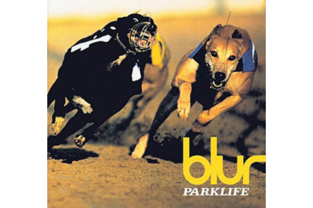
Blur’s Parklife cover from 1994 is the quintessential visual representation of the Britpop era and it perfectly captures the band’s fascination with English culture and working-class pastimes. The image features two racing greyhounds captured in mid-sprint at Walthamstow Stadium and this choice was a deliberate move away from the shoegaze-inspired art of their previous work. It was meant to symbolise the fast-paced, competitive nature of British life and the mundane excitement found in local betting shops or at the track. Photographer Bob Thomas took the shot and the band members were actually absent from the main cover which was a bold decision that allowed the imagery to speak for itself.
The use of the greyhounds was a stroke of genius because it tapped into a specific sense of “Britishness” that felt both nostalgic and modern at the same time during the mid-nineties. It aligned perfectly with the album’s themes of urban observation and the quirks of daily life in London while establishing Blur as the premier chroniclers of the national psyche. The bright green and yellow colour scheme of the racing jackets added a pop-art sensibility to the photograph and made it stand out on the shelves of HMV and Virgin Megastores. This cover helped define the aesthetic of a movement that celebrated the ordinary and it remains a powerful piece of iconography that evokes the sun-drenched, beer-soaked summers of the decade.
Radiohead The Bends Figure
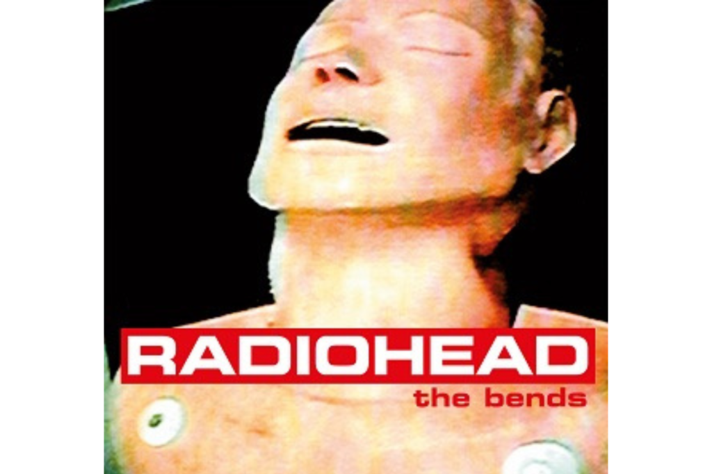
Released in 1995, the cover for Radiohead’s The Bends features a haunting and somewhat distorted image of an orange-tinted human head that appears to be in a state of either ecstasy or agony. The visual was created by Stanley Donwood and Thom Yorke by filming a television screen displaying a CPR mannequin which explains the slightly blurred and artificial quality of the final result. This choice of a “plastic” person perfectly mirrored the album’s lyrical themes of artificiality, emotional numbness, and the pressures of modern existence. It was a significant shift from the more conventional rock imagery of their debut and marked the beginning of their long-term artistic partnership with Donwood.
The ambiguous expression on the face of the mannequin has led to endless interpretation by fans who see it as a reflection of the “bends” or decompression sickness mentioned in the title. It captures a sense of being caught between two worlds or feeling disconnected from one’s own body which was a recurring sentiment in the nineties alternative scene. The stark typography and the warm yet unsettling colour palette give the sleeve a timeless quality that still feels contemporary today. This artwork didn’t just represent a band coming into their own creatively because it also established Radiohead as a group that cared deeply about the visual language surrounding their music and would continue to push boundaries for decades to come.
Hole Live Through This
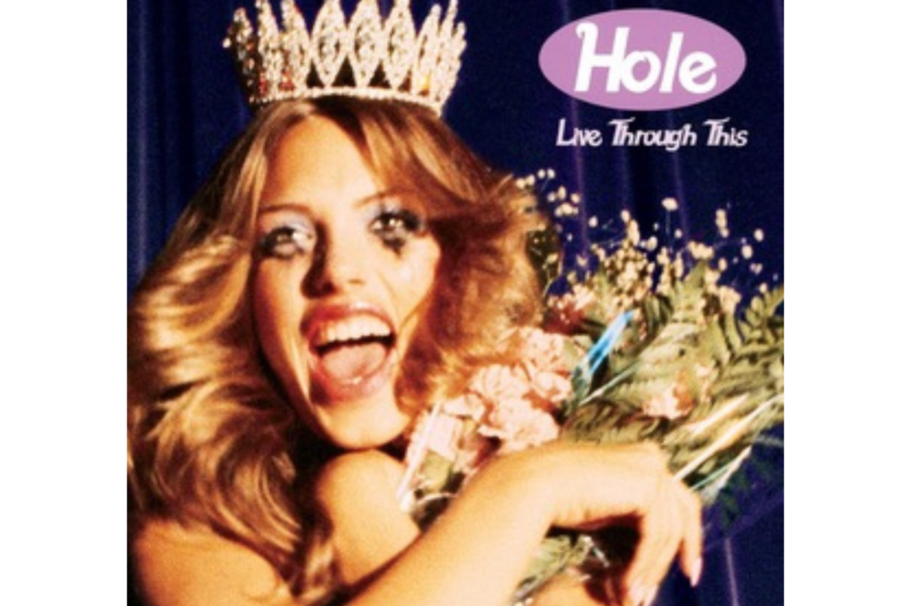
The cover for Hole’s 1994 album Live Through This features a beauty pageant contestant with mascara running down her face while she clutches a bouquet of flowers and a trophy. Captured by photographer Ellen von Unwerth, the image is a savage subversion of the traditional “American Dream” and a direct commentary on the impossible standards placed upon women in the media. Courtney Love wanted the artwork to represent the idea of surviving trauma and the “ugly” reality behind the polished veneer of celebrity and pageant culture. The model, Leilani Bishop, perfectly embodies this “sad-happy” contradiction which echoed the raw and visceral themes of the songs contained within the record.
This image became a defining symbol of nineties “Riot Grrrl” aesthetics and feminist punk because it refused to play by the rules of conventional beauty. By showing the cracks in the makeup and the visible distress of the winner, the band challenged the listener to look past the surface and acknowledge the pain and anger that often fuels female creativity. It was released just a week after the death of Kurt Cobain which added an unintentional layer of tragic depth to the title and the bruised look of the cover art. It remains one of the most powerful and provocative images of the decade and serves as a reminder of a time when grunge was a vessel for genuine social and personal upheaval.
Green Day Dookie Illustration
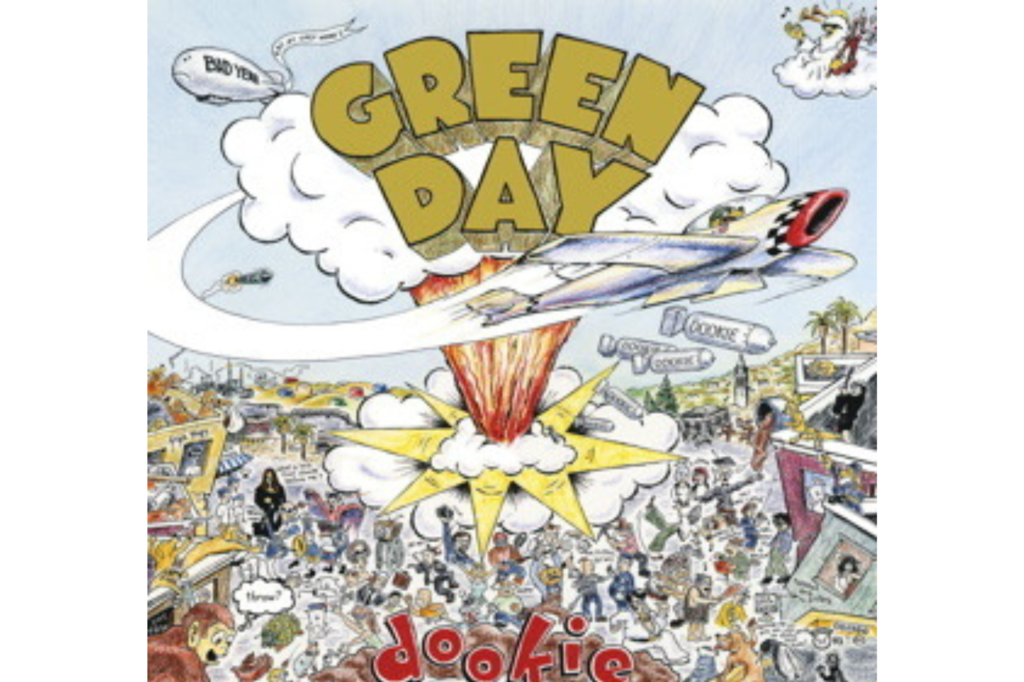
Green Day’s major-label debut Dookie, released on 1 February 1994, featured a chaotic and densely packed illustration that perfectly captured the bratty, energetic spirit of East Bay punk. Created by artist Richie Bucher, the artwork depicts a “bombs” eye view of Berkeley’s Telegraph Avenue and is filled with hidden references, inside jokes, and cartoonish violence. From a dog dropping “dookie” on a passerby to a cameo from the woman on the cover of Black Sabbath’s debut album, the detail is so immense that fans spent hours scanning the sleeve to find every secret. It was a colorful rebellion against the somber and serious tone of the grunge movement that was dominating the airwaves.
The decision to use a busy illustration rather than a photo of the band helped establish Green Day as a group that didn’t take themselves too seriously while still being deeply rooted in their local scene. The word “Dookie” is written in a graffiti-style font that reinforces the album’s juvenile and rebellious themes which resonated with millions of teenagers around the world. It felt like a comic book come to life and provided a visual hook that was just as infectious as the power chords and melodies of “Basket Case.” This cover is a masterclass in how to use artwork to build a world around a record and it remains a beloved piece of punk rock history that still feels vibrant and mischievous.
Massive Attack Mezzanine Beetle
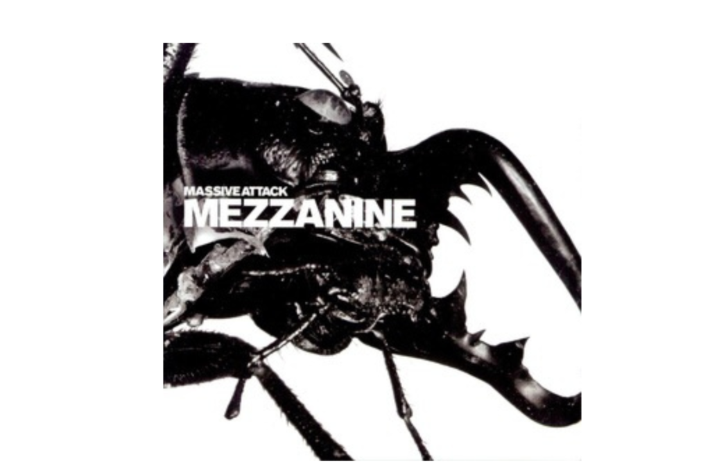
Massive Attack’s 1998 album Mezzanine is often cited as the pinnacle of trip-hop and its cover art is just as dark and atmospheric as the music itself. It features a high-contrast, macro photograph of a black stag beetle that looks both elegant and terrifying against a plain white background. Designed by Robert Del Naja (3D) in collaboration with Tom Hingston and photographer Nick Knight, the image was intended to represent the claustrophobic and metallic sound of the record. The beetle’s hard exoskeleton serves as a perfect metaphor for the defensive, cold, and intricate production that defined the band’s shift away from their soulful roots into something much more industrial.
The choice of an insect was a bold move that rejected the usual human-centric imagery of the music industry and instead focused on a cold and alien beauty. By blowing the beetle up to such a large scale, the artists forced the viewer to confront the details of a creature that is usually ignored or reviled which mirrored the way the music explored the darker corners of the human psyche. The minimalist layout and the use of a custom-designed font added to the sophisticated and “designer” feel of the release. It remains a striking example of how photography can be used to evoke a specific mood and it solidified Massive Attack’s reputation as one of the most visually literate bands of the late nineties.
Björk Post Portrait
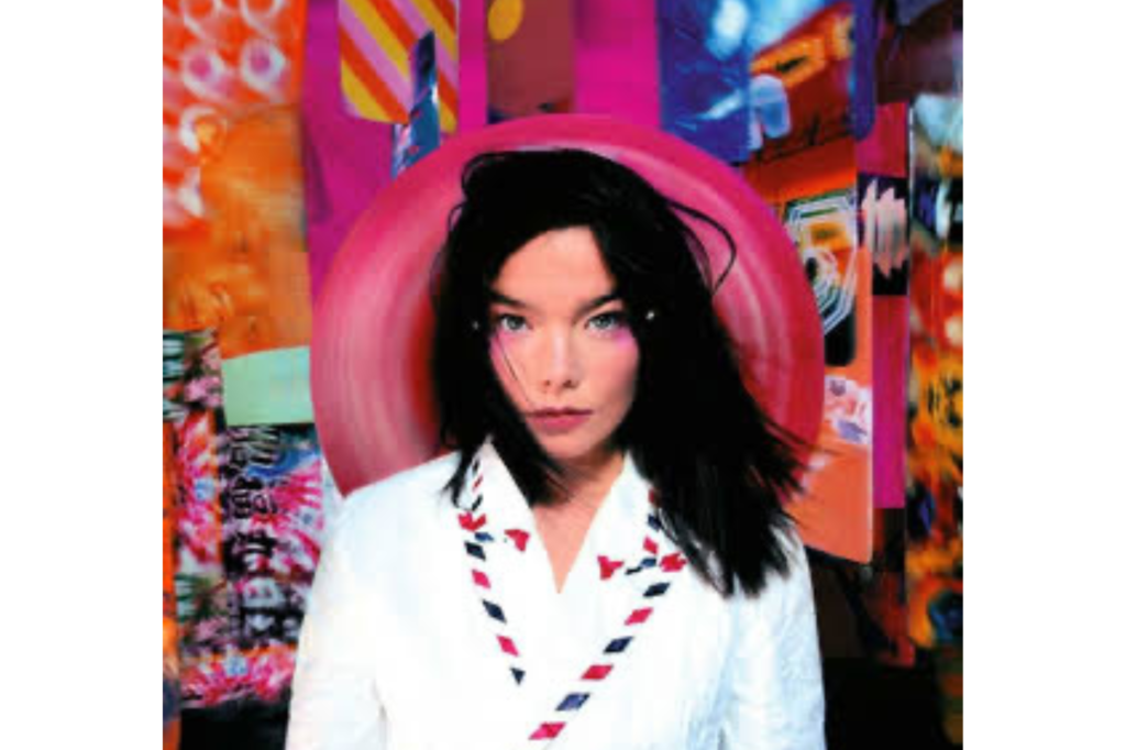
Björk’s 1995 album Post features a stunning portrait of the Icelandic singer standing in front of a background of oversized postcards and airmail stationery. Photographed by Stéphane Sednaoui, the image captures Björk in a jacket made of Tyvek paper which was designed to look like an envelope to symbolise her sending musical “messages” back to her home in Iceland from London. The vibrant pinks and oranges of the background contrast with her pale skin and dark hair to create a look that is both futuristic and deeply personal. It perfectly represented the eclectic mix of techno, jazz, and pop that made the album such a groundbreaking success upon its release.
The artwork is a masterpiece of art direction because it manages to be incredibly stylish while still feeling playful and eccentric like the artist herself. By placing herself in the center of the frame surrounded by the symbols of communication and travel, Björk emphasized her status as a global nomad and a pioneer of the digital age. The use of bright colors and surreal proportions was a breath of fresh air in a decade that was often dominated by the muted tones of alternative rock. This cover helped turn Björk into a visual icon and established her as a performer who viewed her album sleeves as an integral part of her overall creative output rather than just a commercial necessity.
The Verve Urban Hymns Bus
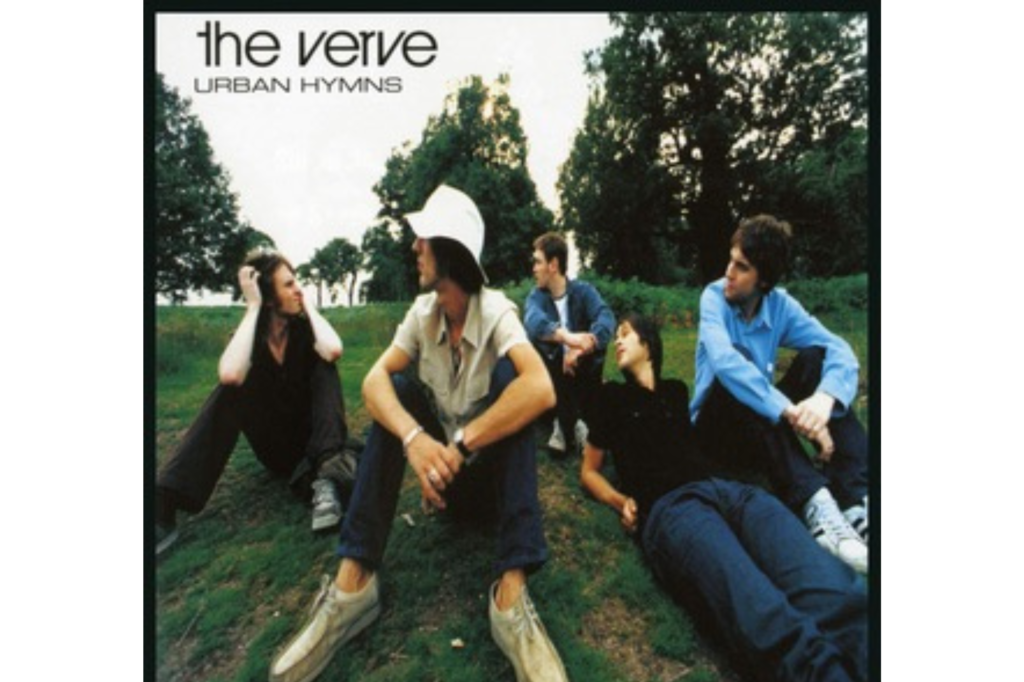
The cover for The Verve’s 1997 blockbuster Urban Hymns is a masterclass in Britpop cool and it features the band members sitting casually on a wooden bench in Richmond Park. Shot by photographer Chris Floyd, the image has a cinematic and slightly melancholic quality that fits the sweeping, anthemic sound of tracks like “Bitter Sweet Symphony.” The band looks tired yet defiant and the natural setting provides a calm contrast to the gritty and expansive “urban” themes suggested by the title. It was a simple yet effective way to present the group as a gang of brothers who had weathered the storms of internal conflict to create something truly monumental.
The choice of the park setting was a deliberate nod to the pastoral side of English life which was a common theme in the “Cool Britannia” era of the late nineties. By avoiding the typical street scenes or studio shots, The Verve managed to create an image that felt timeless and grounded in reality rather than being tied to a specific fashion trend. The soft, natural lighting and the relaxed poses of the musicians gave the album a sense of authenticity and weight that resonated with a massive global audience. This cover didn’t need any flashy gimmicks to be effective because it relied on the quiet charisma of the band and the emotional resonance of their music to make a lasting impression on the charts.
Smashing Pumpkins Mellon Collie Fantasy
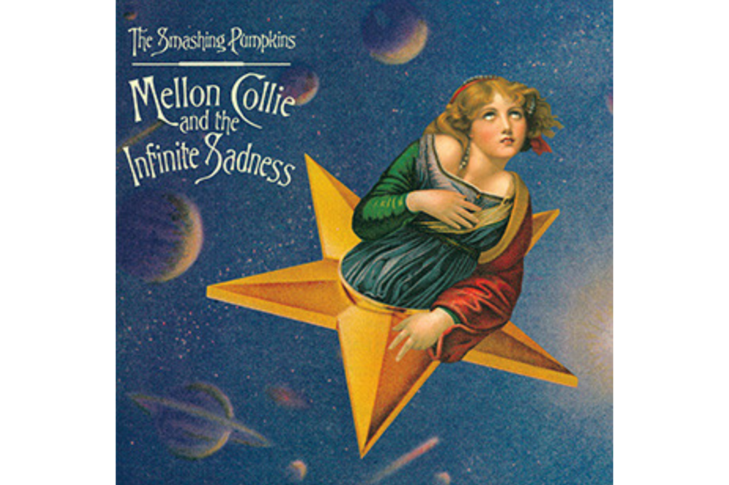
Released on 24 October 1995, the artwork for Mellon Collie and the Infinite Sadness is a whimsical masterpiece that perfectly mirrors the sprawling, ambitious nature of the double album. Artist John Craig created the collage by using various Victorian-style illustrations and celestial imagery to construct a dreamlike world that feels both nostalgic and otherworldly. The central figure is a woman wearing a star crown who appears to be floating inside a celestial body and this character was actually a hybrid of two different classical paintings. Craig used a woman’s face from a Jean-Baptiste Greuze painting and combined it with the body from a Raphael portrait to create a distinctively surreal icon for the alternative rock generation.
The intricate details of the cover including the personified planets and the velvet-textured background suggested a move toward a more theatrical and romantic aesthetic for Billy Corgan and his bandmates. It stood in stark contrast to the gritty realism of many other mid-nineties rock covers because it invited the listener into a Victorian fairytale world filled with mystery and longing. Fans spent hours poring over the expanded booklet which featured additional collages that brought the songs’ themes of childhood and cosmic wonder to life. This cover helped the album feel like an “event” and it remains one of the most celebrated examples of digital collage and art direction in the history of the music industry.
Spice Girls Spice Lollipops

When the Spice Girls burst onto the scene in 1996 with their debut album Spice, they brought with them a vibrant and unapologetic brand of “Girl Power” that was reflected in their colourful cover art. The image features the five members—Victoria, Mel B, Emma, Mel C, and Geri—each striking a pose that highlighted their individual personas while they stood behind large, illuminated letters spelling out the album title. This visual strategy was a masterstroke in branding because it allowed fans to easily identify with their favourite “Spice” and fostered a sense of community among young listeners. The bright and punchy aesthetic was a deliberate rejection of the self-serious and often male-dominated rock imagery that had defined the earlier part of the decade.
The use of the illuminated letters became an iconic motif for the group and helped establish them as a global phenomenon almost overnight through their sheer visual charisma. By presenting five distinct personalities in one frame, the artwork reinforced the message that being different was a strength and that friendship was the ultimate foundation for success. The high-gloss photography and the pop-art sensibilities of the sleeve made it a fixture in record shops and bedroom walls across the world during the height of “Spice Mania.” It remains a definitive cultural artifact of the nineties because it captured a moment when British pop music became bold, colourful, and inclusive once again.
Fatboy Slim You’ve Come Long Way
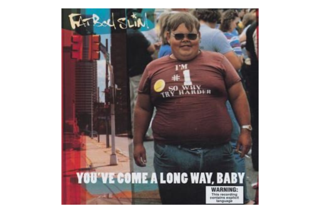
The 1998 cover for Fatboy Slim’s You’ve Come a Long Way, Baby is a quintessential example of the cheeky and sample-heavy spirit of the Big Beat movement. It features a candid photograph of an overweight man wearing a t-shirt that says “I’m #1 So Why Try Harder” while he holds a cigarette and looks directly at the camera with a nonchalant expression. The image was taken at a 1983 fat people’s festival in Virginia and Norman Cook chose it because it captured a sense of irony and “everyman” rebellion that suited the fun-loving nature of his tracks. It was a massive departure from the glossy and airbrushed covers of the mainstream dance scene and it immediately stood out for its raw and humorous quality.
The man in the photo, later identified as Ronald Pell, became an unlikely icon of the late nineties club scene despite the fact that the image was nearly fifteen years old when the album was released. By using a “real” and unpolished photograph, Fatboy Slim aligned his music with a sense of suburban fun and discarded the pretentiousness often associated with electronic music at the time. The title itself was a nod to a cigarette advertisement which added another layer of satirical depth to the overall presentation of the record. This cover helped make the album a household name and it serves as a humorous reminder that some of the best art comes from the most unexpected and unrefined places.
The Notorious B.I.G. Ready To Die
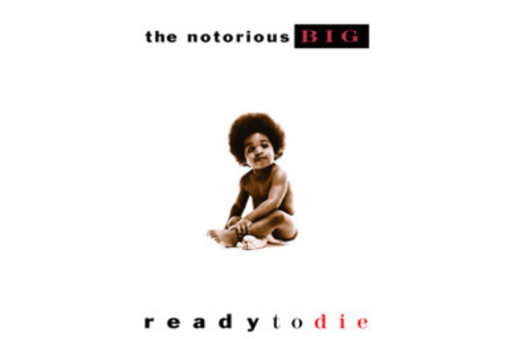
Released on 13 September 1994, the cover for Ready to Die features a young African American baby with a miniature afro who bears a striking resemblance to a young Christopher Wallace. While many fans initially believed the child was Biggie himself, it was actually a baby model named Keithroy Yearwood who was chosen to represent the album’s central concept of the circle of life and death in the inner city. The image of innocent youth contrasted sharply with the gritty and often violent lyrical content of the songs which explored the struggles of growing up in Brooklyn. This juxtaposition served to humanise the artist and provided a poignant visual anchor for his storytelling.
The white background and the simplicity of the portrait gave the album a classic and timeless feel that helped it stand out in the competitive East Coast hip-hop market. It has since become one of the most parodied and celebrated covers in the genre because it perfectly captured the duality of Biggie’s persona, vulnerable yet resilient. The success of the artwork even influenced other legends like Nas and Drake to use childhood photos for their own releases in later years. It remains a powerful symbol of the potential and the peril facing young Black men in America and it serves as a lasting tribute to the legacy of one of the greatest rappers to ever pick up a microphone.
Oasis (What’s The Story) Morning Glory
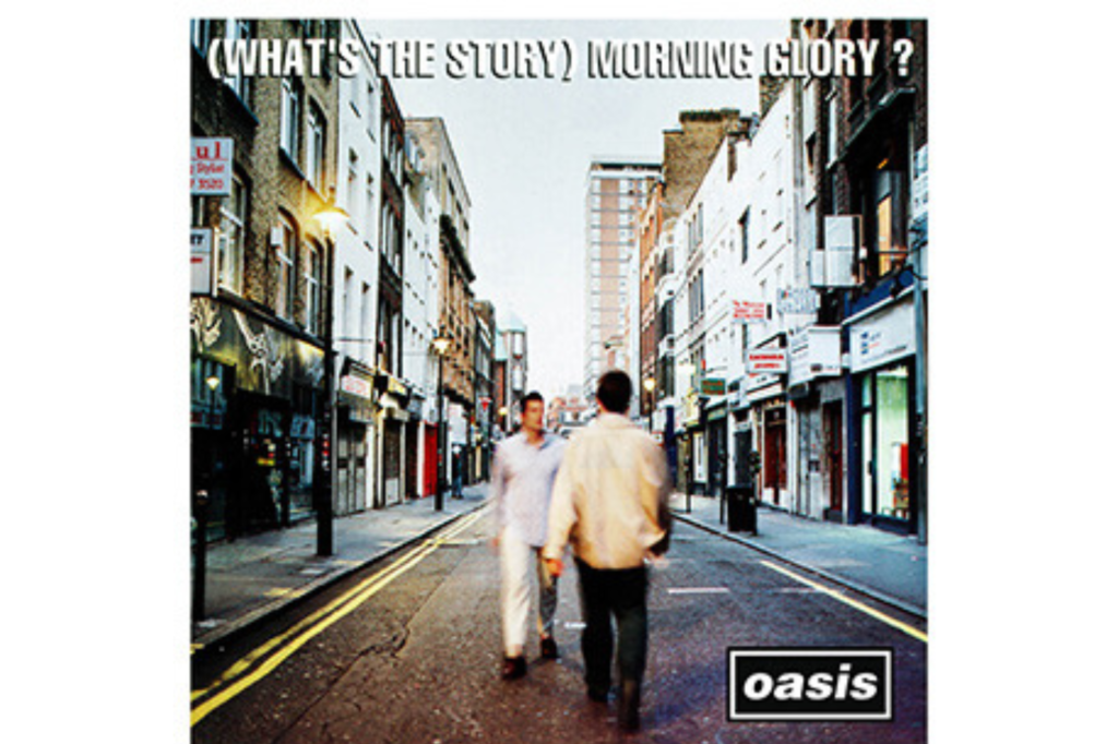
The cover for Oasis’s 1995 second album, (What’s the Story) Morning Glory?, is an atmospheric shot of two men passing each other on Berwick Street in London’s Soho. Photographed by Michael Spencer Jones, the image was intended to capture the feeling of a busy city morning and the fleeting nature of urban encounters. One of the men is the album’s designer Brian Cannon and the other is DJ Sean Rowley and they are walking past the independent record shops that defined the musical heart of the capital at the time. The blurred background and the slightly hazy light give the sleeve a cinematic quality that matched the grand and anthemic scale of hits like “Wonderwall.”
Berwick Street became a site of pilgrimage for Oasis fans around the world who wanted to recreate the famous walk and the image cemented the band’s status as the leaders of the Britpop movement. The choice of location was a tribute to the physical culture of music buying and the importance of the independent record store in British society. By placing themselves in the heart of London’s musical district without actually appearing on the cover themselves, Oasis created a visual that felt more like a cultural landmark than just a piece of promotional material. It remains one of the most evocative images of the nineties because it perfectly captured the confidence and the urban energy of a Britain that was once again at the center of the musical world.
Green Day Insomniac Collage
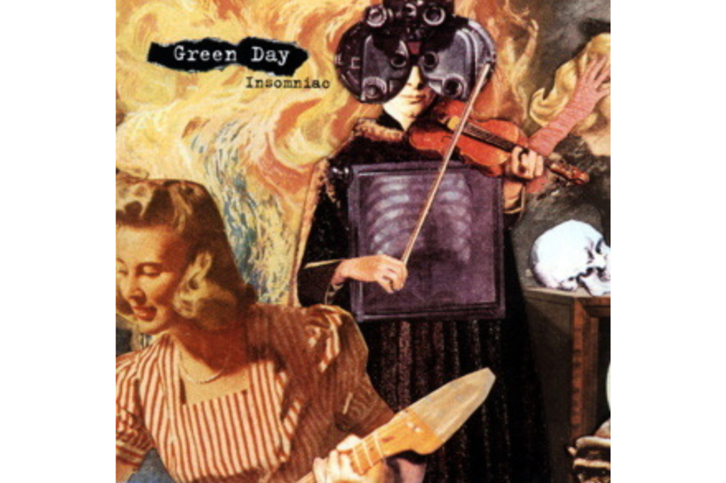
For their 1995 follow-up to Dookie, Green Day opted for a much darker and more intricate piece of artwork for the album Insomniac. The cover is a surreal collage titled “God Told Me to Skin You Alive” which was created by the artist Winston Smith using various vintage magazine clippings and illustrations. It features a three-eyed man clutching a guitar while surrounded by chaotic imagery of consumerism and existential dread which reflected the band’s growing discomfort with their sudden fame. The title Insomniac was chosen because Billie Joe Armstrong was struggling with sleep deprivation following the birth of his son and the frantic nature of the collage perfectly echoed that mental state.
Smith’s work was heavily influenced by the punk aesthetic of the seventies but he updated it for the nineties by using a more polished and detailed approach to his “culture jamming” techniques. The artwork is filled with hidden meanings and satirical stabs at the corporate world which resonated with the band’s core audience of disillusioned youth. Unlike the bright and bratty look of their previous release, this sleeve was grittier and more sophisticated and it showed that the band was willing to evolve and explore the darker side of their success. It remains a fan favourite for its complexity and its ability to capture the restless and anxious energy of a band trying to navigate the pressures of being the biggest punk group on the planet.
Beck Odelay Collage
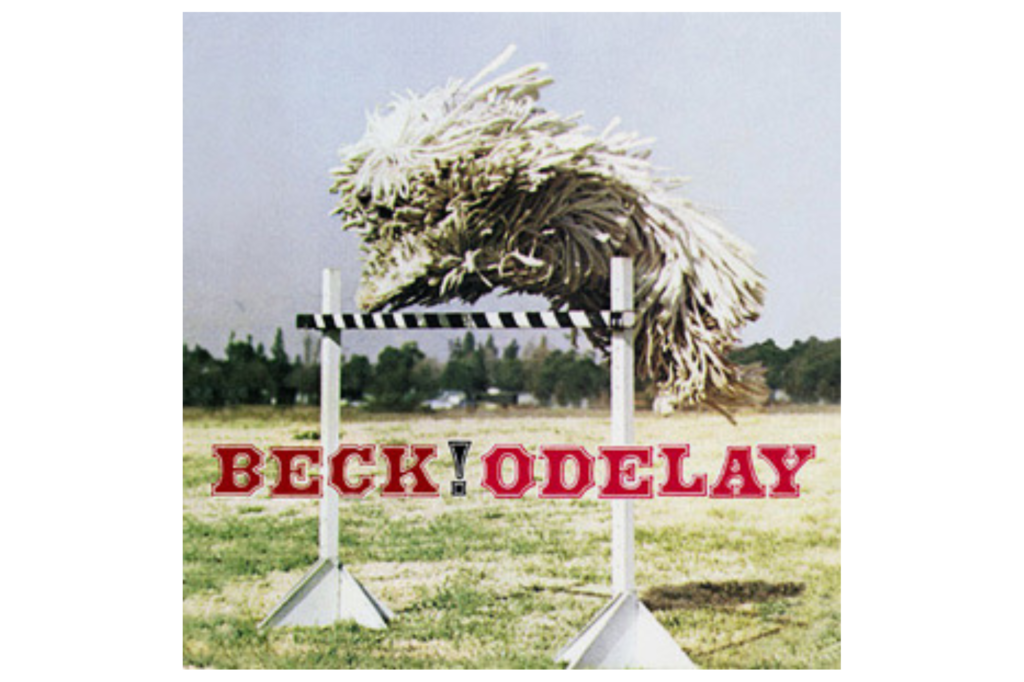
Beck’s 1996 album Odelay features one of the most bizarre and memorable covers of the decade and it consists of a simple photograph of a Komondor dog leaping over a hurdle. The dog; a rare Hungarian breed known for its distinctive corded coat that resembles a giant mop—was captured in mid-air by photographer Joan Ludwig. Beck found the image in a book about dog breeds and was immediately drawn to its surreal and joyful quality which mirrored the eclectic and sample-heavy “junkyard” aesthetic of the music. It was a total rejection of the typical rock star posing and instead embraced a sense of playfulness and absurdity that defined Beck’s creative output during this period.
The image has a lo-fi and almost accidental feel to it which was a perfect match for the album’s mix of folk, hip-hop, and garage rock. By choosing such an unconventional “star” for his cover, Beck signaled to his audience that the rules of genre and presentation were there to be broken. The dog’s leaping form is so unusual that many people initially thought it was a bundle of rags or a piece of abstract art which only added to the mystery and the charm of the release. It remains a classic example of how a simple and unexpected image can become an iconic piece of branding and it serves as a testament to the quirky and unpredictable spirit of the mid-nineties alternative scene.
Looking back at these eighteen covers reveals a time when the album sleeve was a vital battleground for cultural relevance and artistic bravery.
Like this story? Add your thoughts in the comments, thank you.

