
When Album Art Became Cultural History

The relationship between a needle hitting vinyl and the cardboard sleeve held in a listener’s hands has always been a sacred bond. Before the era of endless scrolling and digital thumbnails, an album cover was the definitive gateway into a musician’s psyche because it provided a visual language for the sounds hidden within the grooves. These 12-inch canvases allowed artists to bridge the gap between auditory experimentation and fine art while they transformed record shop bins into miniature galleries that anyone could afford to take home.
In the modern world, we often forget that these images were frequently as provocative and revolutionary as the songs they accompanied. These covers did more than just sell records because they defined entire eras and gave subcultures a uniform to wear with pride. By looking back at the most iconic designs in history, we can see how photographers and graphic designers shifted the cultural needle and proved that music was never just about what we heard but was equally about the vision we chose to embrace.
The Beatles Abbey Road

The sight of the Fab Four strolling across a zebra crossing in North London remains perhaps the most parodied and celebrated image in pop culture history. It was a remarkably simple concept dreamt up by Iain Macmillan during a brief ten-minute photo shoot, yet it managed to capture the end of an era with effortless poise. While the music inside was a sophisticated masterpiece of studio production, the cover felt grounded and approachable because it placed the world’s biggest stars in a mundane urban setting. Fans spent decades dissecting every tiny detail from Paul’s bare feet to the hidden meaning of the Volkswagen Beetle parked in the background, which turned a simple walk into a legendary piece of folklore that still draws thousands of tourists to that specific street corner every single year.
This photograph serves as a poignant visual full stop for a band that had redefined the world several times over by 1969. There is a certain magic in the way the four men move in unison even though their internal creative bond was beginning to fray at the edges during the recording sessions. The bright sunlight and the clean lines of the pavement provided a stark contrast to the psychedelic complexity of their previous outings like Sgt. Pepper, which suggested a return to basics that felt both honest and revolutionary. It is a testament to the power of photography that a fleeting moment on a quiet morning could become a symbol of musical perfection and a permanent fixture in the collective memory of global art enthusiasts.
Pink Floyd Dark Side

Simplicity often carries the heaviest weight in the world of graphic design and the prism created by Storm Thorgerson for Pink Floyd is the ultimate proof of that concept. Hipgnosis was the design firm responsible for this minimalist marvel and they purposefully avoided using any photographs of the band members to let the concept of light and madness speak for itself. The white beam of light entering the glass and exiting as a vibrant rainbow perfectly mirrored the lyrical themes of the album which explored the various pressures of human existence. Because the design was so clean and geometric, it transcended the specific trends of 1973 and became a timeless emblem that looks just as modern on a t-shirt today as it did on a record player fifty years ago.
The brilliance of this cover lies in its ability to represent the sprawling and atmospheric soundscapes of the music through a single and silent metaphor. As the rainbow extends across the gatefold sleeve and into the interior, it creates a sense of continuity that encourages the listener to view the album as one singular and uninterrupted journey. It challenged the industry standard of putting a famous face on the front of a product and instead opted for an intellectual approach that invited the audience to think and feel before the first note even played. This shift towards abstract symbolism paved the way for future artists to experiment with their visual identity and ensured that the prism would remain one of the most recognisable shapes in the history of global commerce.
Nirvana Nevermind Underwater
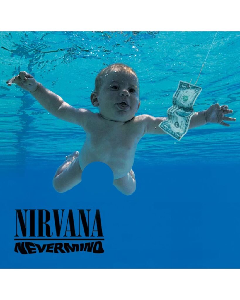
When Robert Fisher and photographer Kirk Weddle submerged a four-month-old baby in a swimming pool to capture the cover of Nevermind, they inadvertently created the defining image of the nineties. The sight of a naked infant chasing a dollar bill on a fishhook was a scathing and brilliant critique of the consumerist society that Nirvana was about to conquer. It captured the raw and unpolished spirit of the grunge movement while it simultaneously mocked the very industry that was desperate to market it to the masses. The blue and shimmering water provided a dreamlike backdrop for this cynical metaphor which helped the album stand out amongst the polished and artificial pop aesthetics that had dominated the airwaves for the previous decade.
Beyond the social commentary, the image possessed a striking and natural beauty that felt entirely authentic to the band’s rebellious ethos. It was a daring choice for a major label release because it flirted with controversy while maintaining a sense of innocent curiosity that mirrored Kurt Cobain’s own complex personality. As the album climbed the charts and eventually toppled the kings of pop, the “Nirvana Baby” became a shorthand for a generation that felt disillusioned and disconnected from the American Dream. The cover didn’t just represent the songs; it acted as a manifesto for a cultural shift that prioritised substance over style and helped turn an underground punk band from Seattle into the most important musical force on the entire planet.
David Bowie Aladdin Sane
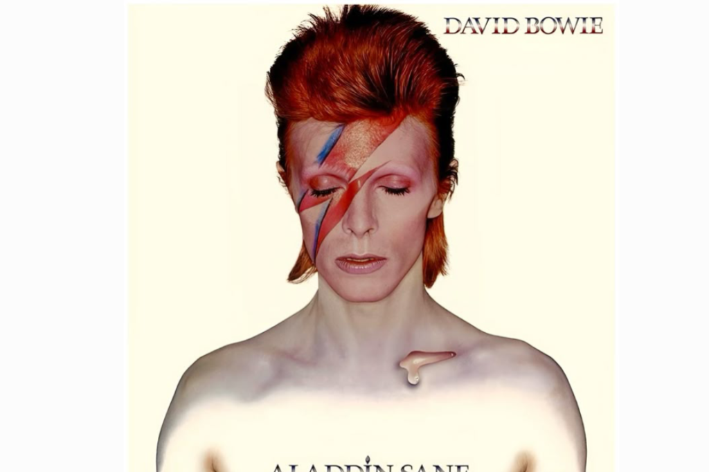
The lightning bolt painted across David Bowie’s face is more than just a make-up choice because it represents the ultimate fusion of rock music and high fashion. Photographer Brian Duffy captured this image in 1973 and it immediately established Bowie as a chameleonic figure who could manipulate his own identity to suit his creative whims. The thin and teardrop-shaped globule on his collarbone added a touch of alien vulnerability to the otherwise sharp and aggressive aesthetic of the red and blue bolt. It was a visual representation of a “lad insane” and it perfectly captured the fractured and glamorous tension of a star who was struggling with the pressures of his own meteoric rise to fame.
This cover effectively turned the human face into a canvas for avant-garde expression and it influenced countless artists in the realms of music and makeup for decades to follow. Bowie understood that the image was a vital part of the storytelling process and he used this specific look to distance himself from the Ziggy Stardust persona that had previously defined him. The stark and pale background ensures that the focus remains entirely on the character he is portraying which creates an intimate and haunting connection with the viewer. It remains a masterpiece of portraiture because it manages to be both incredibly beautiful and deeply unsettling at the same time and it solidified Bowie’s reputation as the premier visual artist of the twentieth century.
Joy Division Unknown Pleasures

Peter Saville was a young designer when he stumbled upon a data visualisation of radio waves from a dying star and he decided it was the perfect fit for Joy Division’s debut. The resulting cover for Unknown Pleasures is a masterclass in mystery because it features no text and no band name on the front at all. The jagged white lines set against a deep and textured black background evoke a sense of cold and industrial isolation that perfectly matches the brooding and atmospheric post-punk sounds of the record. It feels like a transmission from another world or perhaps a glimpse into a dark and digital future where emotions are reduced to frequencies and data points on a flickering screen.
What makes this specific piece of art so enduring is its transition from a niche underground record cover into a global fashion phenomenon. You can find these pulsar waves on everything from high-end catwalks to street-wear hoodies which proves that the design has a life entirely independent of the music itself. However, for those who know the haunting voice of Ian Curtis, the image remains a profound symbol of the beauty found in melancholy and the precision of scientific sorrow. By choosing such an abstract and intellectual image, the band avoided the tropes of the era and created a visual identity that is both hauntingly quiet and incredibly loud in its cultural impact across the world of modern design.
The Velvet Underground Banana
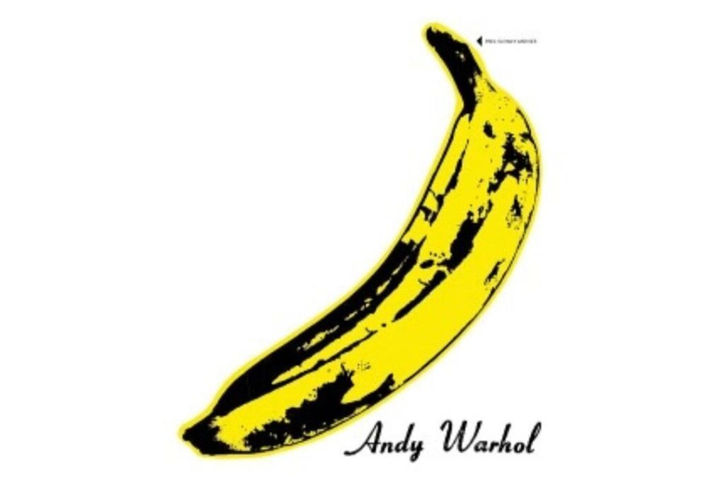
Pop art legend Andy Warhol famously contributed the artwork for the debut of The Velvet Underground and he turned a simple piece of fruit into a provocative statement. The original vinyl pressings featured a sticker that invited the listener to “peel slowly and see” which revealed a flesh-colored banana underneath the yellow skin. This interactive element was a stroke of genius because it blurred the line between a commercial product and a piece of conceptual art that fans could manipulate. Even though the album was not an immediate commercial success, the cover became a badge of cool for anyone involved in the avant-garde scene of New York City and it eventually became one of the most recognisable images in the history of rock.
The simplicity of the yellow banana against the plain white background was a direct challenge to the busy and psychedelic covers that were popular in 1967. Warhol’s signature at the bottom gave the band an instant sense of artistic credibility and it linked the gritty and experimental music of Lou Reed with the high-society art world of the Factory. It was a perfect marriage of high and low culture that reflected the band’s own lyrical explorations of the dark underbelly of urban life. Today, the banana remains a symbol of independent spirit and creative fearlessness because it reminds us that even the most common objects can become legendary when viewed through the lens of a visionary artist who isn’t afraid to play with expectations.
Grace Jones Island Life
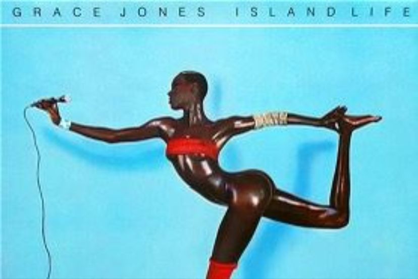
Jean-Paul Goude created a visual miracle when he photographed Grace Jones for the Island Life compilation and he pushed the boundaries of what the human body could achieve. The image features Jones in an impossible and gravity-defying pose that was actually a composite of several different photographs meticulously spliced together. It highlights her incredible athleticism and her statuesque beauty while it simultaneously presents her as something beyond human or perhaps a living sculpture of jet-black marble. The bright blue background provides a sharp and tropical contrast to her dark skin which creates a vibrant and energetic aesthetic that perfectly mirrors her eclectic blend of disco and reggae and new wave music.
This cover is a landmark in the history of black feminine representation because it presents Grace Jones as a powerful and uncompromising figure who owns her own sexuality and strength. There is no softness or submission in her expression and instead there is only a fierce and focused intensity that commands the viewer’s attention. It challenged the traditional beauty standards of the 1980s and it paved the way for future icons to embrace a more androgynous and experimental visual style. By using the camera to manipulate reality, Goude and Jones created an image that feels both ancient and futuristic which ensured that the cover would remain a timeless piece of art that continues to inspire photographers and fashion designers around the globe.
Led Zeppelin IV House
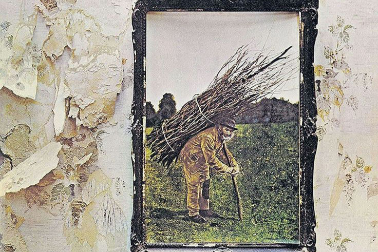
The fourth album by Led Zeppelin is famously untitled and features a worn and rustic painting of an old man carrying a bundle of sticks on his back. Jimmy Page found the painting in an antique shop and he decided to mount it on a dilapidated wall in a suburban housing estate for the photo shoot. This juxtaposition between the old and rural world and the modern and decaying urban environment created a sense of mystical intrigue that perfectly suited the band’s fascination with folklore and heavy blues. There is a deep sense of weight and history in the image which suggests that the music inside is something ancient and rediscovered rather than just another rock record from the seventies.
When you open the gatefold sleeve, you are greeted by an illustration of The Hermit from a tarot deck which further deepens the esoteric and magical themes of the project. The band chose to leave their name and the album title off the cover entirely because they wanted the music and the art to stand on their own merits without the distraction of branding. This bold move forced the audience to engage with the visuals on a more visceral level and it helped create the legendary aura that still surrounds the band to this day. It is a cover that feels like a mystery waiting to be solved and it continues to fascinate fans who look for hidden meanings in the textures of the peeling wallpaper and the tired eyes of the stick-man.
Prince Purple Rain
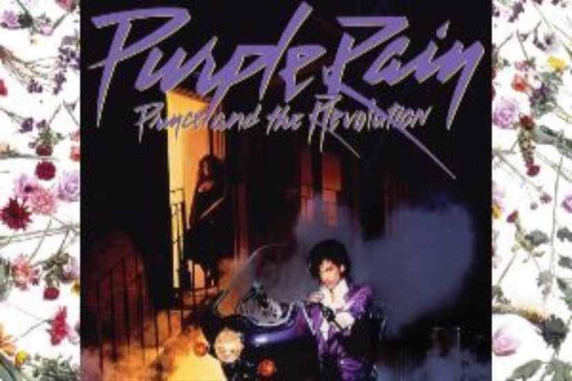
Nothing captures the flamboyant and electrifying essence of the eighties quite like Prince sitting on a purple motorcycle in a misty and neon-lit alleyway. This cover for Purple Rain is the ultimate expression of rock stardom because it combines elements of romance and mystery and raw cinematic power. Prince looks directly at the camera with a confident and smouldering gaze while his ruffled shirt and purple suit reflect the decadent and regal style that would become his trademark. The smoke and the purple hues create an atmosphere that feels like a dream or a scene from a classic film and it perfectly sets the stage for the epic and emotional ballads that define the soundtrack.
The image was actually taken on a film set at Warner Bros Studios and it was designed to tie the album directly to the motion picture of the same name. However, the cover quickly took on a life of its own and it became the definitive visual for the “Minneapolis Sound” that Prince pioneered. It represents a moment where a singular artist took complete control of his image and his music to create a unified world that fans could inhabit. The motorcycle and the flowers and the ornate font all work together to create a sense of lush and dramatic storytelling that invited the listener to step into Prince’s world and experience the passion and the pain of his creative journey.
Fleetwood Mac Rumours
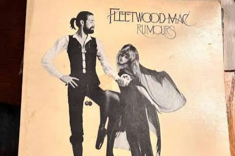
The cover of Rumours is a masterclass in understated elegance and it features Mick Fleetwood and Stevie Nicks in a whimsical and theatrical pose. Stevie is dressed in her iconic “Rhiannon” stage attire with flowing black fabric while Mick stands tall with his signature wooden balls hanging from his waist. The cream-coloured background gives the image a clean and sophisticated feel that allowed the personalities of the band members to shine through without any unnecessary clutter. It suggests a sense of playfulness and intimacy which is somewhat ironic given the deep personal turmoil and the messy breakups that were occurring within the group during the making of the record.
This photograph captured a moment of calm within a creative storm and it helped ground the sprawling and polished pop-rock of the album in a human and relatable context. The chemistry between the two figures is palpable and it hints at the complex web of relationships that fuelled the song-writing process for hits like Go Your Own Way and Dreams. By choosing a portrait that felt like a still from a Victorian stage play, the band created a visual identity that felt both timeless and highly personal. It remains one of the most beloved covers in music history because it feels like a glimpse behind the curtain of one of the world’s most famous bands and it reminds us that great art often comes from the most complicated human connections.
The Rolling Stones Sticky Fingers
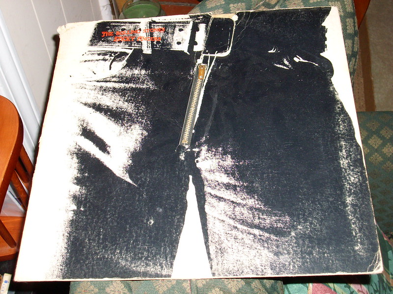
When Andy Warhol collaborated with The Rolling Stones for their 1971 masterpiece, he didn’t just create a cover because he designed a provocative piece of interactive sculpture. The original vinyl featured a real metal zipper embedded into the denim of a man’s crotch which fans could actually pull down to reveal cotton briefs printed underneath. This tactile experience was a stroke of genius that perfectly mirrored the gritty and sexual energy of the music found on the record. It was a bold and scandalous departure from traditional packaging that forced the listener to physically engage with the product before the needle even touched the groove. Because the design was so complex and expensive to produce, it became an instant collector’s item that defined the band’s transition into their most decadent and successful decade.
The imagery was a masterclass in the power of suggestion and it captured the rebellious spirit of the early seventies with effortless cool. While many fans initially assumed the model was Mick Jagger himself, it was actually several different men from Warhol’s inner circle at The Factory who contributed to the final composite image. This sense of mystery and anonymity added to the allure of the package while it simultaneously challenged the conservative standards of the era. The zipper famously caused issues during shipping because it often scratched the vinyl records stacked on top of it, but the band refused to change the design because they valued the artistic statement over practical concerns. It remains a legendary example of how a physical object can enhance the auditory experience and turn a simple album into a piece of high-concept art.
Grace Jones Nightclubbing
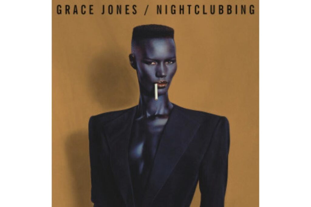
The collaboration between Grace Jones and Jean-Paul Goude reached a peak of stylized perfection with the cover for Nightclubbing in 1981. This painted photograph features Jones in an oversized Armani suit with padded shoulders and a cigarette dangling from her lips against a stark and moody blue background. It is an image that successfully blurred the lines between masculinity and femininity while it presented Jones as a futuristic and impenetrable icon of the avant-garde. The sharp angles of her haircut and the matte texture of her skin created a visual language that felt entirely original and dangerously sophisticated. It wasn’t just a portrait of a singer because it was a manifesto for a new kind of stardom that prioritized a cold and calculated aesthetic over traditional pop warmth.
This specific artwork became a defining symbol of the New Wave movement because it married the world of fashion with the underground pulse of the club scene. The use of the “French Correction” technique by Goude allowed him to elongate her features and create a silhouette that looked almost superhuman in its precision and strength. As the reggae-infused rhythms of the music filled the airwaves, this image provided the perfect visual counterpart to her deep and commanding vocals. It challenged the audience to look beyond gender norms and embrace a more fluid and artistic identity which influenced a whole generation of designers and musicians. Today, the cover is still celebrated in galleries around the world as a pinnacle of twentieth-century portraiture because it captures a moment where pop music truly became a work of fine art.
Bruce Springsteen Born In The USA
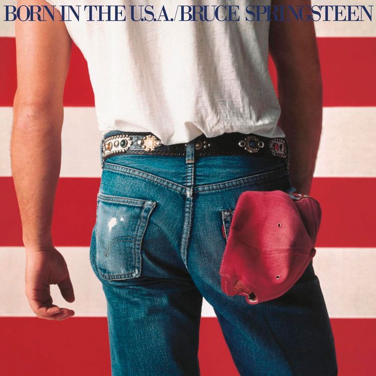
Annie Leibovitz captured one of the most misunderstood yet iconic images in American history when she photographed Bruce Springsteen’s backside against the backdrop of the stars and stripes. The cover for Born in the U.S.A. features the Boss in a simple white t-shirt and worn-out blue jeans with a red cap tucked into his back pocket. It was a visual celebration of the working-class hero and it radiated a sense of rugged and honest patriotism that resonated with millions of people during the mid-eighties. The composition was tight and focused which gave the image a sense of intimacy and power that felt both timeless and contemporary. It portrayed Springsteen not as a distant rock god but as a man of the people who was deeply rooted in the soil of his homeland.
Despite the vibrant and patriotic colours, the image carried a deeper and more complex meaning that many people overlooked at the time. Much like the title track itself, the cover was a reflection on the American identity and the struggles of the ordinary citizen during a period of significant social change. Springsteen later remarked that they chose the shot of his rear because the pictures of his face didn’t look quite right, yet this accidental choice created a shorthand for the blue-collar spirit that defined his entire career. It became a cultural touchstone that appeared on posters and billboards across the globe and it helped turn the album into a global phenomenon. The simplicity of the denim and the flag remains a powerful symbol of the enduring link between music and national identity and it continues to be one of the most recognizable covers in the history of rock.
Bjork Homogenic

Alexander McQueen and Nick Knight teamed up to create a visual masterpiece for Björk’s 1997 album Homogenic and they transformed the singer into a stunning techno-geisha. The image features Björk with elongated silver rings around her neck and incredibly intricate hair that looks like a structural work of art against a minimalist silver background. It was designed to represent a character who was a “warrior of love” and it perfectly captured the blend of organic strings and harsh electronic beats found within the music. This was a significant departure from her previous playful and whimsical images because it presented her as a serious and formidable artistic force. The contrast between the cold and metallic accessories and her soft and emotional expression created a haunting beauty that felt both ancient and incredibly futuristic.
The production of this cover was a feat of high-fashion engineering and it required Björk to stand for hours while the heavy rings and the elaborate wig were meticulously adjusted. It demonstrated her commitment to the visual side of her craft and her willingness to push her own body to the limit for the sake of an image. This collaboration between three creative giants resulted in a cover that transcended the music industry and found a permanent home in the world of high art and fashion design. It remains a powerful example of how an album cover can act as a world-building tool that prepares the listener for a unique and immersive sonic journey. By embracing such a bold and unconventional look, Björk solidified her reputation as a pioneer who wasn’t afraid to challenge the expectations of the pop world and create something truly visionary.
NWA Straight Outta Compton
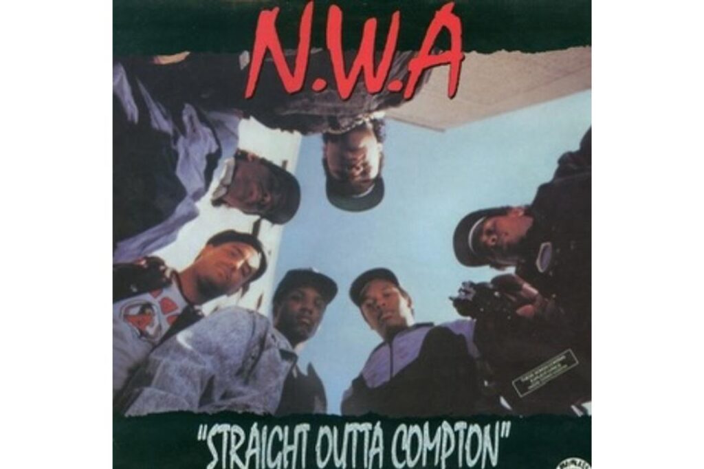
The world of hip-hop changed forever when N.W.A. released Straight Outta Compton with a cover that felt like a direct confrontation with the listener. Photographer Eric Poppleton captured the group from a low-angle perspective as they stood in a circle looking down at the camera with Eazy-E pointing a handgun directly at the lens. It was a raw and uncompromising image that perfectly mirrored the aggressive and reality-based storytelling of the lyrics inside the sleeve. The grainy and unpolished look of the photograph gave it a documentary-style feel that suggested this wasn’t just music but a report from the front lines of the inner city. It was a visual slap in the face to the mainstream media and it immediately established the group as the most dangerous and honest voices in the industry.
This cover was a radical departure from the flashy and colourful aesthetics of earlier rap acts and it set the standard for the gangsta rap genre for decades to come. It wasn’t about glamour or fame because it was about power and intimidation and the reality of life on the streets of South Central Los Angeles. The black and white contrasts and the defiant expressions of the band members created a sense of urgency that demanded the world’s attention. Even though it faced significant controversy and censorship at the time, the image became a symbol of resistance and a voice for a disenfranchised generation. It remains one of the most influential covers in history because it proved that an album could be a political statement and a cultural mirror that forced society to look at the parts of itself that it often tried to ignore.
The shift toward digital streaming has certainly made music more accessible but we must consider if the loss of the physical canvas has flattened our emotional connection to the art we consume.
Like this story? Add your thoughts in the comments, thank you.

