
1. C.H.U.D. (1984)
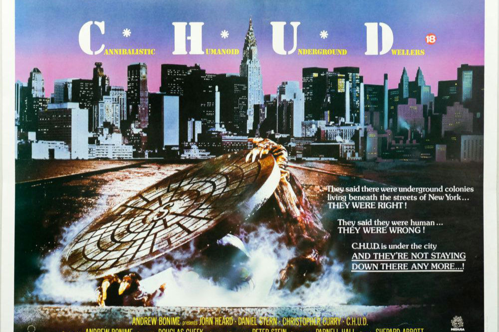
The VHS cover for C.H.U.D., which stands for Cannibalistic Humanoid Underground Dwellers, is a masterclass in unsettling 1980s horror art, depicting a monstrous, fanged face looming from the darkness of a sewer grating. This image alone was enough to give countless video store patrons nightmares, suggesting a relentless, grotesque creature feature. However, the film itself is more of a slow-burn mystery and social commentary about government cover-ups and toxic waste, with the C.H.U.D. creatures being somewhat sparsely featured and often appearing as more clumsy, glowing-eyed figures in the shadows, rather than the sharp-toothed titan promised on the box. The movie’s focus on the urban infrastructure and political conspiracy diluted the raw monster horror the cover so effectively advertised.
2. Chopping Mall (1986)
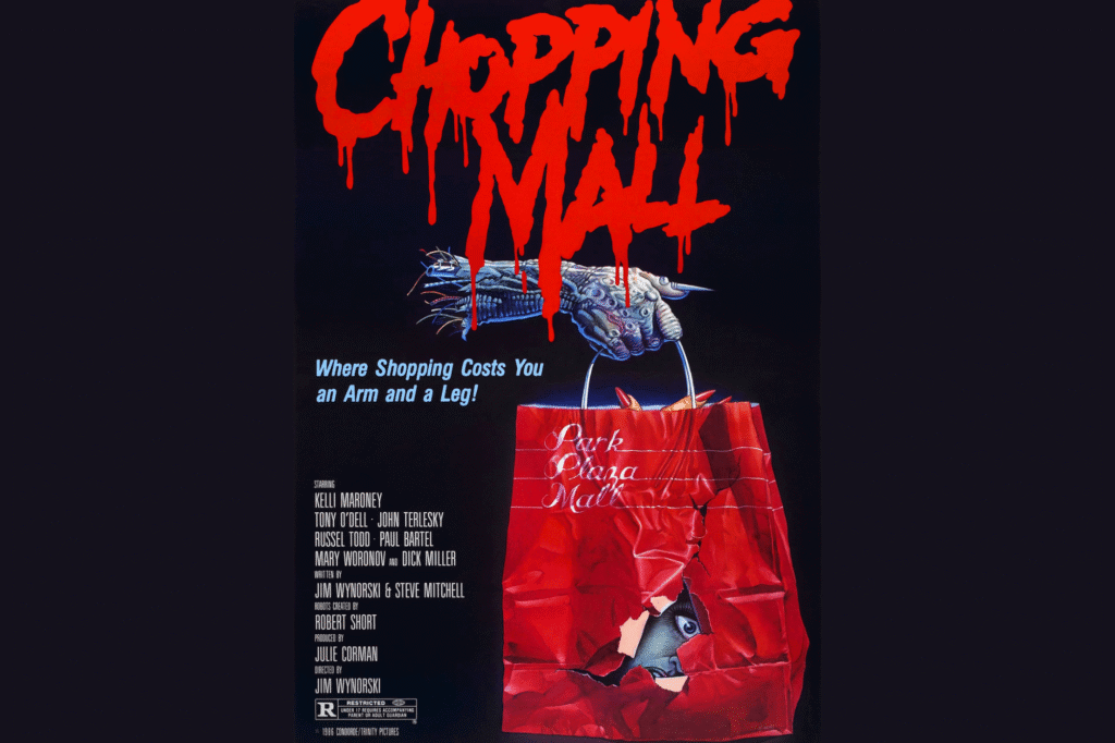
The box art for Chopping Mall features a robotic monster hand holding a red bag with an eye peeking through the torn part, suggesting a supernatural slasher lurking in the retail aisles. The title itself promises a gory, high-body-count horror flick. In reality, the film is a science-fiction comedy-horror hybrid centered on security robots, or “Killbots,” that malfunction and turn against a group of teens spending the night in the mall. While the robots deliver some violence, they look more like clunky industrial machines with laser beams than the primal, shadowy threat on the cover. The comedic tone and mechanical nature of the killers often undercut the terror implied by the box.
3. Sleepaway Camp II: Unhappy Campers (1988)
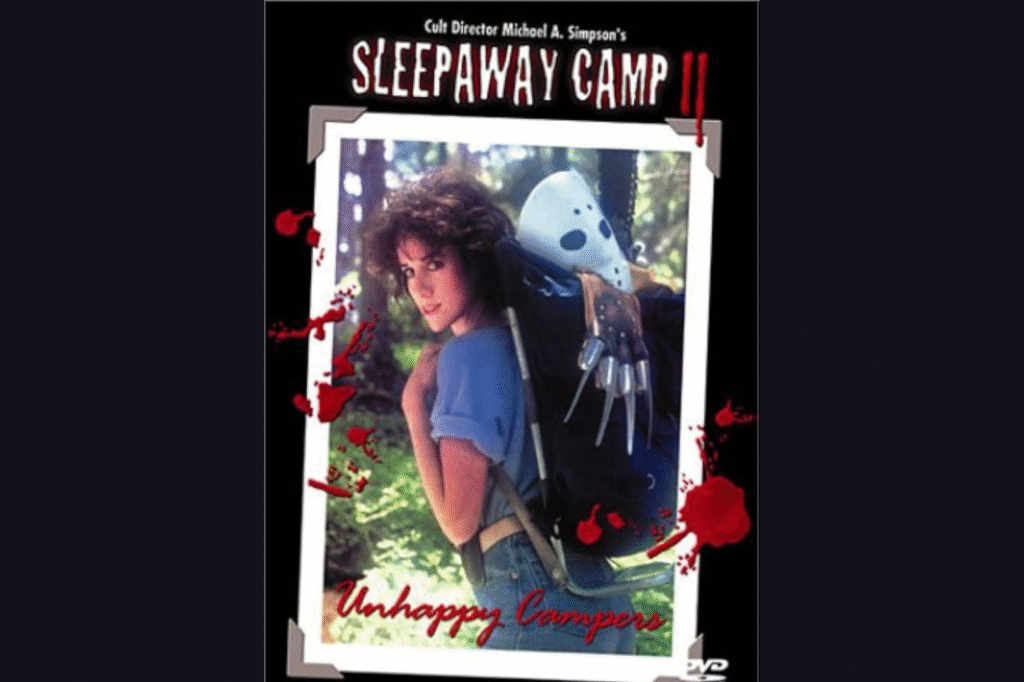
The marketing for Sleepaway Camp II took a very aggressive approach to slasher film rivalry, placing the protagonist Angela with a backpack visibly containing the unmistakable hockey mask of Jason Voorhees and the razor glove of Freddy Krueger. This cover suggested an epic, cross-franchise showdown or at least a new slasher that somehow merged the powers of the era’s biggest icons. The actual film is a darkly comedic, self-referential sequel focused entirely on Angela, who is now a counselor eliminating “bad” campers. It contains none of the characters or supernatural elements hinted at by the props on the box. The terror is mostly played for laughs, making the cover’s promise of a grand slasher crossover feel far scarier and more serious than the campy movie delivered.
4. House (1986)
The iconic cover for House features a skull-like face appearing in a brightly lit suburban window, suggesting a classic ghost story or demonic possession in a traditional haunted house setting. This striking image was genuinely chilling, hinting at a purely terrifying spectral entity. While the movie does take place in a “haunted” house, it quickly veers into surrealist fantasy and comedy, following a Vietnam veteran turned horror writer who confronts literal monsters, war flashbacks, and grotesque stop-motion puppets. The film is a wildly imaginative, tonally confused experience, but the cover’s simple, stark image of pure dread is far more cohesive and unsettling than the creature effects and comedy found within the movie.
5. Black Moon Rising (1986)
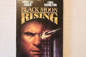
The VHS artwork for Black Moon Rising is a stunning piece of 80s action cinema marketing, showcasing an aggressive, futuristic-looking supercar tearing through a man’s face, suggesting a high-octane thriller where the car is central to the plot. Viewers expected a vehicular action masterpiece similar to Mad Max or Knight Rider. The movie stars Tommy Lee Jones as a thief who gets caught up in a plot involving the titular prototype car. However, the “Black Moon” car is actually featured surprisingly little throughout the film’s runtime, mainly appearing at the beginning and the end. The movie focuses more on espionage and a fairly conventional heist plot, making the dynamic, car-focused cover a major bait-and-switch for action enthusiasts.
6. Monkey Shines (1988)
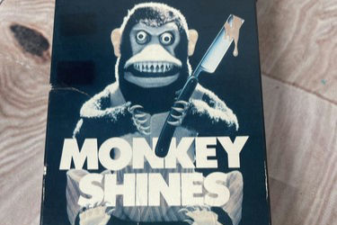
The Monkey Shines VHS cover depicts an enraged Capuchin monkey, its eyes glowing with malice, gripping a bloody razor blade. The close-up and intense lighting make the cover feel like a true tale of primal, homicidal fury unleashed, capable of traumatizing any young person who wandered into the horror aisle. The film is actually a George A. Romero-directed psychological thriller about a quadriplegic man who uses a service monkey, Ella, whose mind becomes linked to his own. The monkey’s violent actions are a result of this connection and an experimental drug. While creepy, the on-screen Ella is a far cry from the monstrous, purely evil creature suggested by the close-up, razor-wielding depiction on the unsettling box art.
7. Rabid (1977)
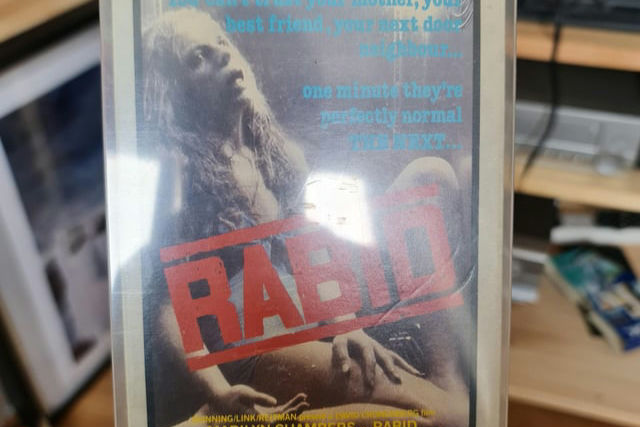
David Cronenberg’s Rabid VHS cover is a haunting image of a woman’s face, star Marilynn Chambers, looking sickly and contorted, with what appears to be a grotesque, veiny growth or mold covering her. The image suggests a body horror film of extreme, graphic decay and infection, a disturbing vision of disease. The film is indeed about a viral epidemic spread by a woman who develops a phallic-like stinger in her armpit that she uses to feed on people. However, the film is shot in a relatively sterile, clinical style typical of early Cronenberg, focusing more on the societal breakdown and philosophical terror. The actual transformation is less outwardly repulsive and more subtle than the cover’s visceral promise of a woman consumed by a horrifying physical mutation.
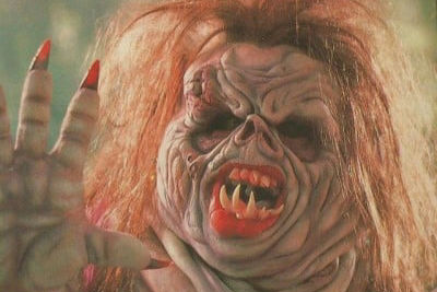
8. The Unnamable (1988)
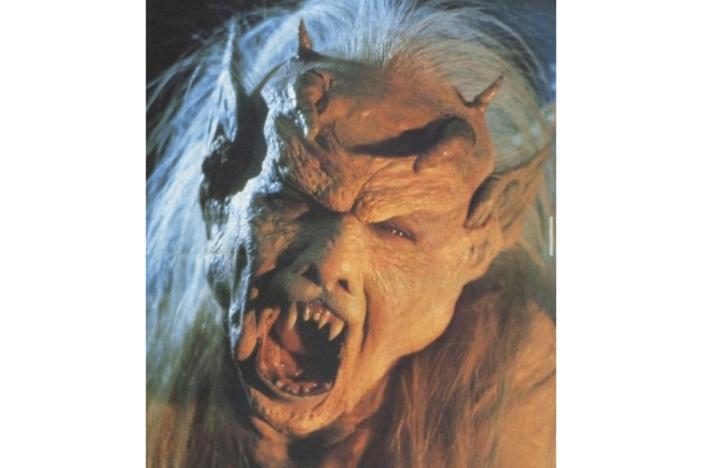
The VHS box for The Unnamable features a truly monstrous, green-skinned, fanged humanoid face with wild, flowing hair, giving a terrifying, up-close look at what seems to be a classic, unstoppable movie monster. The cover promised a pure, effects-driven creature feature that would deliver relentless graphic horror. The film, a low-budget adaptation of an H.P. Lovecraft story, does feature a creature, but it is often obscured by shadows or presented via inconsistent, limited special effects that do not live up to the spectacular, full-frontal monstrosity of the cover. The movie focuses heavily on talky exposition and a less-than-terrifying student-led investigation, making the bold, explicit horror on the box feel far more potent than the on-screen reality.
9. The Dead Pit (1989)
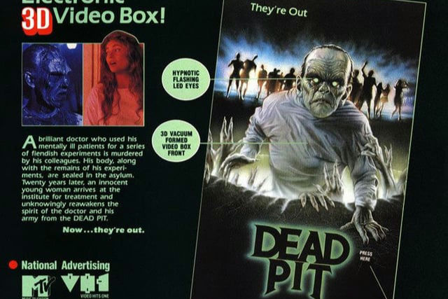
The Dead Pit cover was notorious for its creepy features, often showing a zombified face peering out from the darkness, with some versions featuring a raised, textured box or even light-up eyes when pressed. The artwork effectively captured a sense of relentless, rotting evil rising from the grave. The film itself is a relatively low-budget horror entry about a woman in a mental hospital haunted by the memory of a mad doctor and his murderous experiments, which eventually leads to the reanimation of his victims. While there are zombies, the film relies heavily on atmosphere and a convoluted plot, and the actual zombie makeup and effects, while decent for the time, lack the refined, iconic horror punch of the marketing’s highly-detailed, singular image.
10. Trilogy of Terror (1975)
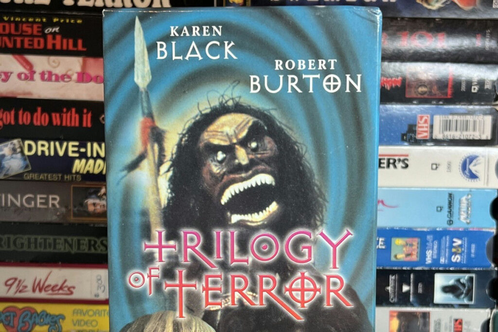
The VHS cover for the TV movie anthology Trilogy of Terror often spotlighted the Zuni doll from the third, and most famous, segment, “Amelia.” The image showed the doll, with its sharp teeth and wild eyes, lunging aggressively, promising a feature-length experience of pure, tiny-killer terror. This single image, based on the doll’s terrifying on-screen attack, was incredibly memorable and unsettling. However, the actual film is an anthology of three unconnected stories, with the doll segment only comprising about one-third of the total runtime. The first two stories are psychological dramas involving adultery, jealousy, and witchcraft that are more suspenseful than overtly horrific, making the Zuni doll cover feel like a misrepresentation of the movie’s overall mild, TV-friendly tone.
11. Night of the Creeps (1986)
The Night of the Creeps VHS cover often featured a shadowy figure behind a window or a dramatic tagline. This artwork promised a slimy, biological horror film with a constant, tactile sense of dread and infestation. The movie is a self-aware horror comedy that follows two college students dealing with alien parasites that turn their hosts into zombies. While the slugs are a key element, the film is much more of a lighthearted, witty homage to B-movies and 1950s sci-fi, complete with a memorable, quipping detective. The comedic and nostalgic elements of the film reduce the actual terror, making the cover’s focus on the pure, visceral disgust of the “creeps” a stronger source of horror than the movie’s campy tone.
12. TerrorVision (1986)
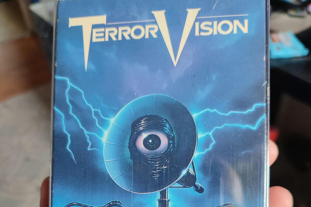
The cover art for TerrorVision frequently depicted a large, glowing, eyed monster satellite dish looming over a suburban living neighborhood, complete with a chaotic color palette that hinted at a bizarre and terrifying spectacle. This promised an epic, visual monster movie with a creature that would dominate the screen. The film is a wildly eccentric, low-budget comedy-horror flick about a suburban family whose satellite dish picks up a monster from a distant planet, which then emerges from the TV set. The film’s tone is surreal and satirical, and the monster, while inventive, is often hampered by the limited budget and special effects, appearing less imposing and more puppet-like than the terrifying, large-scale beast on the cover.
13. The Dentist (1996)
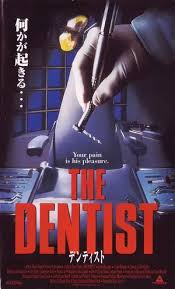
The VHS cover for The Dentist often used a close-up of a dentist’s horrifying, gleaming metal tool of a drill, capitalizing on the common, deep-seated fear of dental work. This simple yet effective image suggested a straight-up, brutal torture film focused entirely on the macabre acts of a mad dentist. The actual film is a psychological slasher that focuses more on the why of the dentist’s descent into madness and his meticulous planning. The on-screen violence is more intermittent, and the movie spends a significant amount of time developing the dentist’s paranoia and jealousy. The cover’s visceral, object-based terror is arguably more effective at inducing fear than the film’s slower-paced, character-driven narrative.
14. The Final Terror (1983)
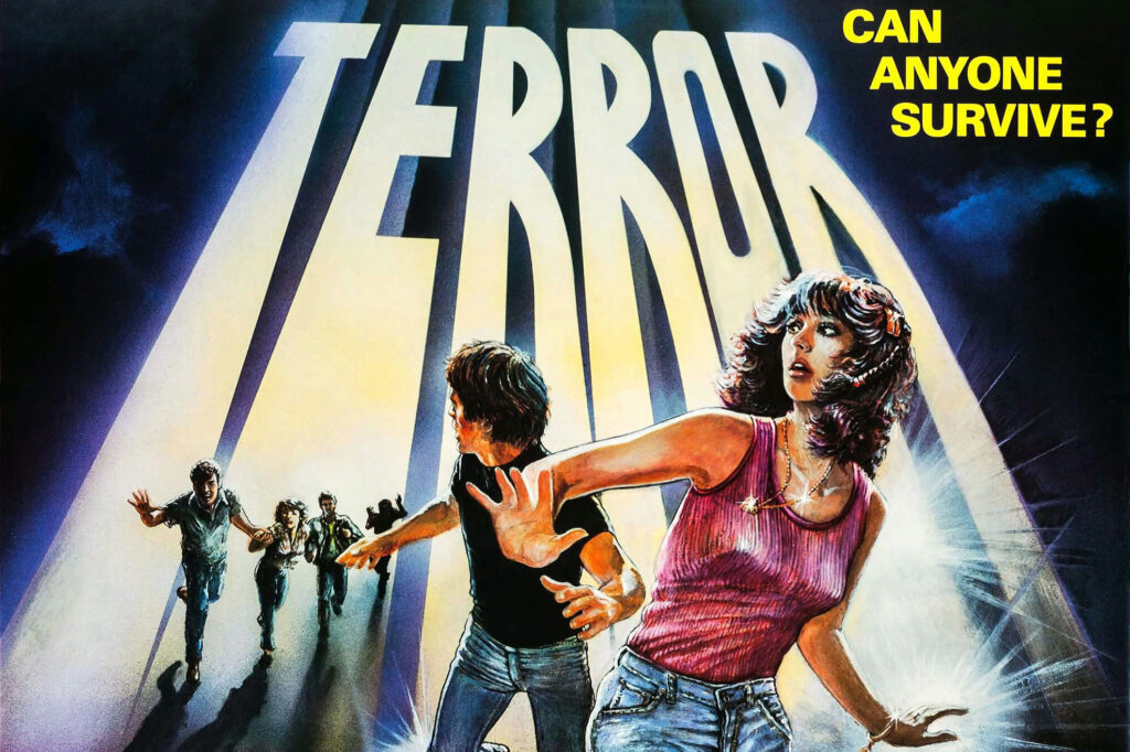
The artwork for The Final Terror typically featured a darkened, ominous forest setting with a shadowy, ill-defined figure looming in the background, and several characters fleeing from it; promising a pure, primal backwoods slasher film in the vein of Friday the 13th. The ominous atmosphere and hidden threat made the cover quite unnerving. The movie follows a group of young conservationists in a remote wilderness who are stalked by a relentless killer. While the film is a respectable slasher, it is notably slow-paced, with a greater focus on character development and woodsy atmosphere than on action and gore. The killer’s identity and motivation are also less imposing and more grounded than the menacing, almost supernatural presence suggested by the dark, foreboding box art.
The VHS era was a golden age of expectation-setting, where the cover was not just an advertisement, but a key piece of the horror experience itself. Many of the most memorable parts of these films existed solely on the bold, terrifying artwork that sparked our imaginations before we even pressed play.
Like this story? Add your thoughts in the comments, thank you.
This story 14 VHS Covers That Were Scarier Than the Actual Movie was first published on Daily FETCH

